Today, we will present the original ideas of combining white with wood in interior design.
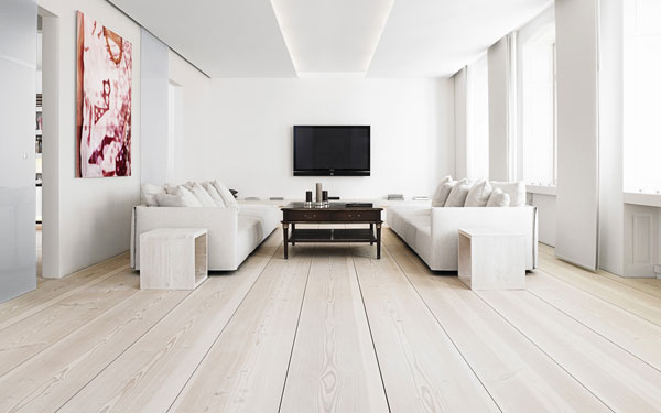
Could there be something cooler and cleaner than white? Barely. To enhance the feeling of cleanliness and freshness in rooms designed in snow-white colors, contrasting elements must be present.
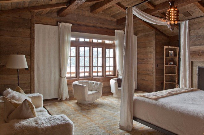
There are many shades of wood. Therefore, you can enter them indoors not only in combination with the white, but also between them, use soft transitions from light to dark or make bright accents. Many options. Let’s look at some of them.
Application Of Wood And White In The Interior Of The House
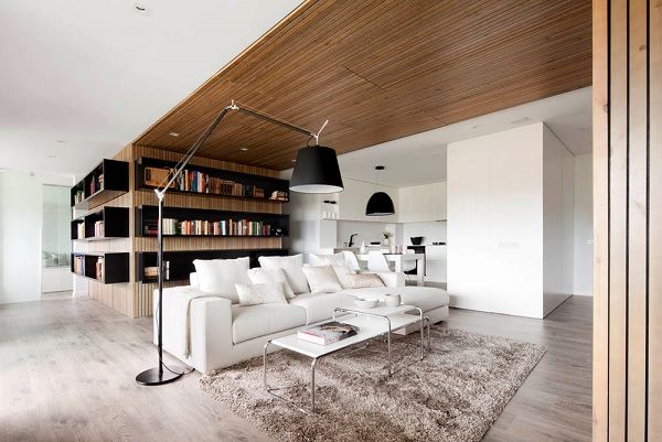
The use of soft transitions between colors gives the depth of the space and emphasizes the interior details. Sometimes, only one small detail is enough to give completeness to the interior.
Combine white and wood using the examples above to create unique interiors.
You can apply wallpapers, paints, etc. on walls and see how they look in various interiors.
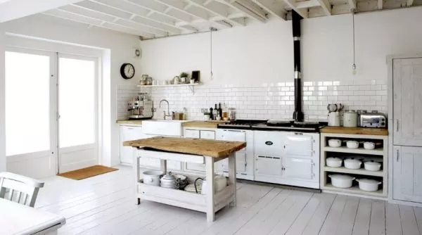
The Combination Of Natural Wood And White Interior of The Room
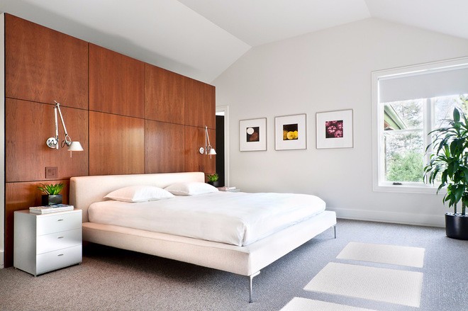
We think first inside a modern kitchen or even non-residential premises. For rooms such as a bedroom or living room, we strive to use more textiles because it is the fabrics that give texture, volume and comfort.
However, you should not be so categorical, designers always advise you to pay attention to a pair of “whiter woods” to work with the decor of the bedroom.
The secret is that any light shade usually has a very organic appearance, it is easy to work with the white, especially because of the abundance of hues. In addition, the wood has a texture created by nature itself, which means that the interior will not be boring and monotonous. Here are some examples of using this pair. They impress with their beauty and inspire experiences.
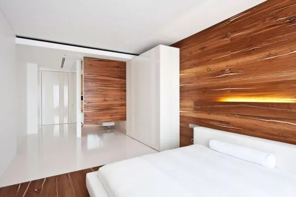
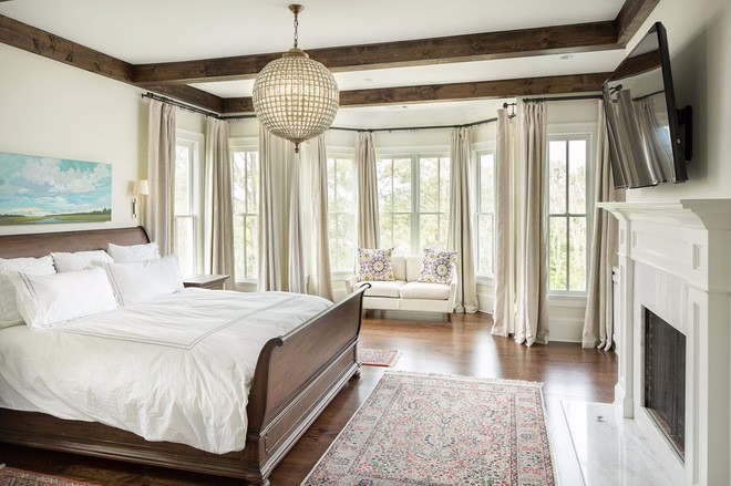
Wooden Bed
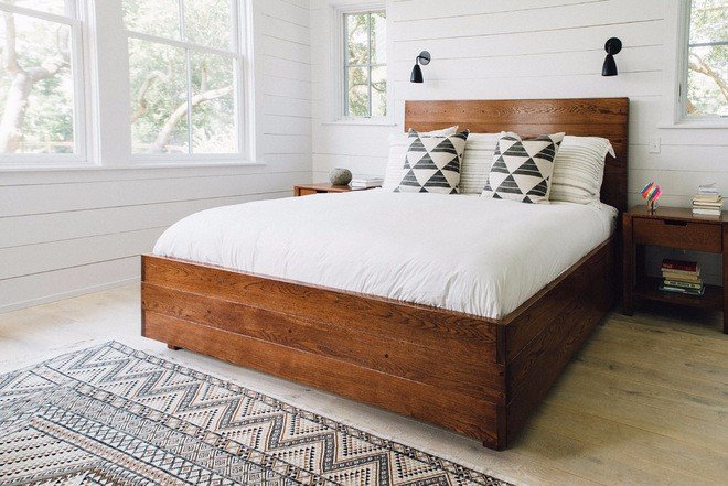
In this project, the bed played the main role, all thanks to the deep color of the wood and its natural texture. The simple, clear white color, used in large volumes, only enhances the contrast and makes the combination even more spectacular.
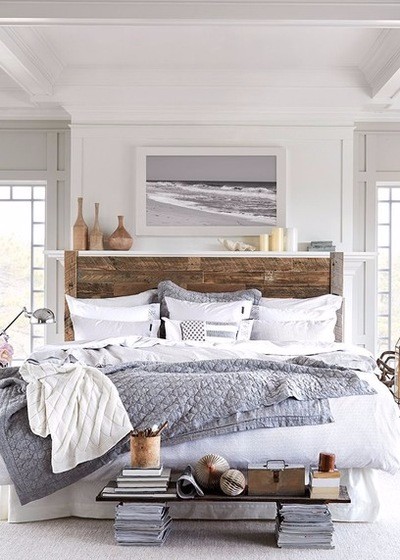
White Under Different Shapes
When working with a large volume of white color, it is often necessary to design the interior so that it is not pale and without a face. In this case, you must pay attention to the shapes in order to make them as diverse and interesting as possible. Inside this room, the designer works with a shade of white, but each time, this color is embodied in different forms: rectangular carpet floor, oval candle holders, curtains, bedspreads.
The Same Nuance In Different Textures
Another technique used by designers to avoid monotony when using the white color is that the same shade is used in different textures. So, for example, a pillow with a silk pillowcase thrown on a velvet covered chair will create an interesting set of textures, and even the same color will be different.
Adds a Contrast Tone
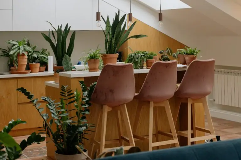
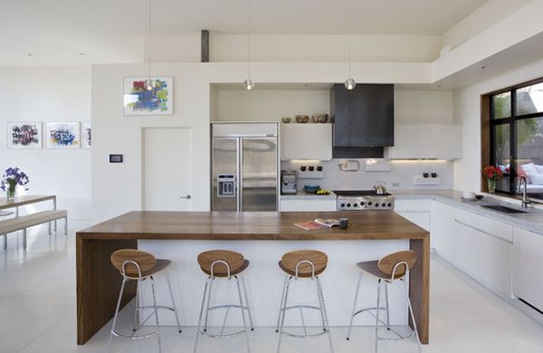
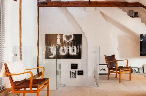
The palette, composed of white and a natural wood hue, is completely self-contained and generally does not require coloring. However, it is sometimes advisable for designers to dilute the range with just a drop of a contrasting and brighter shade. In some cases, this role is played by a small image or a photograph hanging on the wall, while in others, a pair of potted plants is sufficient.
Greyish sub-tone
A slightly more complex variant of this technique is demonstrated inside this beautiful room. The gray color did not appear here by chance, it prolongs the greyish sub-tone already existing in the natural shade of the tree. This creates a very harmonious palette and certainly not boring.
Decoration Elements
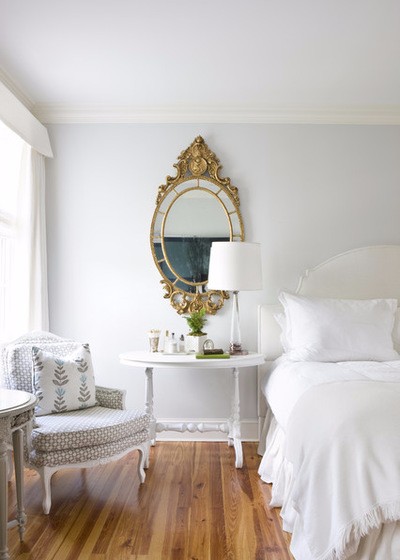
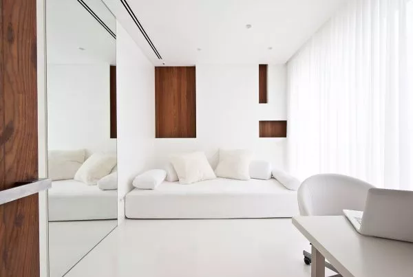
In a palette so simple and concise, all types of brilliant textures are particularly impressive. Decorative elements such as mirrors, crystals and glossy surfaces are essentially neutral. They do not interrupt the main palette and do not overload color, but still provide the necessary shine and freshness.
This richly decorated mirror confers a particular charm to a rather simple room interior and also emphasizes the freshness of the white.