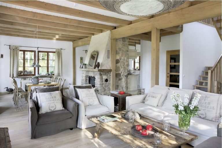
The farmhouse style’s growing popularity has prompted both designers and homeowners to take a closer look at its features. Simple lines and cozy shapes, natural materials, and country-style accessories are undoubtedly important – but the color palette is just as important.
The farmhouse color scheme directly addresses neutrality and classics, so you don’t have to waste time looking for a particular complex shade. The colors remain relevant for decades, and if one day you decide to change the interior, it is possible that you will not even need to change the tone of the finish.
When choosing shades for decorating in the farmhouse style, designers usually focus on large manufacturers’ palettes, where they select colors of suitable shades. For a long time, Sherwin-Williams and Benjamin Moore, the leading American companies in the field of exterior and interior paints have remained the undisputed favorites in terms of brands of paints and varnishes. Let’s find out what they offer for the farmhouse style in 2022.
Farmhouse walls color: paint selection rules
When choosing paints for the rooms of your home, two dangers may lie in wait for you – the risk of not guessing with a shade and the opportunity to create something unnecessarily monotonous and neutral. That is why, in the case of a farmhouse-style interior, designers recommend focusing on the following rules:

You can apply wallpapers, paints, etc. on walls and see how they look in various interiors.

Farmhouse palette: trendy colors (in 2022 and not only)
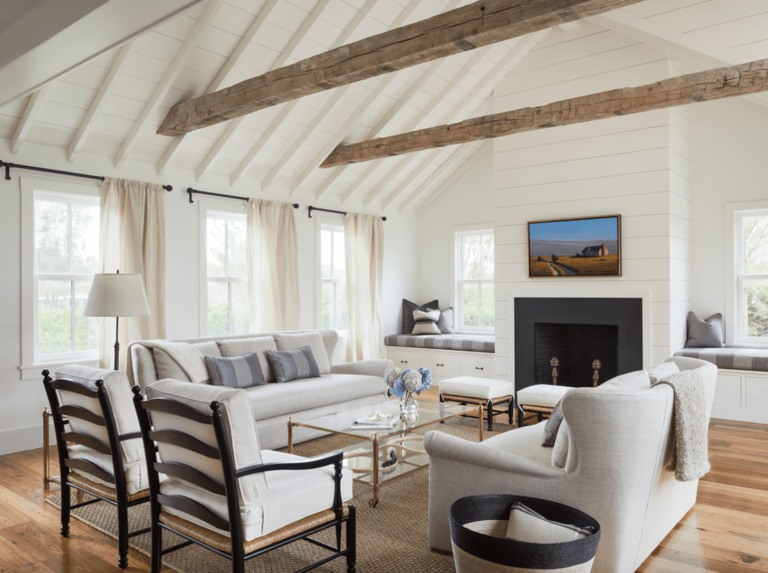
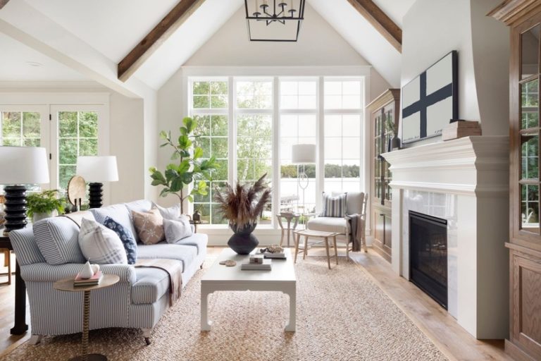
Before we move on to a detailed description of the palette’s key colors for a farmhouse-style interior, we hasten to reassure you: there are very few of them. However, thanks to them, you can create an atmosphere of calm, serenity, comfort, and lightness of life, characteristic of country houses with history.
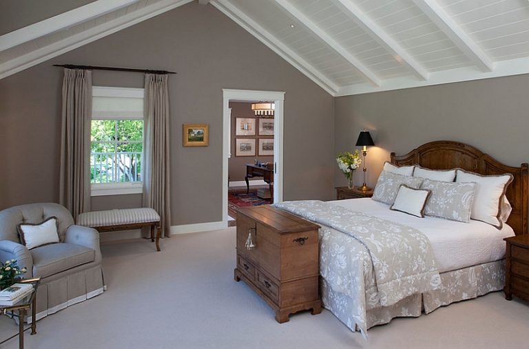
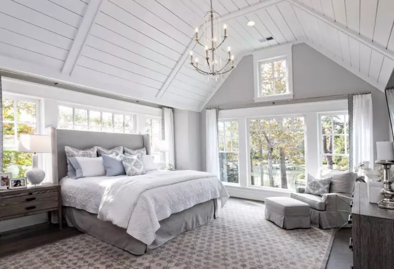
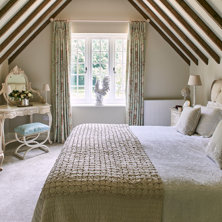
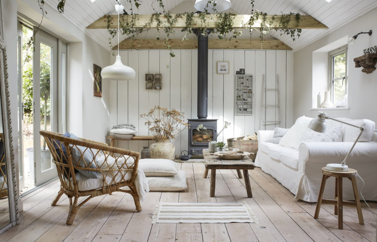
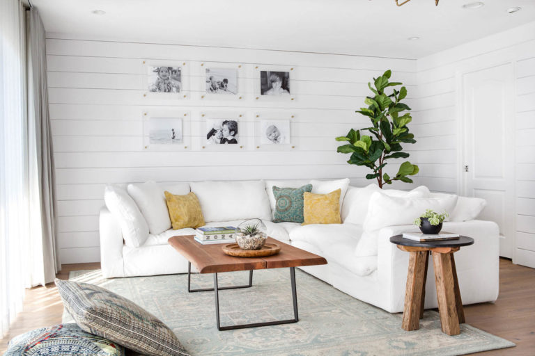
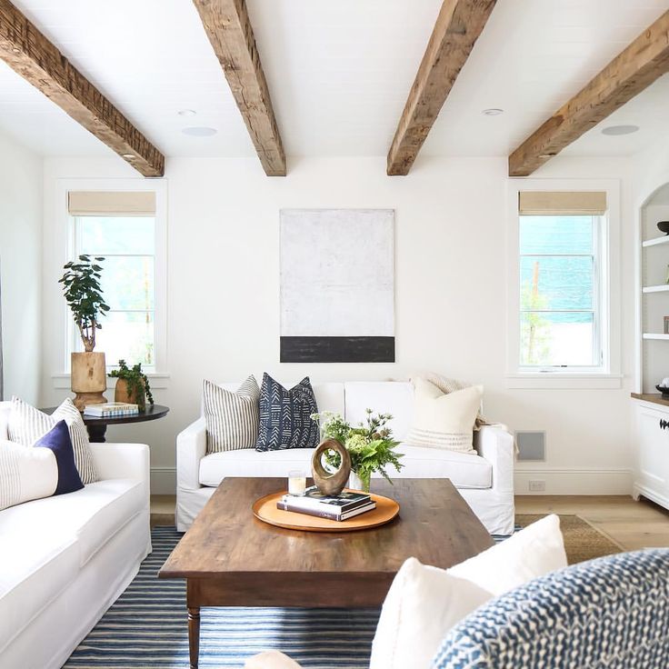
White
As we said earlier, the farmhouse implies soft, calm shades of white with a barely noticeable yellowish undertone. Among them:
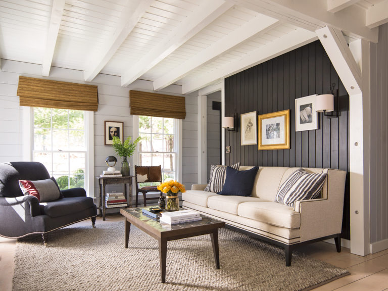
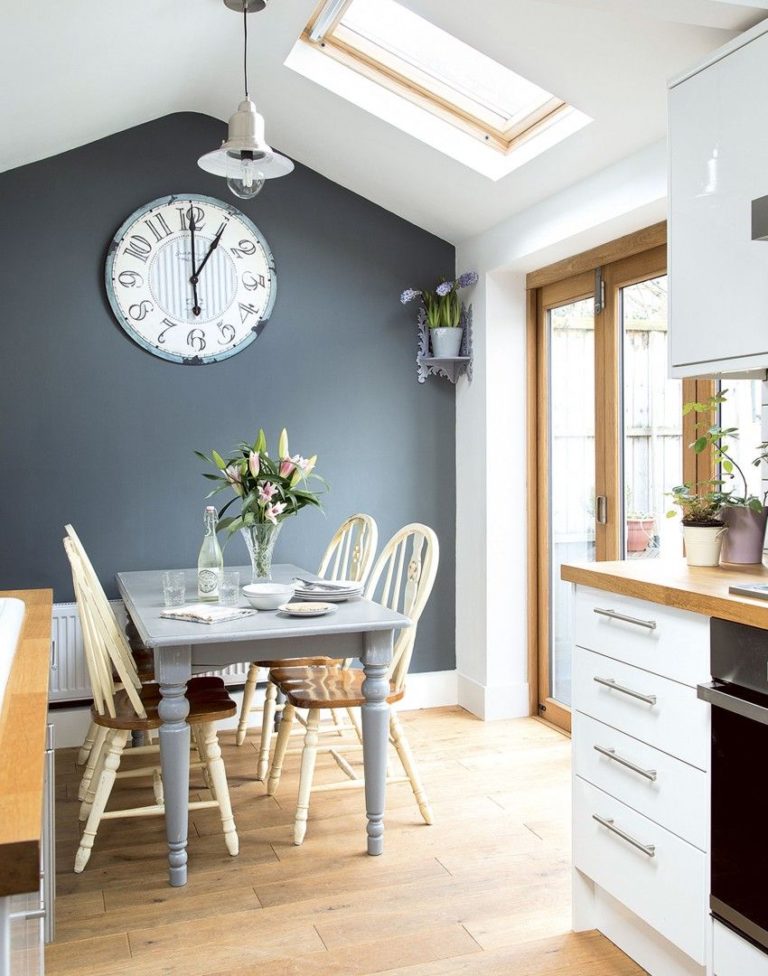
Gray
Gray is essential for a peaceful atmosphere – and a touch of past charm. The most popular farmhouse variation is the Agreeable Gray. Its light beige undertone avoids a dull and boring design even when using this color as a background color. Also, it works great with most of the decorative elements characteristic of this style.
Another fascinating gray variation is the Silver Song. A rather pronounced greenish tone adds the necessary freshness and lightness and looks really cool in sunny rooms.
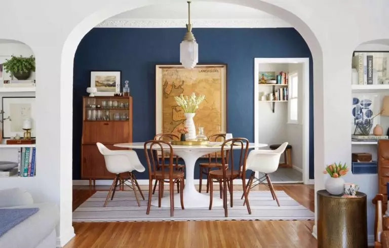
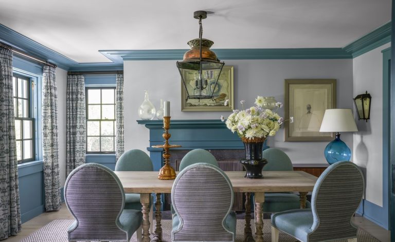
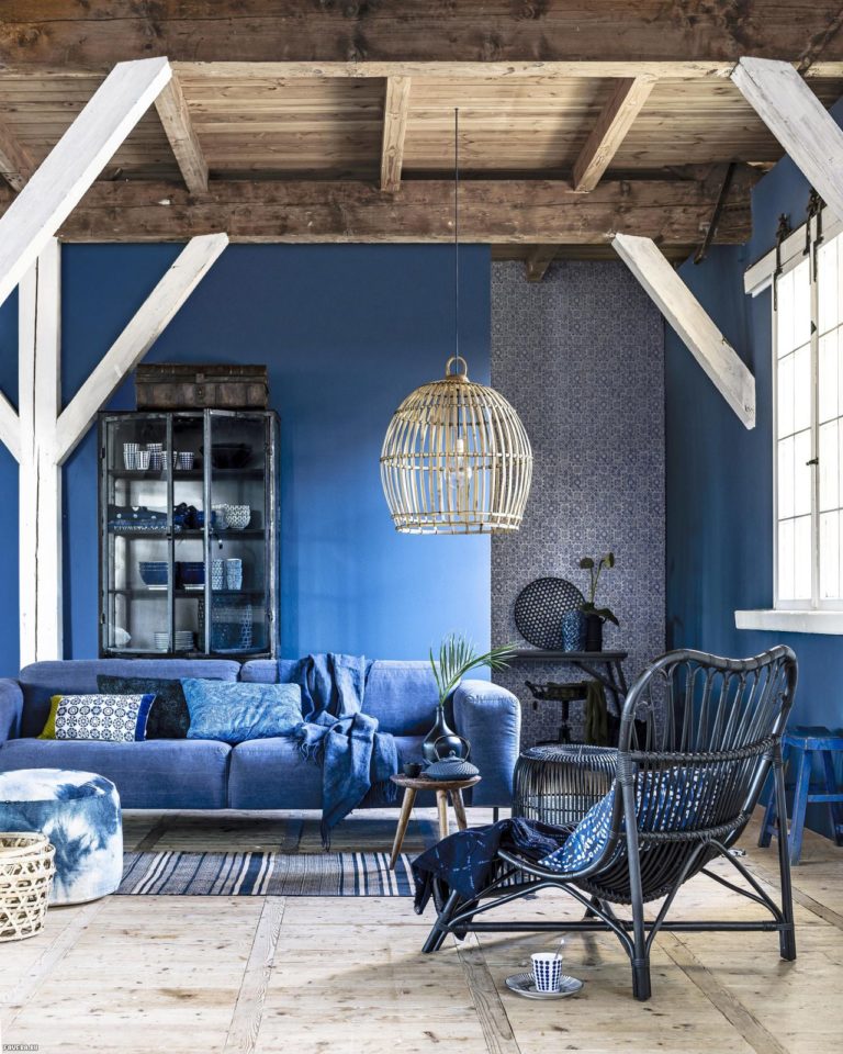
Blue
All fans like pale, faded, and dusty shades of blue and light blue of the farmhouse palette; however, the leading blue tone for a farmhouse interior is Waterloo’s shade by Sherwin Williams. Gray and pearl undertones make this navy blue feel more down-to-earth, neutral, yet surprisingly soft at the same time.
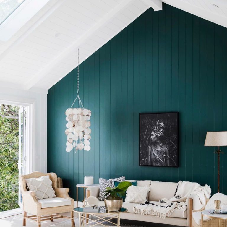
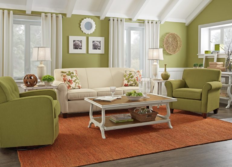
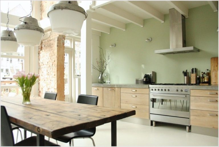
Green
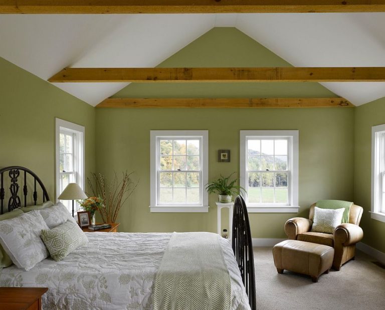
The farmhouse comes alive under the influence of green tones – even though this style is characterized by its light gradations as if touched by time and sunlight:
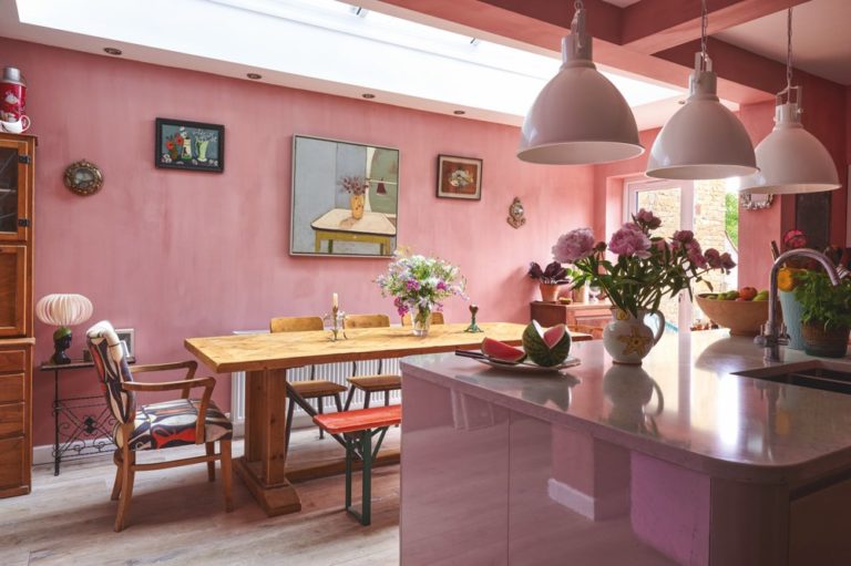
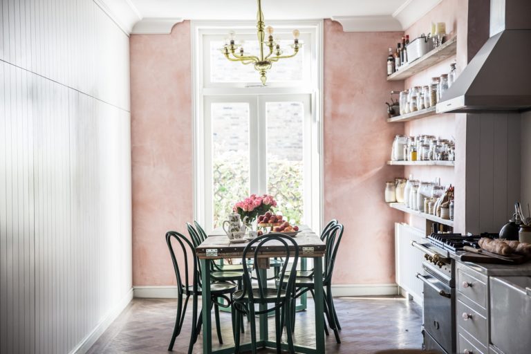
Pink
As you might have noticed, reds and pinks are not very welcome in farmhouse style, but the Blushing from Sherwin Williams’ palette is a welcome exception. It is a very soft and incredibly soothing pink that is perfect for kids’ rooms and rooms that want to be made a little warmer.
Farmhouse-style color palette: Conclusions + Photo Gallery
The colors described above form the basis to which other shades are added. Natural woody, beige and black tones complete the farmhouse palette – harmonious, soothing, and welcoming.