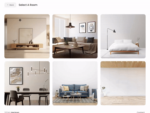
Try Bit Of Sugar paint in a room with Hackrea Visualizer
Bit Of Sugar (Behr PR-W14): what color is, review, and use
As they say – perfectly neutral, and it cannot be any other way but true about the newly found paint color in interior design – Bit Of Sugar PR-W14 from Behr. What makes it perfect? Generally speaking, this is a timeless shade of bright white slightly played down by subtle warm notes, which feel neither warm nor cool, just like a tiny cube of sugar.
The beautiful white variation has features from both worlds – a bit traditional and a bit modern. The neutral base offers a timeless effect, while the slightly aged scents bring in a refined sense of vintage. The new kid on the block seems to be a perfect fit for contemporary interiors and exteriors. Aren’t you intrigued? Well, we are happy to reveal a few secrets!
Bit Of Sugar paint color features
The new neutral is not that of a white shade. It is actually off-white, all due to the gray-beige undertones responsible for its perfect balance of cool and warm. To make it clear, let’s refer to two of the most popular white shades – Chantilly Lace from Benjamin Moore and Alabaster from Sherwin-Williams. The thing is that Bit Of Sugar stands right between them from the point of view of its appearance and popularity. Devoid of the cool notes found at Chantilly Lace and not showing such warm scents as Alabaster does, the PR-W14 paint color from Behr offers a perfect balance between the two paint colors. It is bright enough to expand the room borders and fill it with a standout amount of light and appropriately soft to add a slight touch of individuality without risking the overall neutral result.
You can apply wallpapers, paints, etc. on walls and see how they look in various interiors.
Bit Of Sugar: is it warm or cold?
Yes, it is slightly perceived. No, it does not go beyond limits. Bit Of Sugar contains just the perfect amount of warm notes to soften the classic white look to the right level. The interesting part is that these subtle warm scents feel different in different styles. They offer a stylish touch of softness for the overly simplified modern interiors and enhance the aged effect within Farmhouse approaches.
How does lighting affect Bit Of Sugar?
This paint color is very bright, and when one may think lighting would not much influence its appearance, we are here to convince you of the contrary. In north-facing rooms, Bit Of Sugar reveals more emphasized cool notes yet with a hidden soft base. If we are to speak about rooms with south-facing windows, this shade reveals a warm variation of white that feels comfy and neutral simultaneously. If you wonder about the spaces with eastern and western exposure, it depends on how the light penetrates the room, bringing cooler or warmer notes to the surface.
Bit Of Sugar LRV
For our new guests: Light Reflectance Value tells us how light or dark a paint color is on a scale from 0 to 100. In the case of Bit Of Sugar, it is 89. One should note that 100 stands for true shades of white. Now you can imagine how bright this paint color is. Still, not that far from the pure whites, Bit Of Sugar is slightly off-white. Nevertheless, it shows impressive abilities to reflect the light throughout the space, just like the true shades of white with a bit of an individual approach.
Bit Of Sugar undertones
Is it the gray or beige undertones, of course, slightly perceived, that stand behind this unique shade of white? Both of them, and even a balanced combination between them. One cannot go without the other when we speak about such a perfect neutral. Furthermore, these notes are responsible for the impressive ability of this paint color to adapt to different styles.
Similar colors
It would probably not be a surprise if we told you that Bit Of Sugar has many cousins at other color brands. Still, they each come with a unique sense of beauty that distinguishes among them. Some cooler, other warmer, yet not far from Bit Of Sugar, the range of similar shades is simply astonishing. Let’s discover the most prominent representatives!
Coordinating colors
The new neutral variation is slightly picky when it comes to partnering shades. Its gray and beige composition serves as a perfect contrast for dark greige paint colors. One can also use Bit Of Sugar in combination with bolder accents yet pastel, such as blue and purple. The slightly off-white shade is impressively friendly towards brown shades. It should be noted that most of the offered options suppose warm variations. From a general image to specific examples:
Use of Bit Of Sugar in interior
As stated, Bit Of Sugar is the true companion of those impressed by totally different styles. Be they exceptionally modern or exquisitely traditional. Designers draw our attention to the use of this paint color on shiplap, which makes it a real find in Farmhouse interiors. Still, its combination with monochromatic palettes within Modern interiors is a no less impressive option. You can safely use this off-white variation as a background for bolder accents. Either way, the unique balance of warm and cool this paint color provides is one of a kind.
True replication of Modern Farmhouse
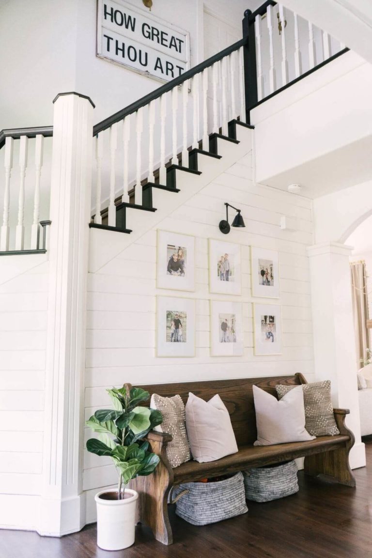
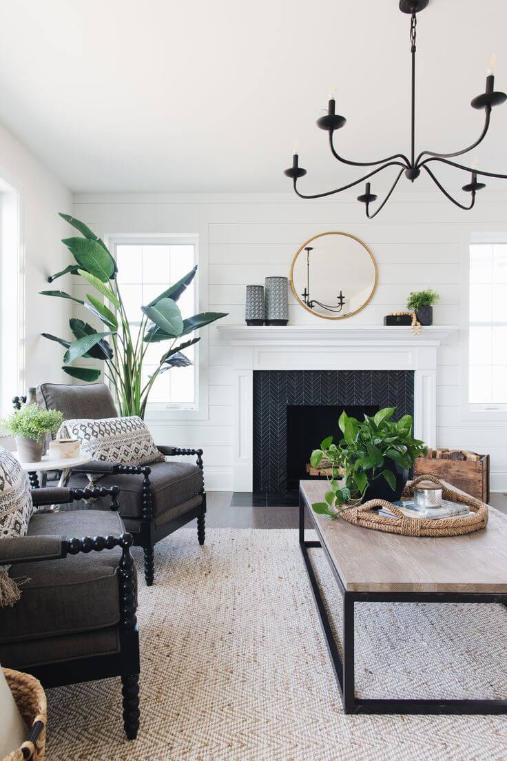
Many paint colors work with Modern Farmhouse interiors. Still, Bit Of Sugar is the exact match. Its neutral base adapts the traditional values to contemporary rules of design, while the slightly warm notes keep pace with the main principle of this style – to preserve comfort. Mandatorily, go for wood, and additionally, consider black accents. Go with the off-white variation for the walls, particularly for shiplap, if it is the case.
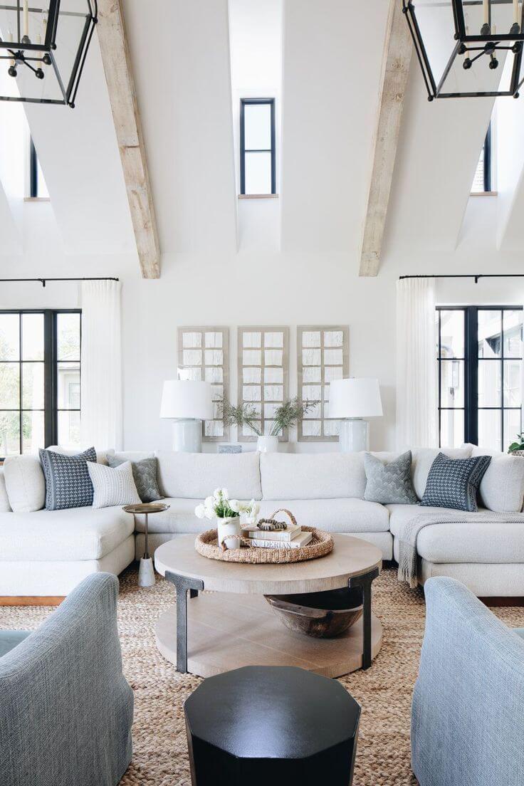
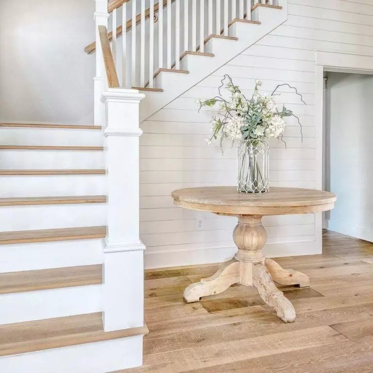
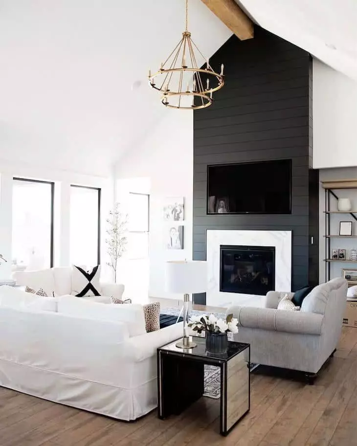
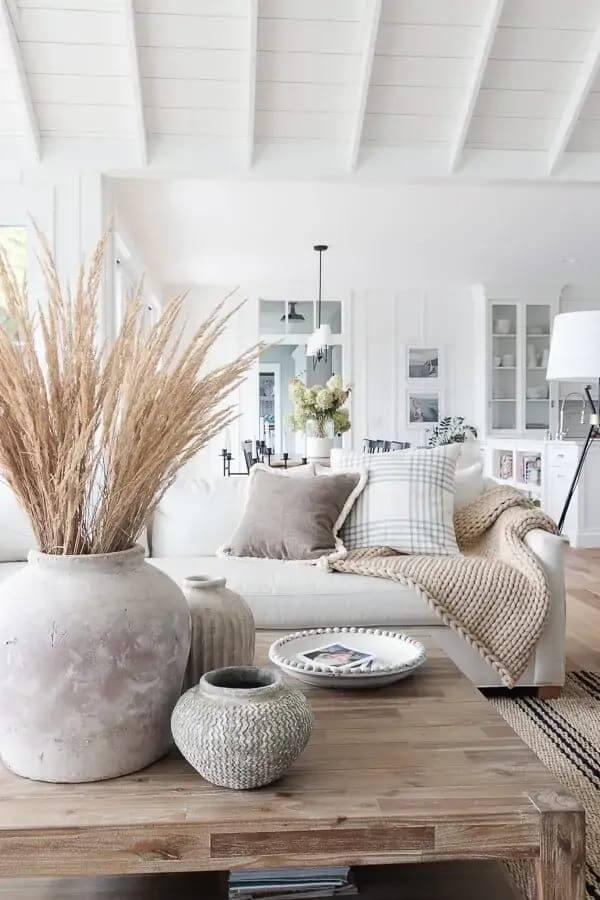
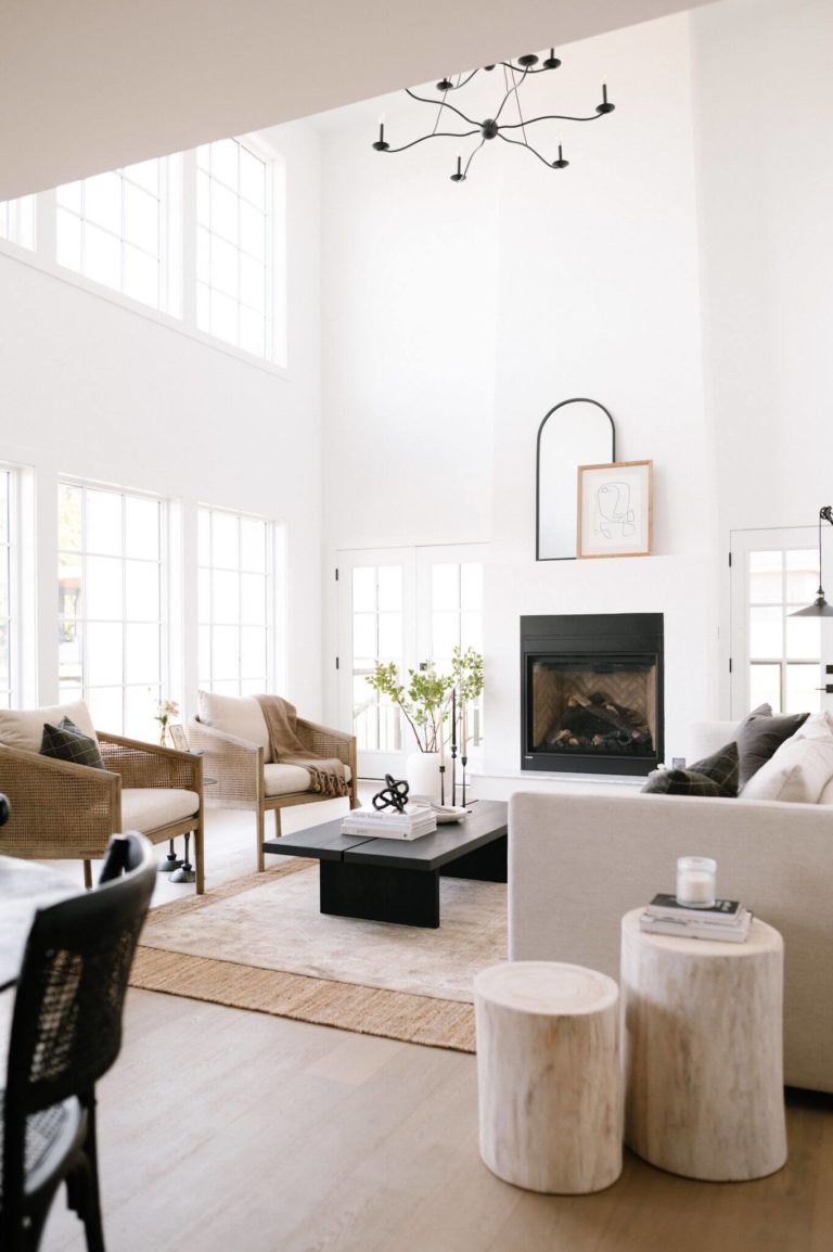
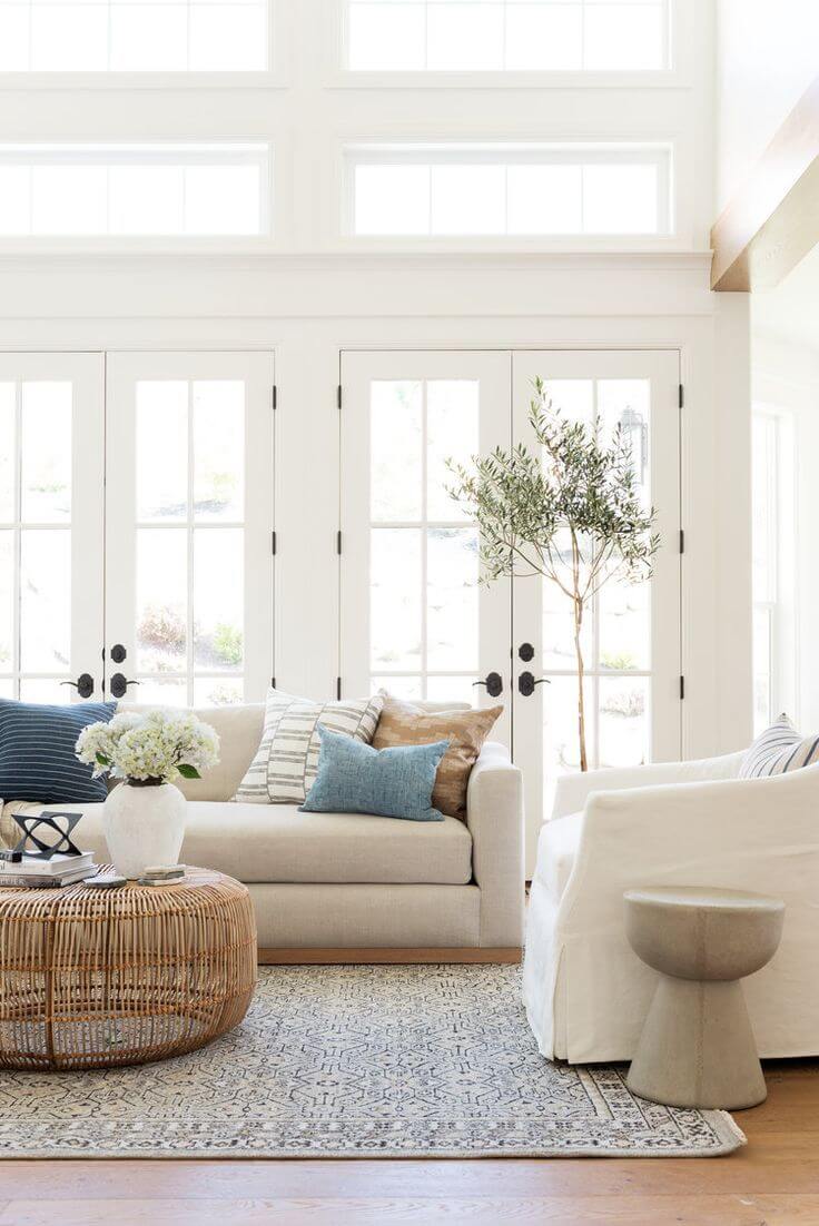
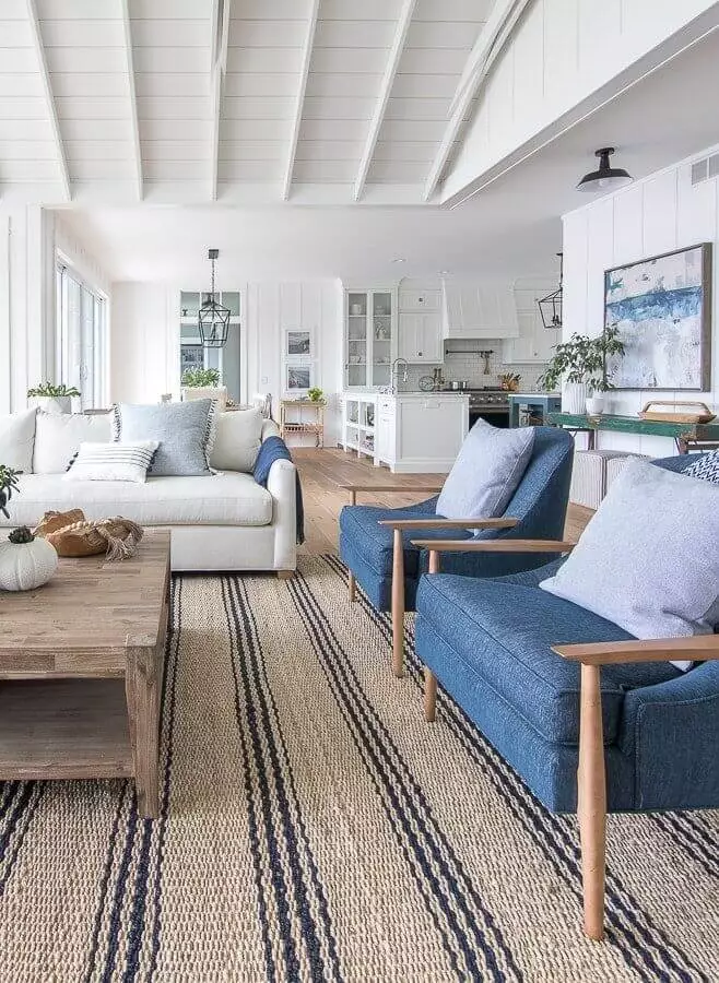
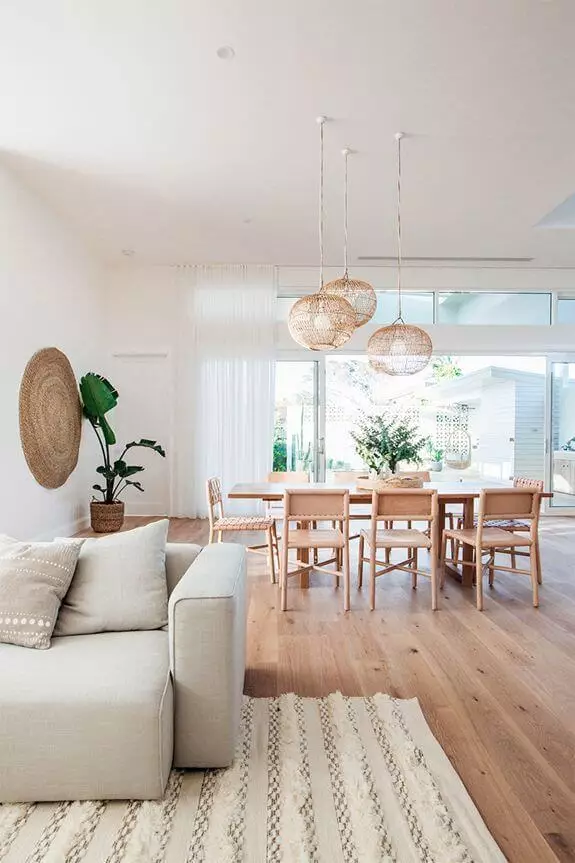
Living room
There is not only one option that works perfectly for this shade. There are various approaches you can go with and achieve a perfect result. What about a monochromatic palette? Do you fancy a few accents? Either way, go with Bit Of Sugar as a background and take any direction you like. With a few vintage elements, you can beautifully bring an aged effect to your walls, while a bit of wood here and a bit of black there can impressively emphasize the modern side of this paint color.
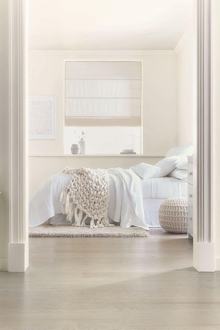
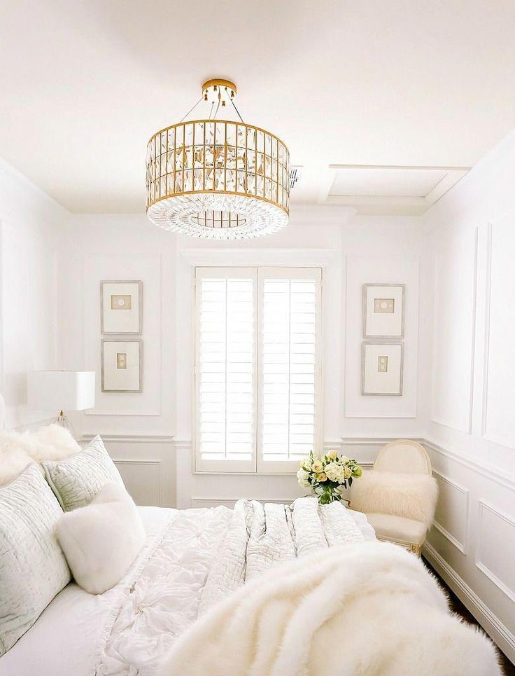
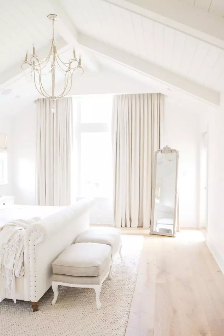
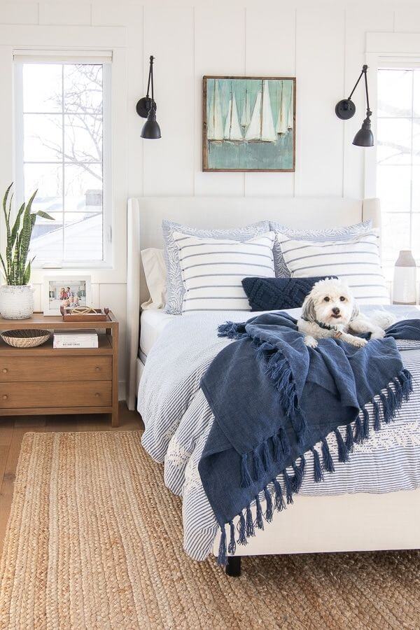
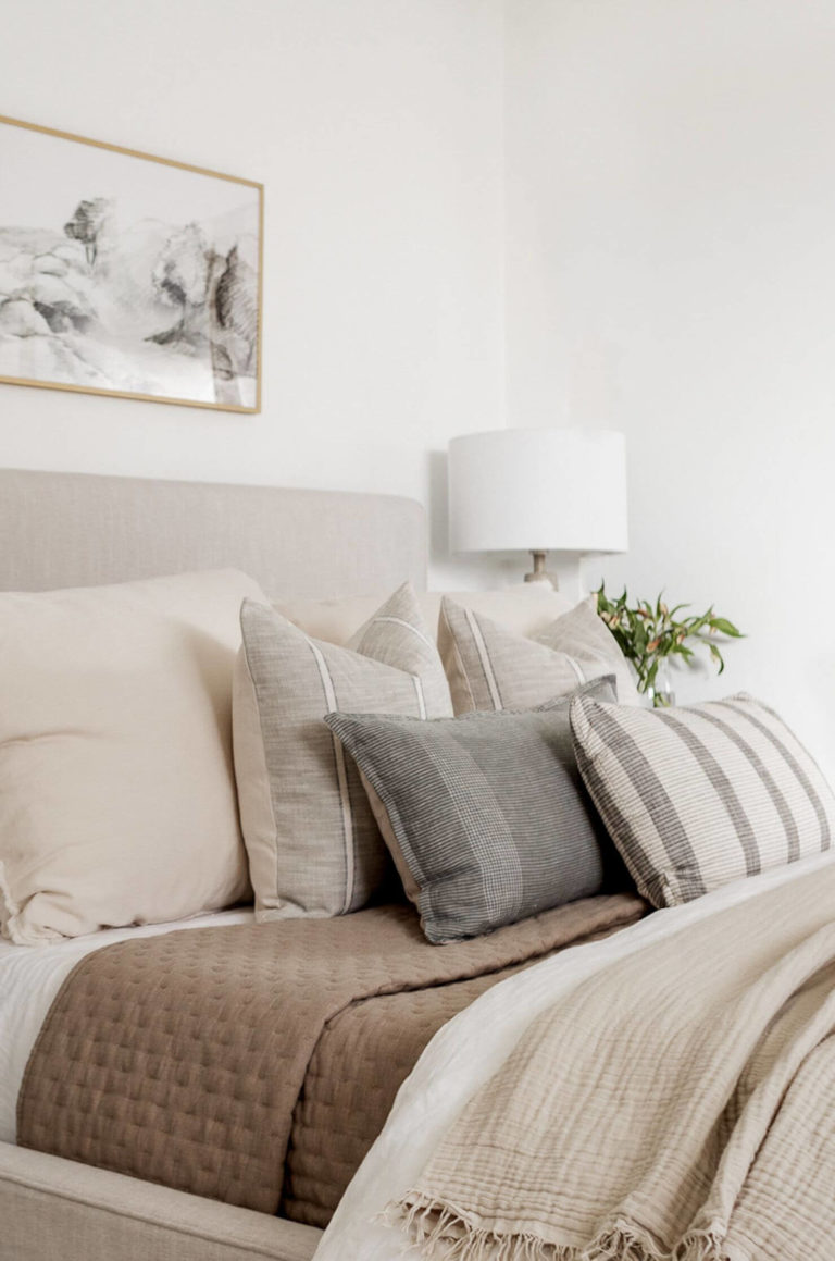
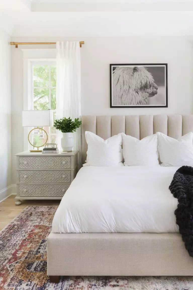
Bedroom
The most you can make of this beautiful off-white is considering it as a background within a monochromatic palette. The slightly perceived warm notes will keep it calm, comfy, and no less contemporary. Do you fancy anything else? Well, you could add a bit of uniqueness with a few brass or wood accents, depending on what style you go. Still, the color itself is more than enough to set an environment for safe and sound sleep and offer this space a look worth trying.
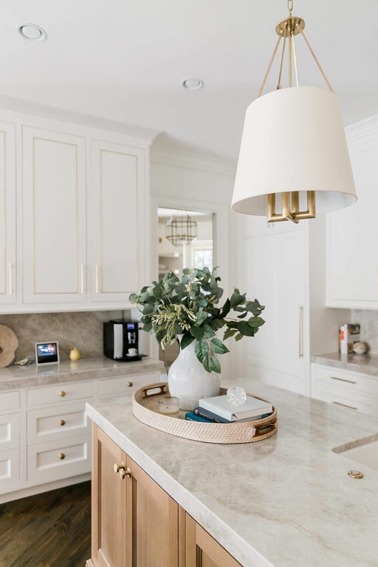
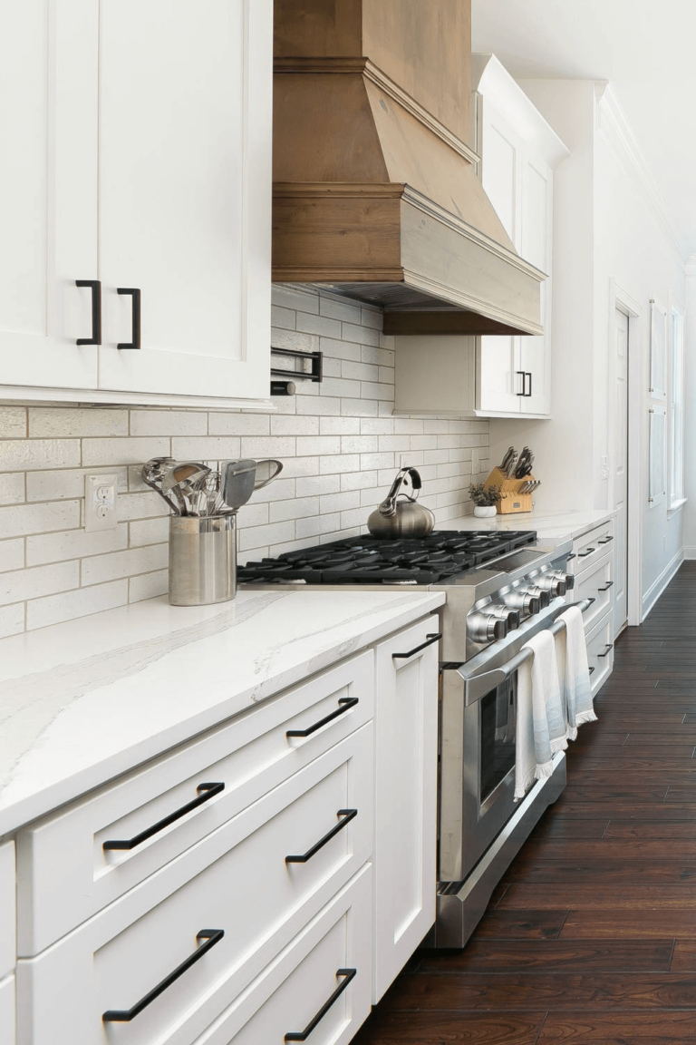
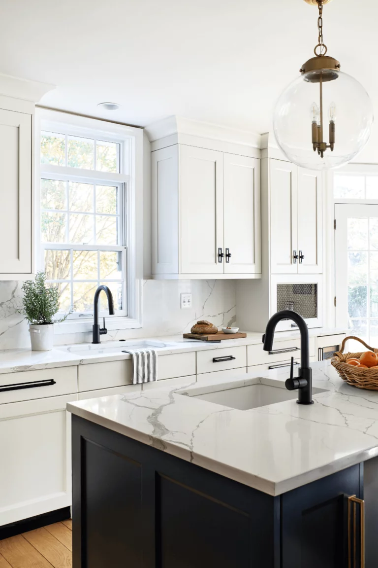
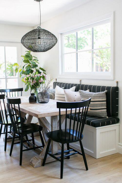
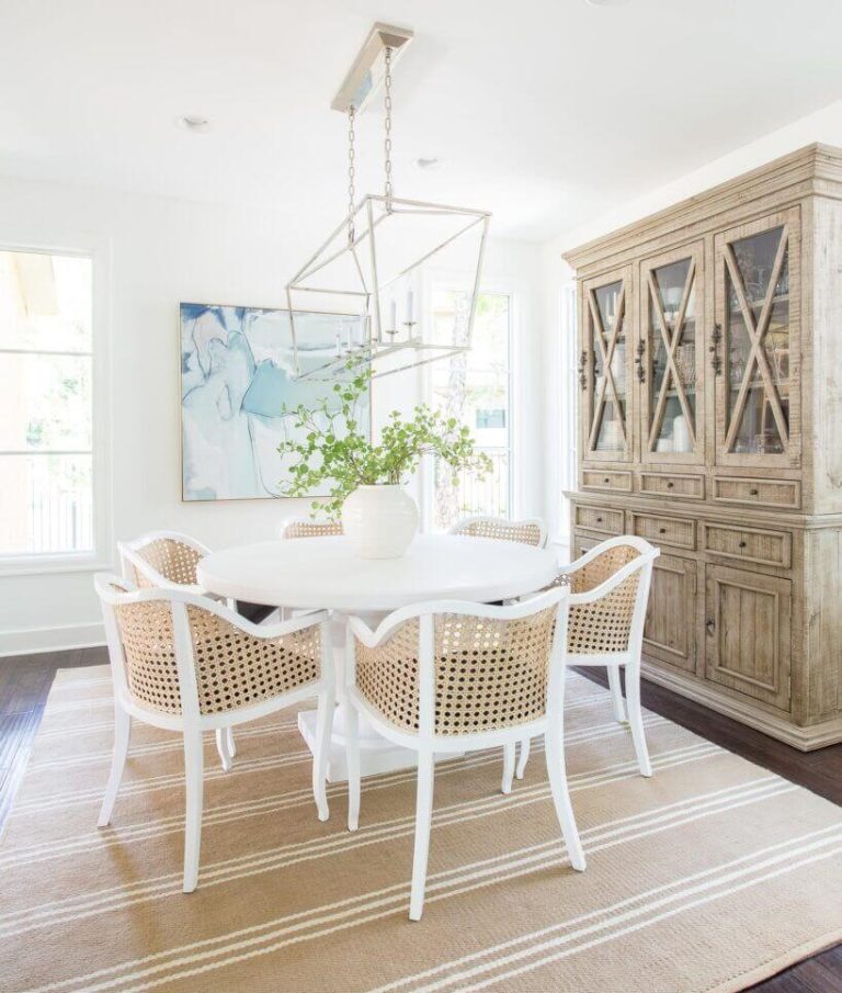
Kitchen and dining room
A mix of traditional and modern goes for both the kitchen and dining room. In the first case, Bit Of Sugar beautifully underlines the traditional cabinets, offering them a contemporary air, combined with any of the following options: black, brass, or wood accents. In the dining area, the fabulous shade of white works best for the walls accompanied by the same pearls, although designers put the accent on the pairing between Bit Of Sugar and rattan for a simple, natural, and original approach.
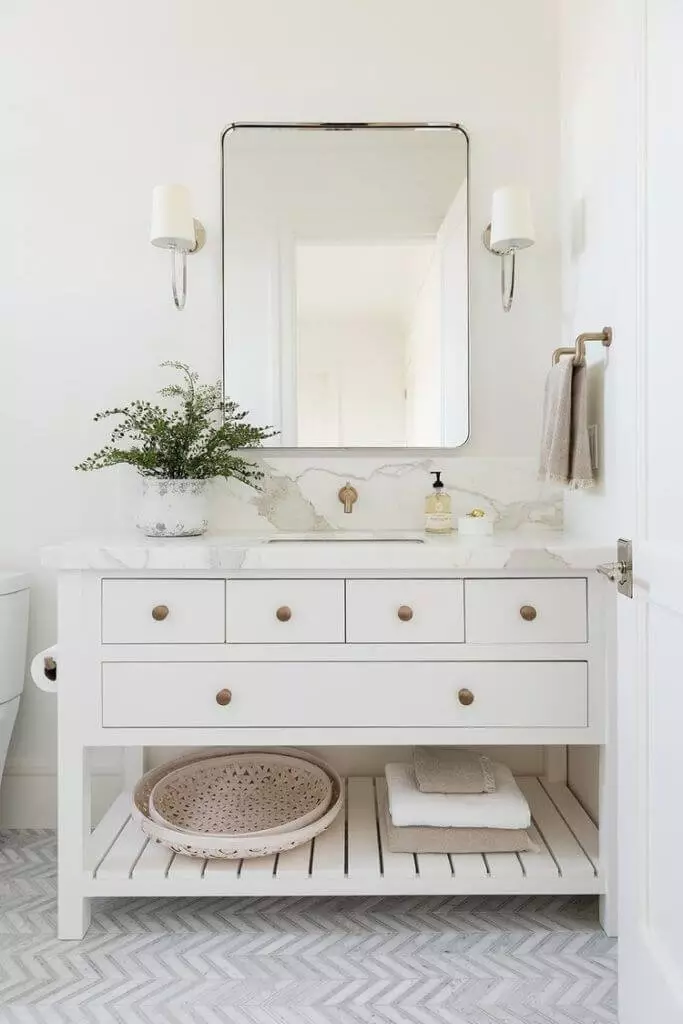
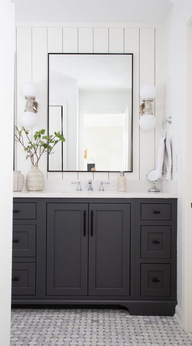
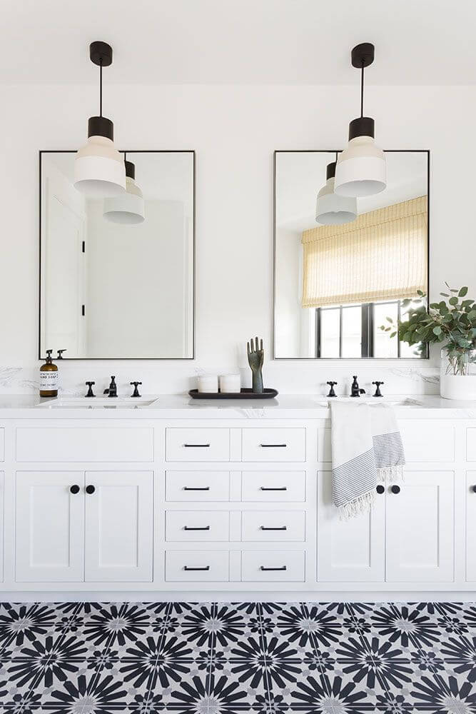
Bathroom
White is undoubtedly a perfect color for the bathroom for a sleek and fresh interior. To slightly soften the environment without risking the effect a true white has on a bathroom, don’t hesitate to consider the standout off-white from Behr for the walls, particularly if we speak about shiplap. From the simplest approach to a few accents of gold, black, or wood, keep it simple yet add uniqueness.
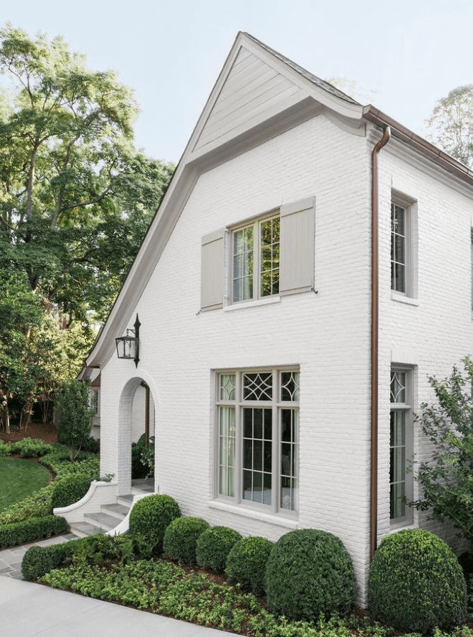
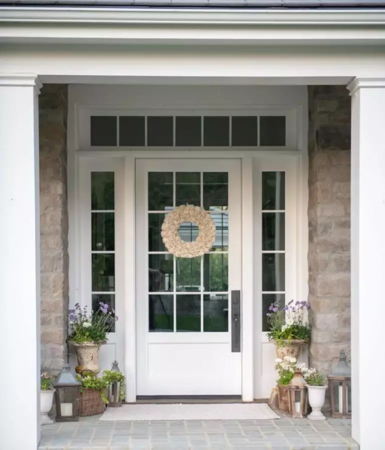
Use of Bit Of Sugar for house exterior
When bathed in the direct daylight, Bit Of Sugar looks much lighter than on the sample. Therefore, we suggest considering it on brick walls so that the additional texture would bring the hidden notes of this paint color to the surface. The irreplaceable darker greige variation is its true companion. As for the front door, this paint color would not look any different from a classic shade of white on a light background. Again, to emphasize its individuality, opt for texture – in this case, stone walls.
The Bit Of Sugar PR-W14 paint color from Behr is the right choice for those looking for a perfect shade of slightly warm white if the renowned Chantilly Lace feels too cool yet Alabaster seems too warm. The new neutral offers a new perspective on the beloved slightly off-white shades.
