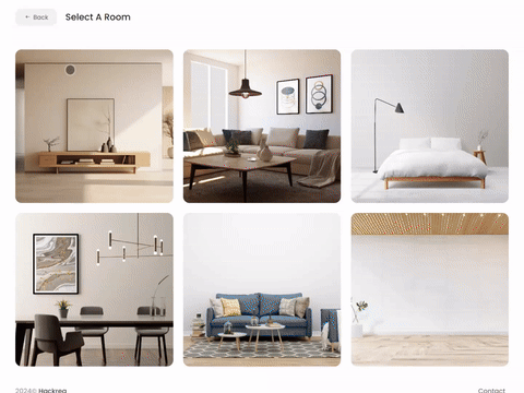
Try Campfire Ash paint in a room with Hackrea Visualizer
Campfire Ash (Behr N320-1): what color is, review, and use
Since greige paint colors are so popular, it would be a shame not to mention one of the best shades of this kind that goes beyond the usual features of the mix between gray and beige and promises to stay trendy for years to come. Ladies and gentlemen: Campfire Ash N320-1 from Behr!
Gravitating between the medium and light-toned paint colors, the combination of clean and soft that colorists from the brand came up with is a go-to shade for any design solution due to the impressive versatility of notes. What makes it stand out? Let’s find out!
Campfire Ash paint color features
As the name implies, there is definitely a gray base, which doesn’t go alone but is accompanied by its favorite beige notes for a balanced mix of neutrality and softness. The interesting thing about this shade that makes it stand out is that this one feels less intense and much lighter, unlike other greige variations. It can even reveal an impressive off-white appearance that feels clean, easy, soft, and not devoid of a body in full daylight.
You can apply wallpapers, paints, etc. on walls and see how they look in various interiors.
Campfire Ash: is it warm or cold?
The balanced pairing between neutral gray and slightly warmed beige can allow us to call it neither cold nor warm. It seems “soft” is the right word. Campfire Ash feels indeed fresh, while the beige scents keep it from going overly cool, resulting in a soft paint color. We would even call it dusty. All in all, it is a fresh perspective on the renowned greige variations.
How does lighting affect Campfire Ash?
While N320-1 looks like a true greige shade, once applied to a surface, fully covered by daylight, it looks impressively light. One may even take it for a white shade, slightly cooled down by the gray notes, featuring a soft surface due to the beige scents. The furthest we reach, the more interesting it gets. In spaces with northern exposure, the gray base may lead to a rather bluish effect, yet a very subtle one. On the other hand, Campfire Ash feels slightly warmer in rooms with south-facing windows, although we would not call it warm. To be precise, it reveals its softest variation. Under artificial lighting, this shade seems rather muted and takes on any temperature direction depending on the light undertones.
Campfire Ash LRV
The light pairing between gray and beige is not mistaken for a white variation without reason, and its Light Reflectance Value is there to prove it. On a scale from 0 to 100, where the latter stands for pure shades of white, N320-1 reaches a value of 69, which is pretty close to the white category. How does it work in practice? Campfire Ash is quite skilled at reflecting the light throughout the room and making it feel spacious.
Campfire Ash undertones
One of the intriguing facts about this paint color is that it indeed may reveal a few particles of blue in cool lighting conditions. Did colorists use blue when developing this shade? Actually not. This effect is the result of interaction between the gray base and the slightly cooled down particles of light. This is why one would hardly notice something of the kind on the sample.
Similar colors
Is there any other color than gray with such a wide range of variations, even when paired with beige? Undoubtedly, the light greige paint color from Behr has similarities within the same brand and at other manufacturers. If you cannot find Campfire Ash for some reason or are looking for slightly lighter or more intense variations, consider the following alternatives:
Coordinating colors
Another impressive feature about this paint color – considering that it is much lighter when applied to a surface, it offers a wider range of matching colors. For a start, consider warm whites for the trim to harmonize with the soft notes of Campfire Ash. Next come medium shades of bright colors that fabulously reveal themselves on the neutral background. Don’t hesitate to pair the greige variation with bolder shades of gray with earthy notes for natural contrast. This is not all! Go on with dark shades of bright color variations of green, purple, or blue for authentic accents. Have you got overwhelmed by such a sea of opportunities? No worries! Consider the following exact color matchings:
Use of Campfire Ash in the interior
With an enhanced greige appearance and resembling an off-white shade within appropriate lighting conditions, Campfire Ash is a real find for modern approaches to styles. N320-1 is a no-fail option for contemporary interiors from monochromatic to contrasting palettes. Let’s see how it really works in actual settings!
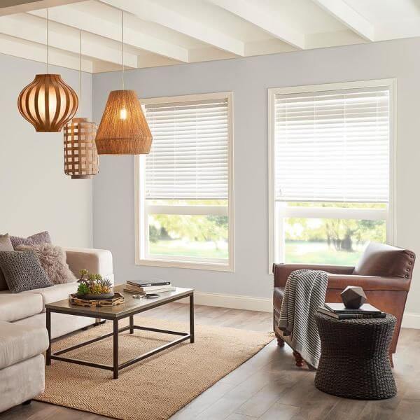
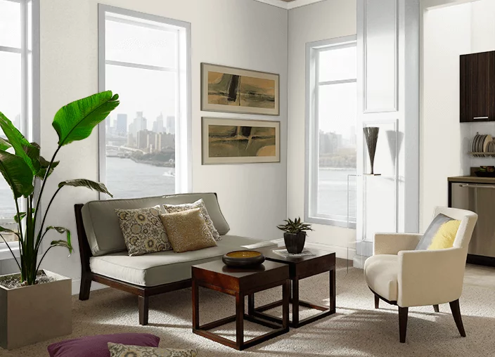
Living room
The background provided by Campfire Ash is a perfect canvas for any design approach. Whether you keep it neutral with sleek lines and unobtrusive colors or stick to a contrasting solution, N320-1 beautifully reveals any accent, even the most neutrally colored one. Greige and white for simplicity, greige and wood for comfort, greige and bright accents for sophistication, greige and metals for elegance.
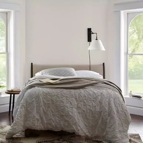
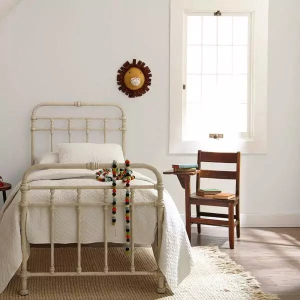
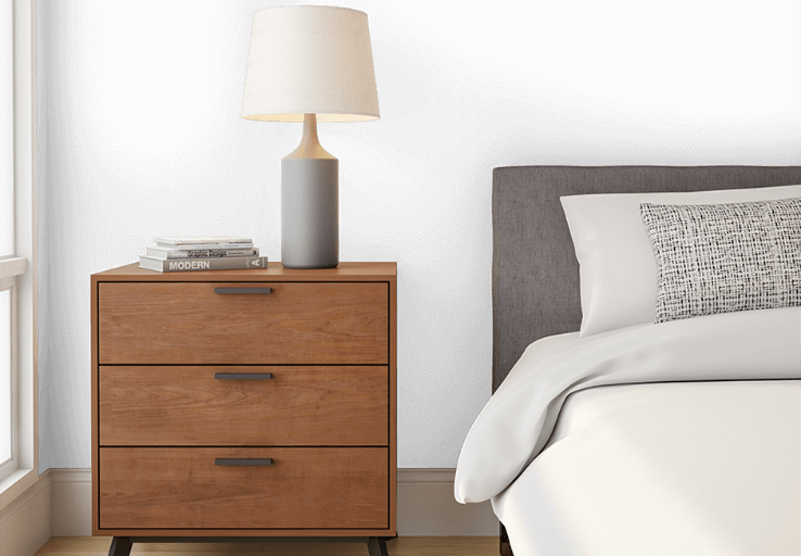
Bedroom
We suggest pairing the walls painted this way with light shades in the bedroom, even for the bedding, to make sure that N320-1 reveals its white-like variation for an easy and soft environment. If your bedroom has north-facing windows, your walls will acquire a bluish scent, while a bit of artificial lighting with warm undertones will bring the soft beige notes to the surface. It is up to you what effect suits your personal space better.
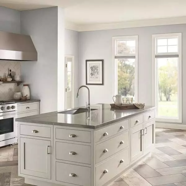
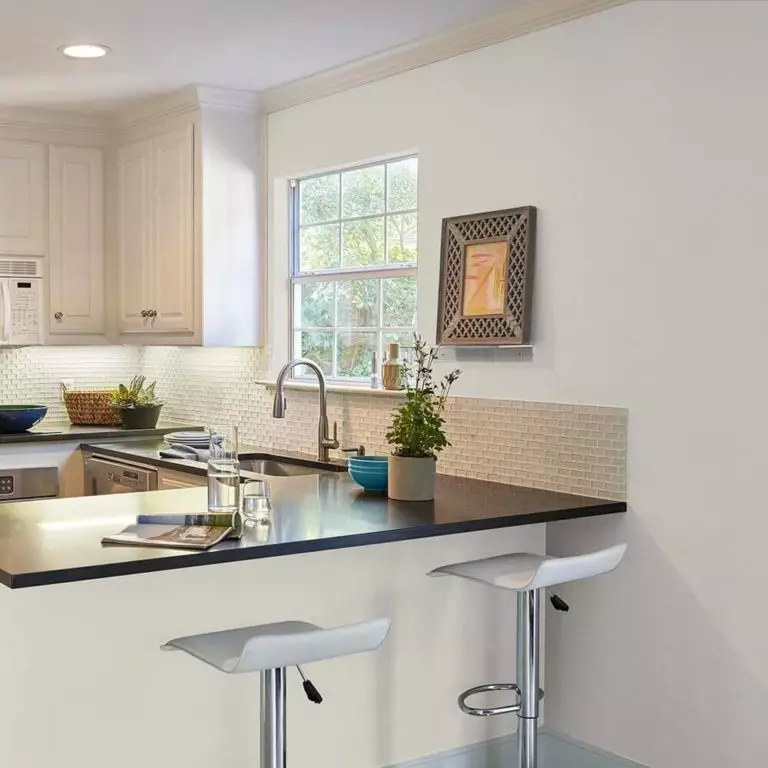
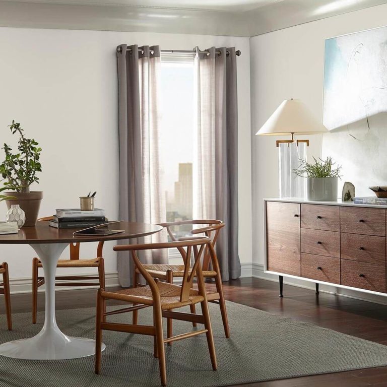
Kitchen and dining room
Following the same range of ideas, we suggest considering the monochromatic palette in the kitchen as well. Paint both the walls and cabinets in greige, and using the appropriate amount of cool light, make sure this shade takes on a white-like appearance. With natural light for the walls and slightly warm light for the cabinets, the paint color will seem different on every surface in part, yet preserving harmony.
As for the dining space, enrich the light variation of greige with dark wood in its natural beauty and intense gray textiles for a sleek contemporary interior that slightly embraces the vintage notes.
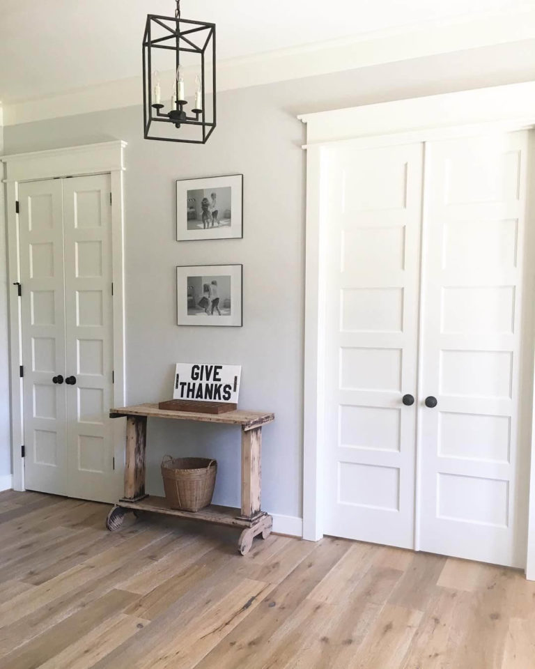
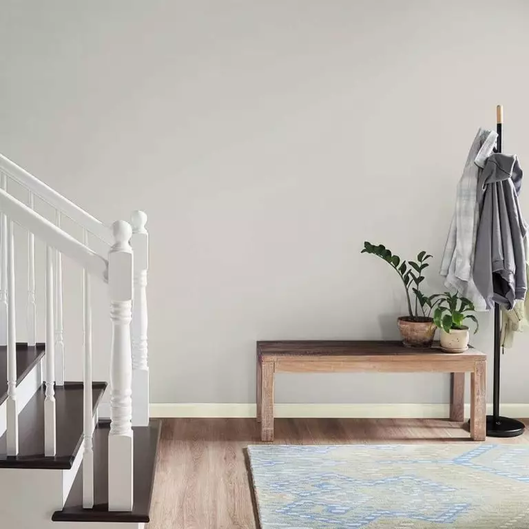
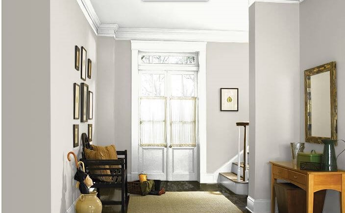
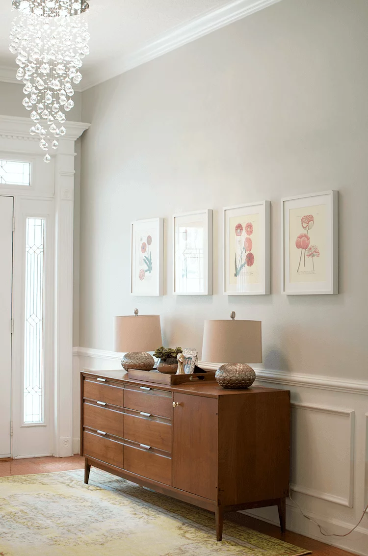
Hallway
Regardless of what style you choose for the hallway, the unique mix of gray and beige will serve as a perfect background. Unlike other shades of this kind, Campfire Ash is very light, which adds to its neutrality and makes it more versatile in terms of partnering textures and colors. Additionally, this combination of freshness and softness sets a pleasant and inviting effect accompanied by a contemporary feel.
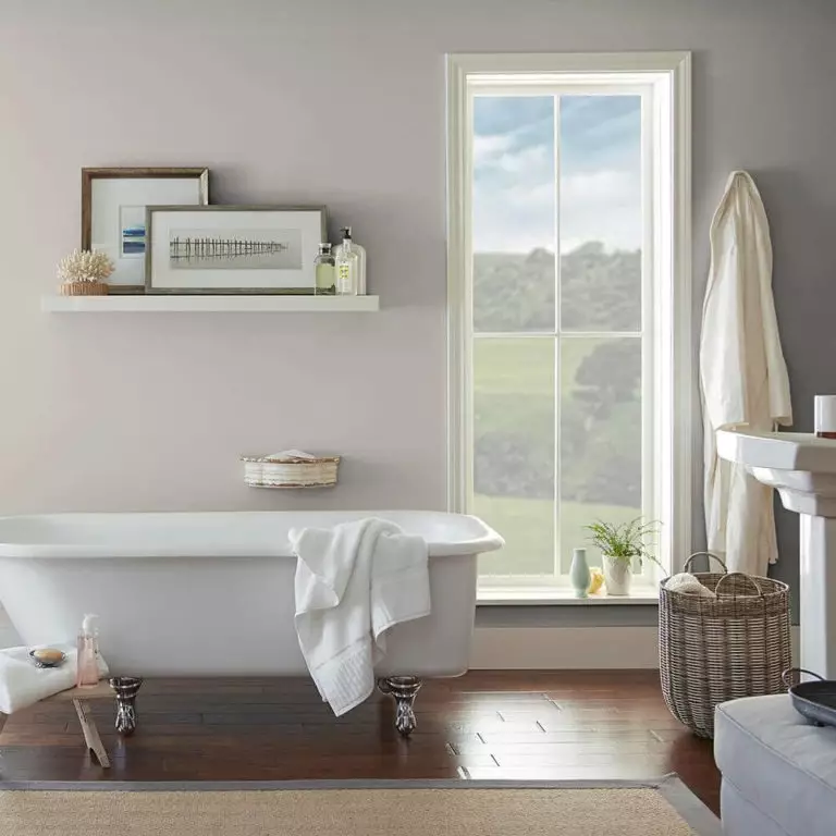
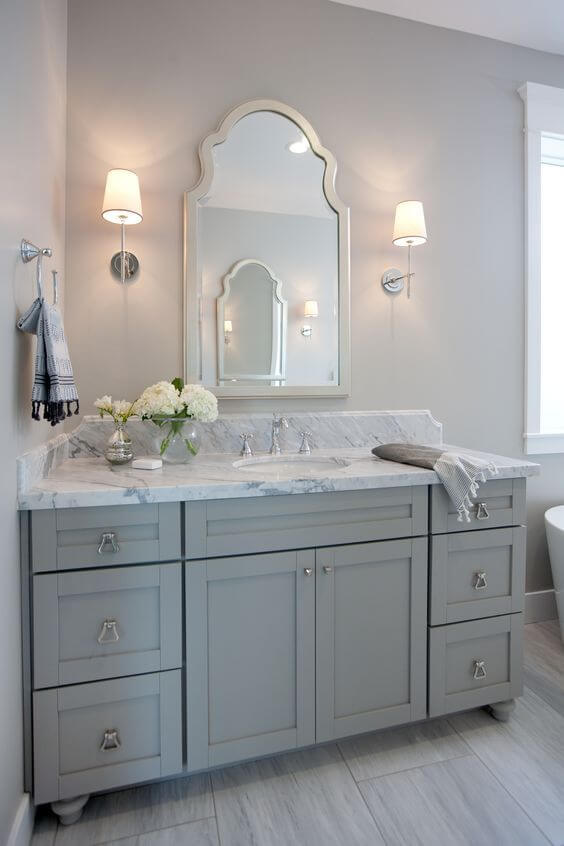
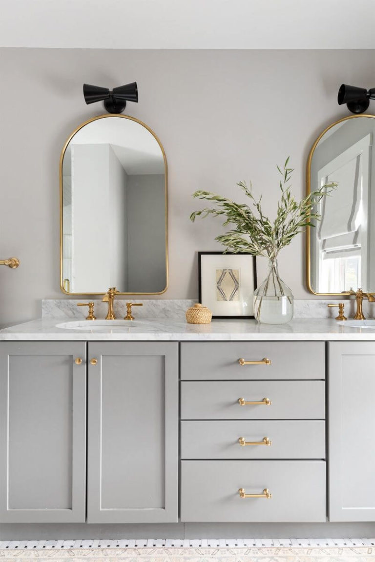
Bathroom
In the bathroom, N320-1 works like any other neutral. Although it seems more intense here, an appropriate lighting source can easily lead to the result you want. The exciting part comes when you have to choose the hardware, with brass to embrace the elegant sense of individuality or silver to preserve the formality of the gray base. Among materials, marble seems to be a perfect fit for the greige shade, adding a bit of sophistication to the seemingly simplified notes of color.
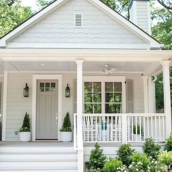
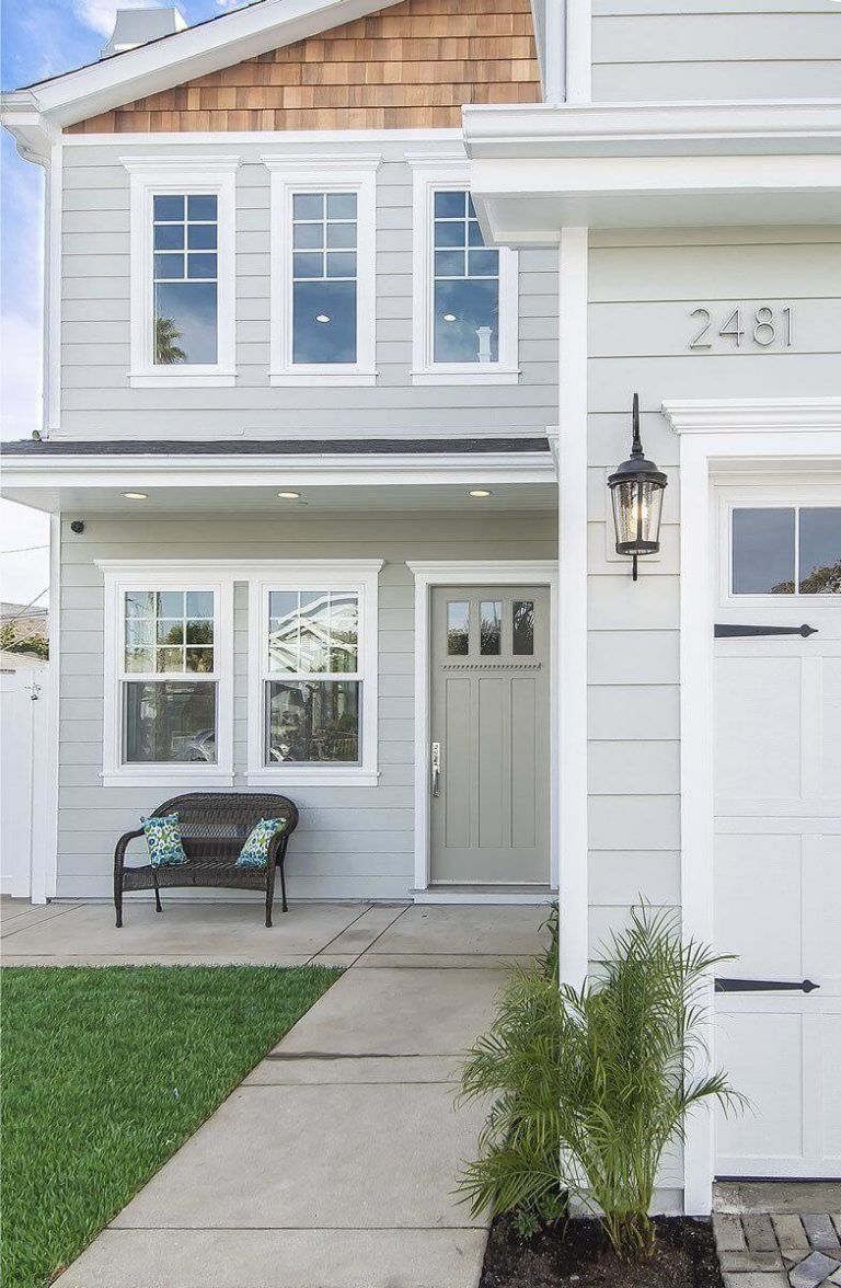
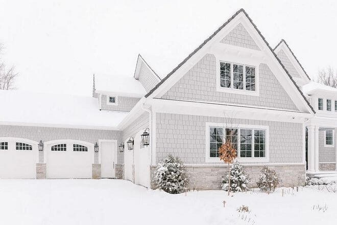
Use of Campfire Ash for the house exterior
Since Campfire Ash looks lighter when penetrated by daylight, it loses a bit of intensity, still preserving its body when applied to the exterior. You can safely go with this shade as an alternative to darker greige paint colors. The classic white trim and darker roof are there to complete the picture of a timeless exterior. Particularly in the winter, on the white background, this shade has the possibility to reveal its range of notes in their full beauty. As for the front door, if directly hit by sunlight, the paint color looks like a shade of white, which would not make any sense to use instead of actual paint colors of this kind. If covered by the porch roof, this color stays true to its greige base, revealing a blue trace with northern exposure, which slightly stands out on a lighter or darker background.
The Campfire Ash N320-1 paint color from Behr is your true companion for the next interior or exterior makeover if the usual greige shades seem too typical and you fancy a similar yet new perspective on the neutral approach to design.
