Melted Ice Cream 2095-70
Benjamin MooreAn appealing light pink shade slightly washed out by gray, resembling the melted strawberry ice cream with vanilla scent that reminds of a warm summer afternoon.
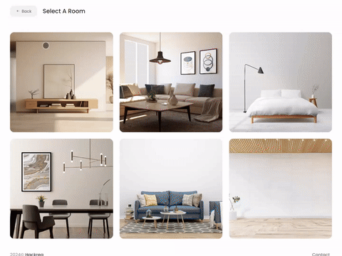
Try Melted Ice Cream paint in a room with Hackrea Visualizer
Melted Ice Cream 2095-70 (Benjamin Moore): what color is, review, and use
Are you ready for the most delicious and summer-like paint color? Well, get prepared to discover the positive splash of pink with the appetizing name Melted Ice Cream from Benjamin Moore. The paint color known under the number 2095-70 is ready for summer. What about you?
Of course, the slightly bright yet soft shade of pink works for any season if you want to make softness and uniqueness defining for your interior and exterior. Still, it is far from a simple light variation of pink. Something must make it taste like ice cream and feel like a warm summer afternoon.
Melted Ice Cream paint color features
As the name implies, Melted Ice Cream replicates the color of a strawberry ice cream, slightly melted down, reflected through the subtle notes of gray that slightly plays down the bright shade. Do you believe that a color can taste like ice cream? Well, neither did we, not before we got acquainted with this pink variation. At least, it feels like you had a taste of ice cream – fresh, slightly softened, pleasant-to-the-eye, and resembling the good old times when everything you had to worry about was not to miss the ice cream van.
You can apply wallpapers, paints, etc. on walls and see how they look in various interiors.
Melted Ice Cream: is it warm or cold?
A dilemma arises here. Considering that this color is ice cream-inspired, the shade itself must feel rather cool. Still, we speak about melted ice cream, which instantly adds a bit of warmth. The same goes for the paint color itself. On the sample, it seems neutralized, yet when applied to a surface, particularly in full daylight, it reveals overwhelming warm notes (positively speaking). All in all, it is a washed-out pink with visible neutral gray notes and slight particles of warmth.
How does lighting affect Melted Ice Cream?
Let’s make a quick journey through the main experiences this shade has when interacting with different types of lighting! We would like to start with daylight. In rooms with northern exposure, this shade feels right like on the sample – a washed-out pink, although now, it reveals more perceived gray notes, yet not devoid of the soothing effect.
On the other hand, in spaces with south-facing windows, the most delicious and appealing shade of pink enters the play so that you can hardly notice the gray scents. It seems that the strawberry ice cream has been mixed with vanilla.
With artificial lighting, the paint color feels rather muted, although various lighting undertones bring different effects, be they warmer, cooler, or the irreplaceable balance of a soft variation.
Melted Ice Cream LRV
To be precise, MIC has a Light Reflectance Value of 76.38, which on a scale from 0 to 100, gravitates towards the latter (the defining value of true shades of white). In a few words, this delicious pink is a medium paint color that gravitates towards the light side. What does it say about its light-reflecting abilities? Like any other light shade, MIC is quite skilled at reflecting the light by absorbing tiny amounts yet bouncing back the largest part. Moreover, in perfect lighting conditions, it can even make the room feel more spacious, an effect that is slightly held back by the cheerful notes of pink that want to penetrate the surface.
Melted Ice Cream undertones
On the sample, one can clearly see the gray undertones that play down the pink and make it look washed-out. Still, when put into practice, it is not that hard to notice those vanilla scents that penetrate the surface. Frankly, these delicious notes have always been part of this paint color, slightly hidden on the sample, waiting for the right occasion to reveal themselves.
Similar colors
Pink, particularly soothing pink shades, has become quite popular, and it would not be a surprise to find out that many other tones resonate with the inner sweetness of Melted Ice Cream. We have scrolled through the color palettes of other brands and came up with a list of the most prominent alternatives.
Coordinating colors
MIC may seem neutral, yet its pink base cannot simply allow us to use it as a background for any accents. If you still go with bold shades, we suggest opting for dark green variations that seem almost black to contrast the pink from all perspectives. One should consider a classic white shade for the trim that would perfectly stand out on pink. For amateurs of monochromatic interiors, the best option is lighter variations with gray or pink notes prevailing that would almost fade on MIC. Let’s see what colorists from this color brand have to offer!
Use of Melted Ice Cream in the interior
As much as MIC is picky about its matching colors, it perfectly works as a base shade. By the way, you can safely integrate it into modern approaches to any style with a balanced combination of shades if you have gotten tired of grays and beiges. Besides the appealing look, you can rest assured about comfort since this paint color will reveal it to the fullest once applied to a space. Let’s see how you can make the most of this standout pink with soothing notes!
Simple and sophisticated
Is it simple or sophisticated? Actually, both and even in the same space. From one side, MIC is neutrally soothing; from the other, this shade is impressively eye-catching. Well, with a background like this, you acquire an updated approach to neutrality and add individuality without considering a new decor. The inspiring pinkish shade has them both. Be it the walls in the bedroom or the cabinets in the kitchen, when combined with rather neutral shades, your interior fills with an irreplaceable sense of sophistication that comes from simplicity itself.


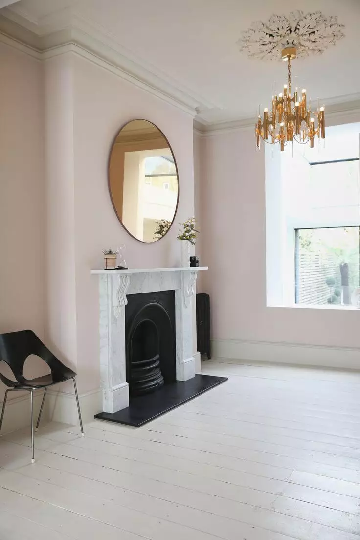
Did someone say Neoclassical?
Can you believe that such a lovely shade with such a delicious name can be integrated into a Neoclassical interior? Actually, if paired with the defining elements of this style, such as the classic wall decor and modern approach to the layout and furniture, particularly in north-facing rooms, MIC reveals its slightly muted gray-pink appearance that seems like the new neutral base color for an updated Neoclassical. Add a bit of texture, marble particularly, and you outstep the most current trends.
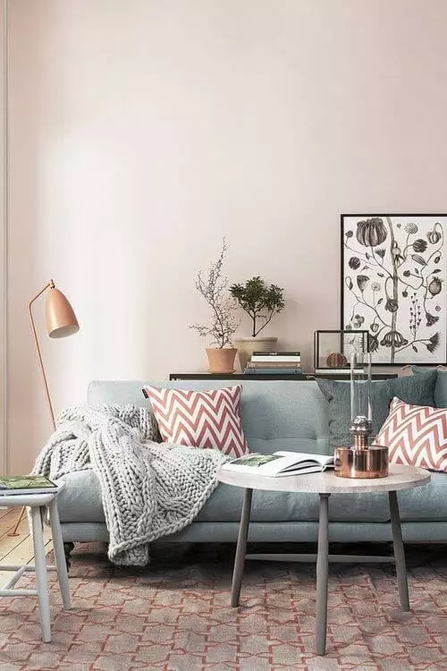
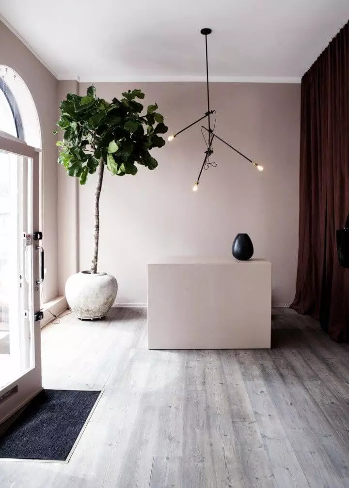
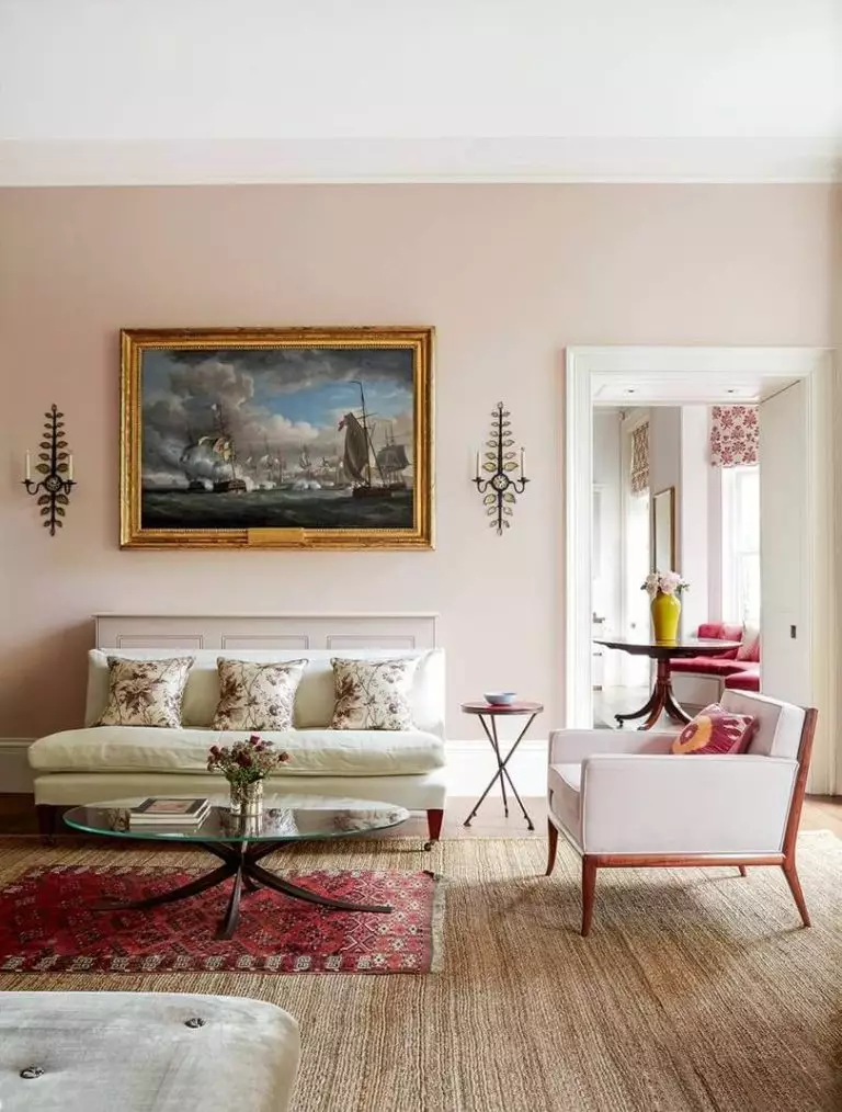
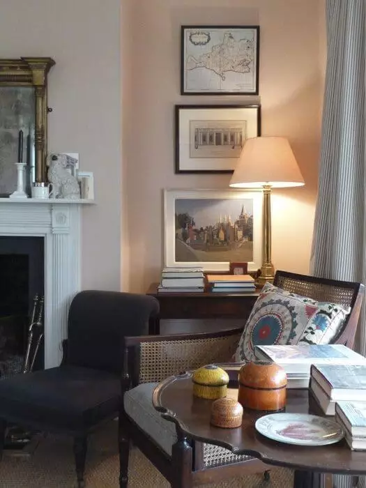
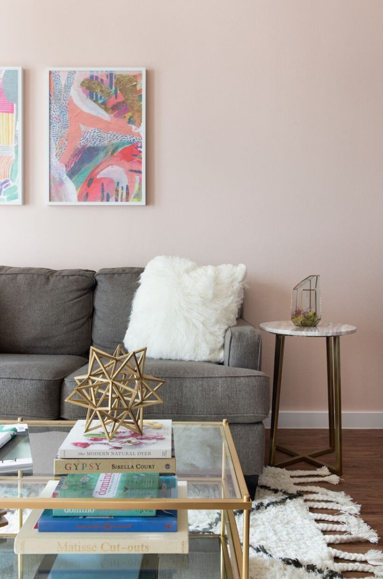
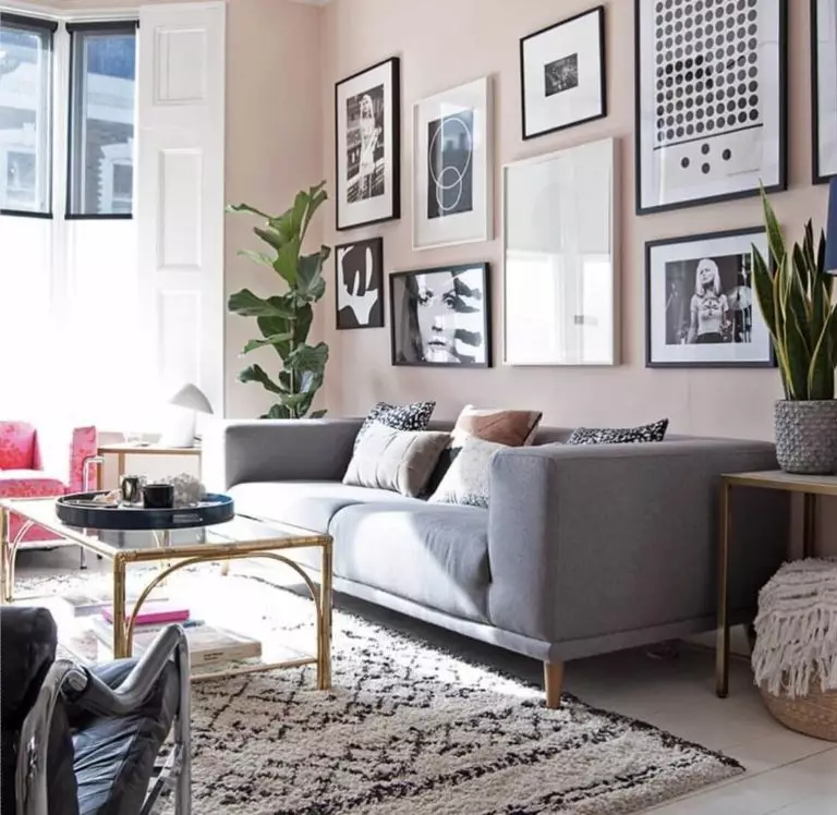
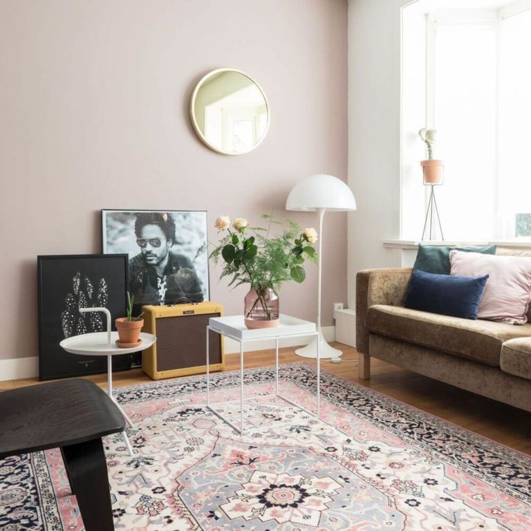
Living room
Since the uniqueness of style goes beyond borders and can integrate the most unusual shades into the most unexpected interior designs, we suggest you use MIC as a base for any style that feels close to you. Think about a Classic interior with an emphasis on dark wood, a balanced layout, and the gray-pink shade for the walls.
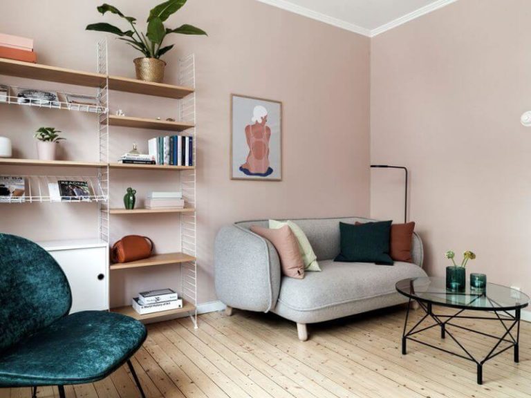
The splash of summer vibe would not look less impressive in Modern living rooms with a gray sofa (better if you opt for curved pieces), a lot of greenery, and inspiring pictures on the wall.
Go with MIC for the walls, a retro-inspired sofa in a velvety texture and bold color, accompanied by a minimalist layout for a result you will not stop admiring. You can consider a few vintage pieces to add originality to an already unique interior.
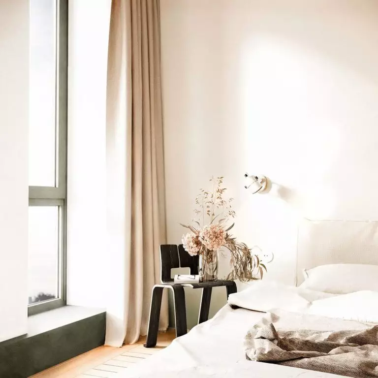
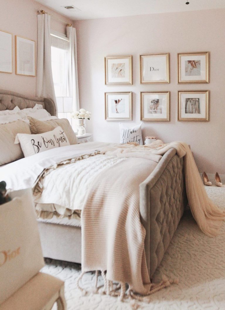
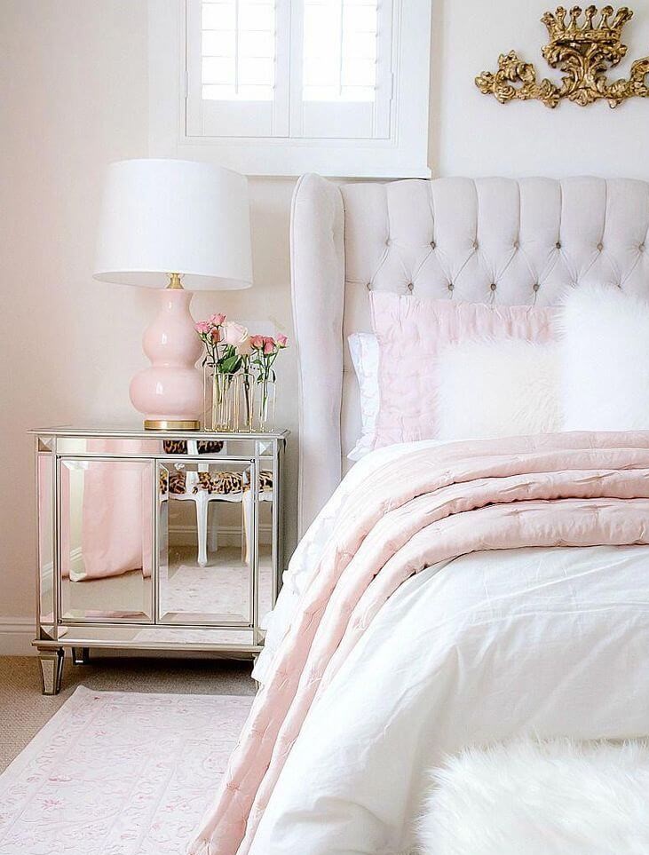
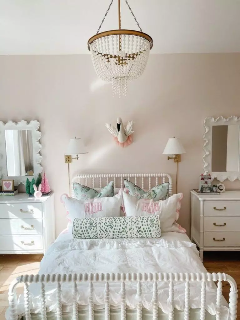
Bedroom
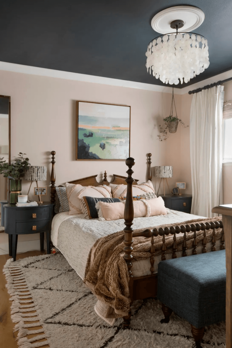
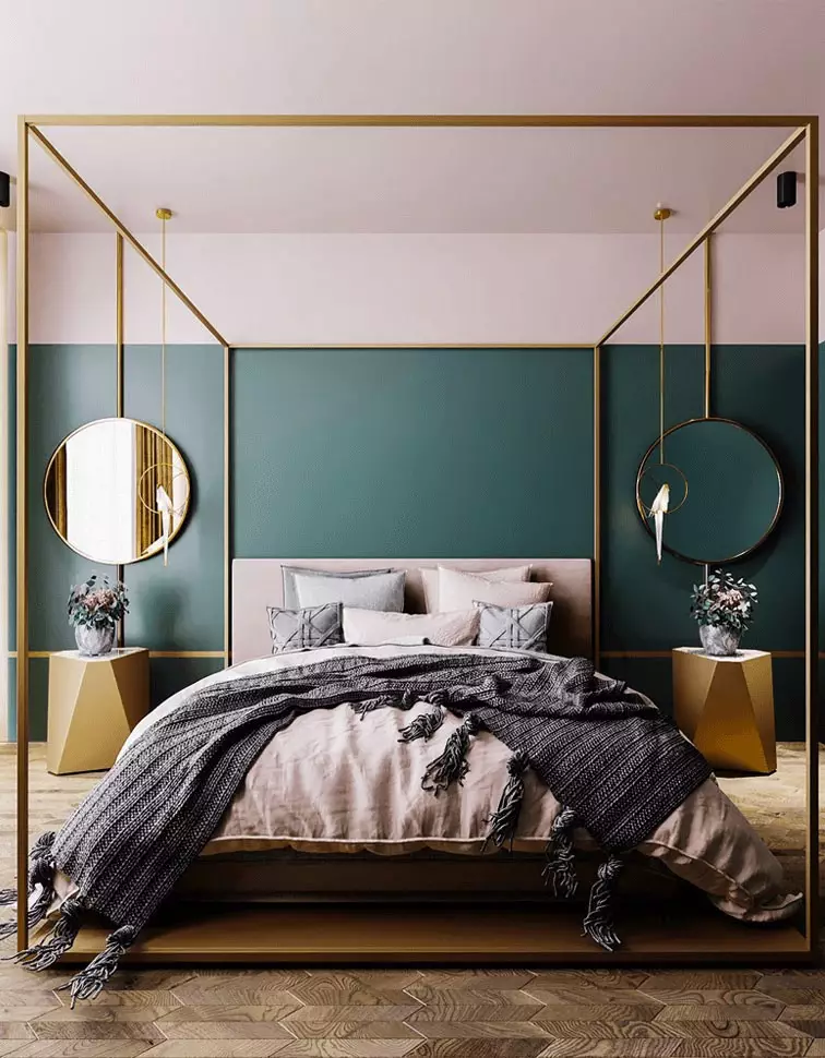
If we speak about the bedroom for a couple, you can safely go with an eclectic approach that combines elements from different styles. For instance, you can consider the modern pink and black partnering completed with a vintage bed and a flamboyant pendant. Or, go with a pink ceiling and green walls accompanied by a modern layout for a sophisticated composition that feels new and unique.
MIC is complex enough to serve as a base and accent color so that you can easily pair it with neutral beige textiles for a space filled with softness that you will enjoy falling asleep and waking up in.
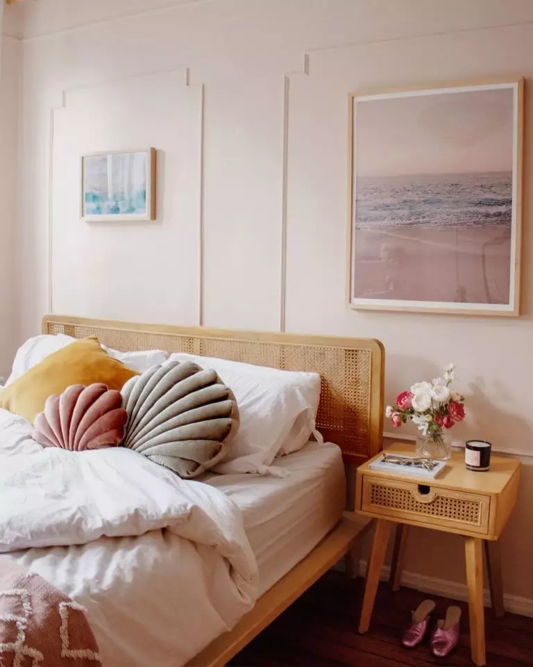
Would you like a more natural interior? Enhance the warm pinkish notes with rattan furniture to enrich your space with an impressive amount of warmth and comfort.
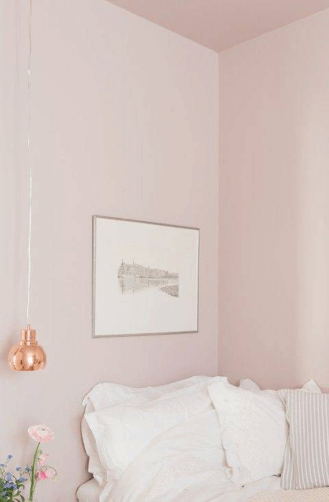
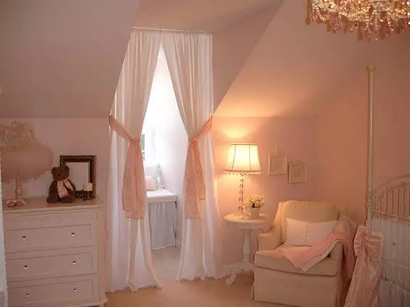
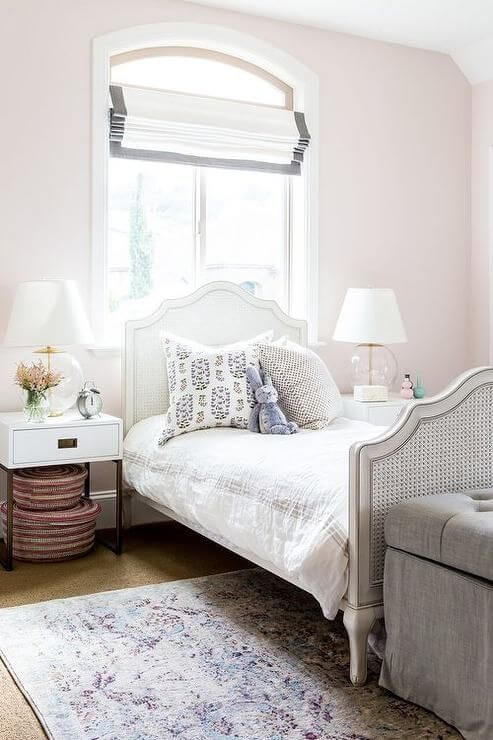
Girls room
If this paint color smells of childhood memories, it means you should definitely apply it to the kids’ room, particularly to a girl’s room. Consider it for the nursery, and be sure that this color will be as appropriate when your child grows up. Don’t suppress the space with lots of splashes of color. An additional shade of white for the furniture feels just right, particularly for the nursery.
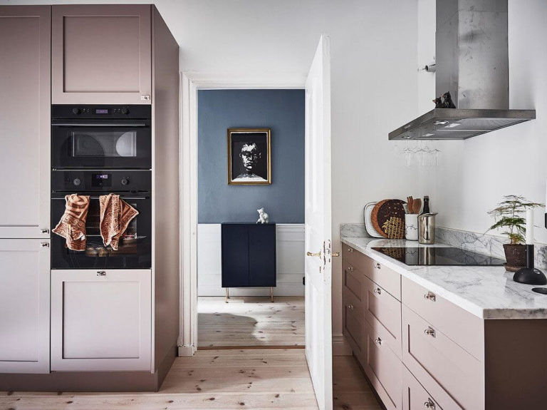
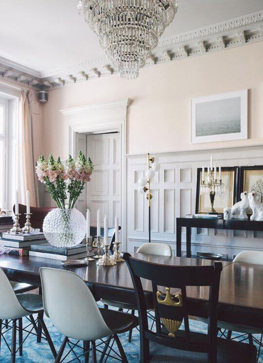
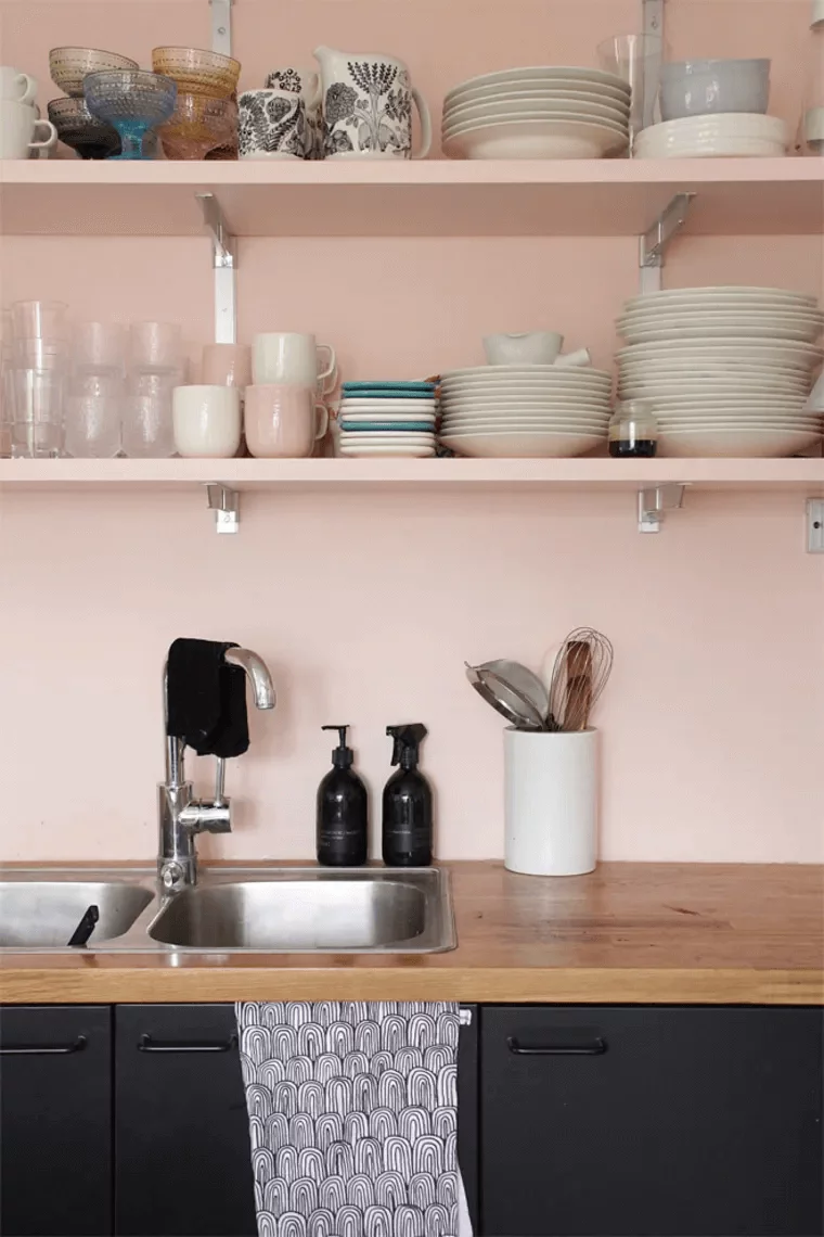
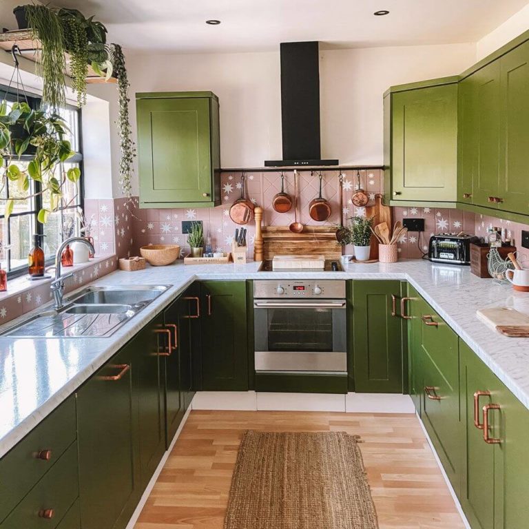
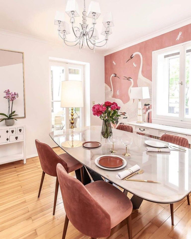
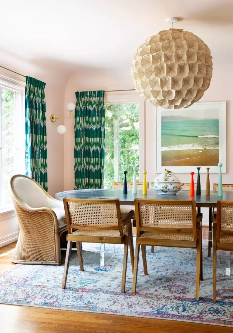
Kitchen and dining room
Do you still wonder if pink is the right choice for the kitchen? Particularly when a soothing shade is in the spotlight? Go without hesitation with the grayish-pink shade and fill this space with an appetizing sense of familiarity yet full of contemporary air. Keep it simple or go as far as painting the walls in pink and combining them with slight bold cabinets, considering any variation, even green.
In the dining, designers suggest sticking to either a modern approach with classy velvet chairs, a marble table, and sleek decor or a retro-inspired layout filled with splashes of color, all on the pink background.
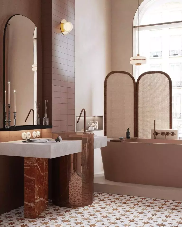
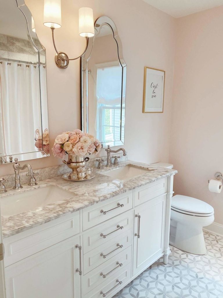
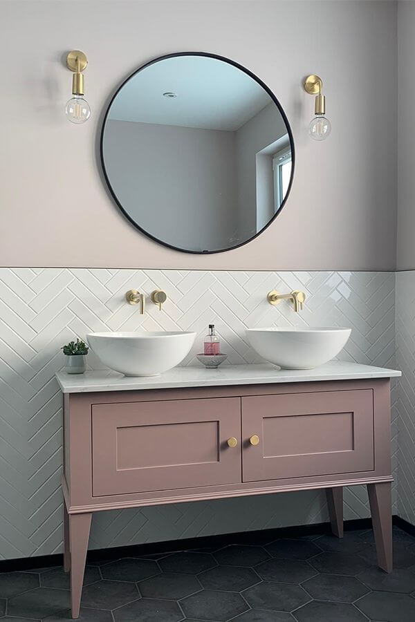
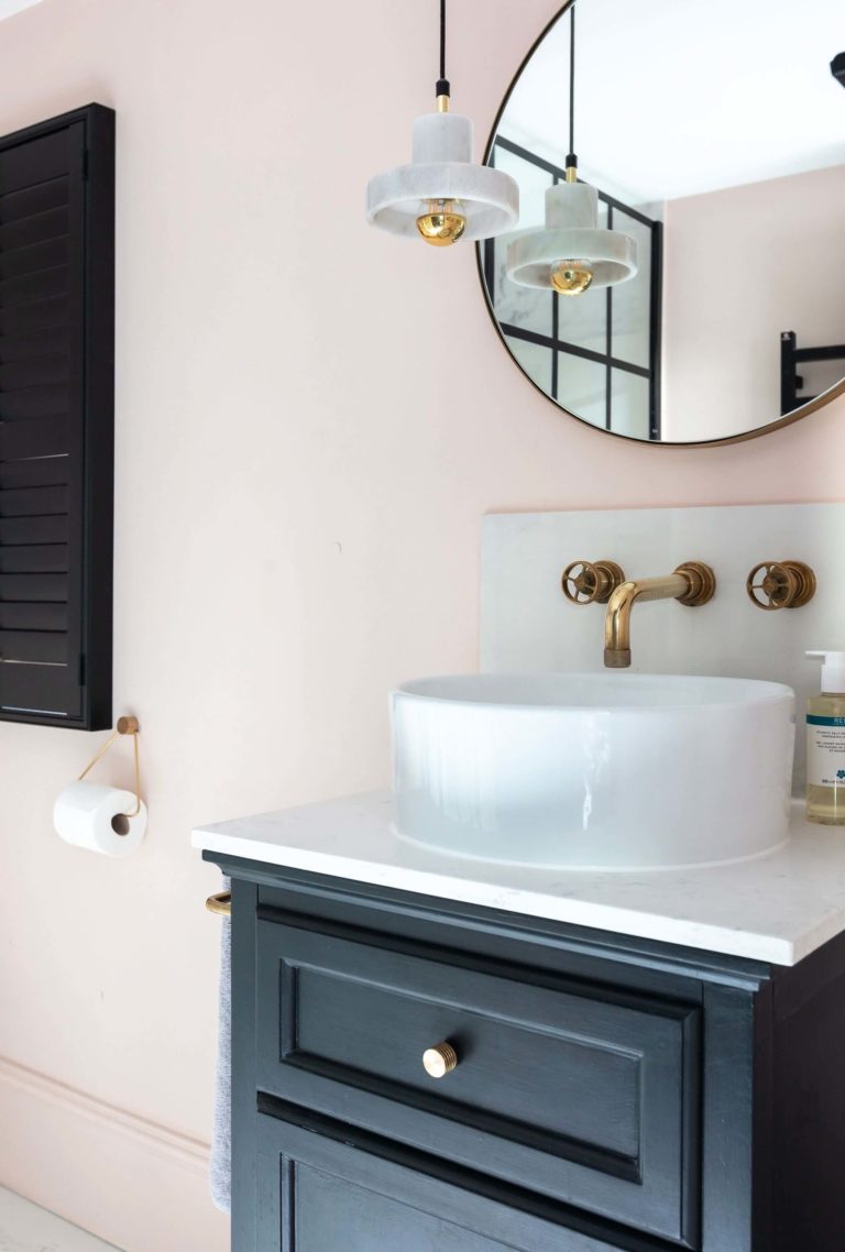
Bathroom
The new splash of summer vibe feels just right for a space that usually seems cold and devoid of color. Go with pink walls, making sure they receive appropriate light. From now on, you are free to go with any approach you want. Keep it sleek and modern with neutrals, or add an even more intense pink for the cabinetry. Consider marble for a touch of elegance, or opt for black splashes of color for a contrasting and eye-catching effect.
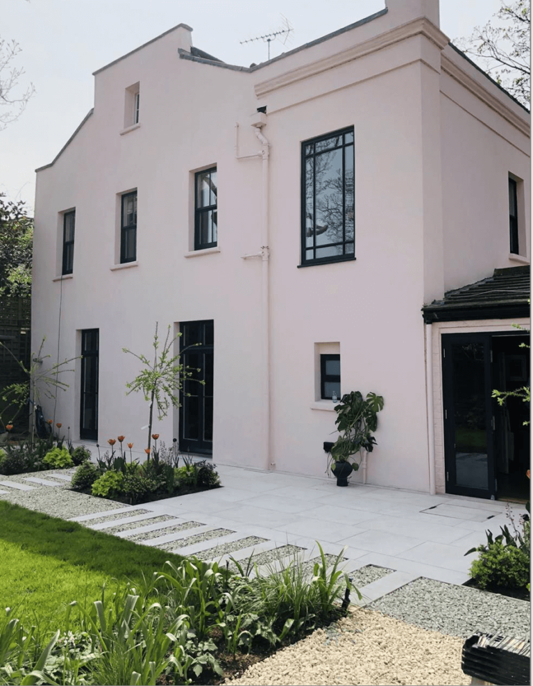
Use of Melted Ice Cream for the exterior
When interacting with the direct daylight, MIC can take different appearances. When the sun rays touch its surface, it appealingly shines and radiates a welcoming feel. A no less impressive yet slightly neutralized look is achieved when the sun is on the other side of the house. Still, you will not regret painting your exterior this way, particularly if black or green are considered partners.
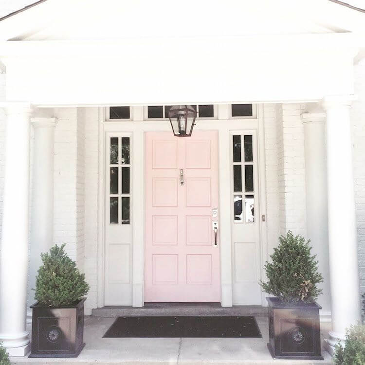
With a similar effect, depending on lighting, comes this paint color on the front door, yet now, the perfect match is a white background that perfectly reveals the entire range of emotions that stand behind the pink paint color.
The Melted Ice Cream 2095-70 paint color from Benjamin Moore hits like a warm summer day, bringing back old memories and inspiring an optimistic perspective on the future. Why not make these features the constant guests of your mind by applying the positive yet slightly neutral grayish-pink to your interior and exterior?
