An updated taupe paint color with a perfect combination of brown and gray underlined by the slightest warm undertones; a trendy alternative to overused neutrals.
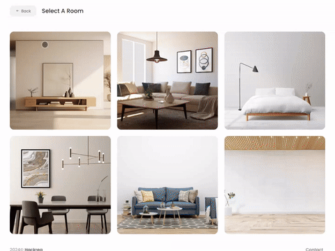
Try Perfect Taupe paint in a room with Hackrea Visualizer
Perfect Taupe (Behr PPU18-13): What Color Is, Review, and Use
This article is about the admiration for taupe shades. You will likely find a new favorite if you are a true connoisseur of the gray-brown color. The trendy taupe shade with the well-defined name Perfect Taupe from the notable paint manufacturer Behr takes the fore in this brand-new design and fashion season.
Colorists from this brand created a taupe shade that reads neither yellow nor green, which they call “perfect”. Undoubtedly, Perfect Taupe is part of the Neutral color family, yet it has more to offer than the overused grays, off-whites, and beiges. Are you intrigued? Find out more!
Perfect Taupe Paint Color Features
The paint color known under the code PPU18-13 from Behr is a mid-tone brownish gray, neither too light nor too dark. You’ll always be safe with a paint color like this. You won’t end up with a color that gives off additional undertones or leans toward the warm or cold side – a perfect color by all means.
As for effect on the interior or exterior design, Perfect Taupe has features peculiar to the base colors, brown and gray. Therefore, expect a strong sense of stability, security, and comfort on the one side and modest elegance, practicality, and timeless sophistication on the other.
You can apply wallpapers, paints, etc. on walls and see how they look in various interiors.
Perfect Taupe: Is It Warm or Cold?
PT may seem neutral, which it mostly is, yet you can perceive a subtle tinge of brown warmth, especially when sun rays flood the space. The effect gets cozier at night when artificial lighting lends this shade a deeper and brown-biased look.
How Does Lighting Affect Perfect Taupe?
In most cases, you will achieve a beautiful neutral effect. Still, if the cold natural light streams in the room (northern exposure), PT will read dusty gray with faded to no brown undertones. Simultaneously, the warm brown notes get more visible and offer the paint color a subtle cocoon-like effect in rooms with south-facing windows. Still, in neither of those cases will you notice a well-defined purple or blue effect since Perfect Taupe is a balanced brown-gray color.
Perfect Taupe LRV
The neutral taupe from Behr has a Light Reflectance Value of 42 out of 100 (0 – true blacks, 100 – true whites). Perfect Taupe is on the lower side of middle tones. Frankly, it is for the better since this value makes the brownish gray deeper and less prone to be influenced by lighting the way lighter colors are. Therefore, walls painted in this taupe won’t seem neutral only. There is something unique and more depth in this shade. All in all, you won’t risk getting a dull ambiance. Perfect Taupe proves to reflect the light skillfully.
Perfect Taupe Undertones
On the Behr official website, you can easily find the defining figures, such as LRV and RGB values. RGB represents the mixed red, green, and blue percentages to receive the color. At Perfect Taupe, there are more or less equal amounts of red, green, and blue, which is peculiar to true neutral colors. Still, Perfect Taupe is slightly red-biased. No wonder it is regarded as a warm paint color.
Similar Colors
Here are the best paint color options from Behr and other renowned brands that you can use as substitutes for the up-to-date Perfect Taupe. Get a taste of each:
Coordinating Colors
Professionals advise using Perfect Taupe paired with a lighter warm off-white to help underline the authenticity of the perfect brownish gray. Ideally, PT is the best choice for shades of brown and gray (no need to elaborate). At the same time, designers use Perfect Taupe with blues, greens, and purples. Your safe resort is here. Dive into the coordinating color palette suggested by colorists from Behr:
Use of Perfect Taupe in Interior
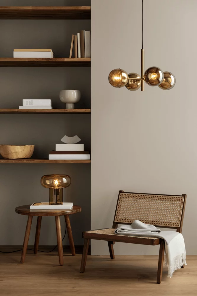
As a perfect neutral paint color with more depth than any other gray, greige, or tan, Perfect Taupe proves to be an excellent color choice as the primary or accent color. Designers refer to this shade as the color of taste and comfort. Since it works for almost any room in the house, we will show you how you can update your interior design with a fresh taupe hue.
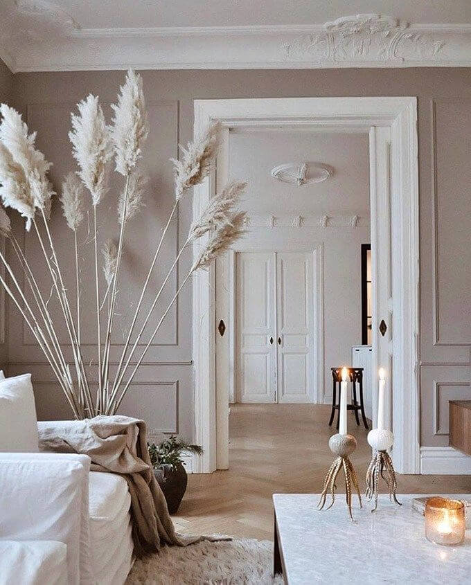
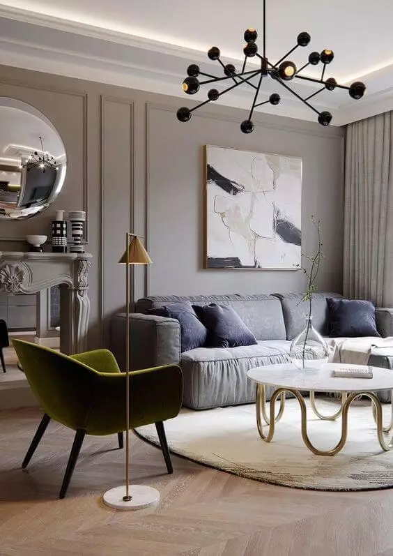
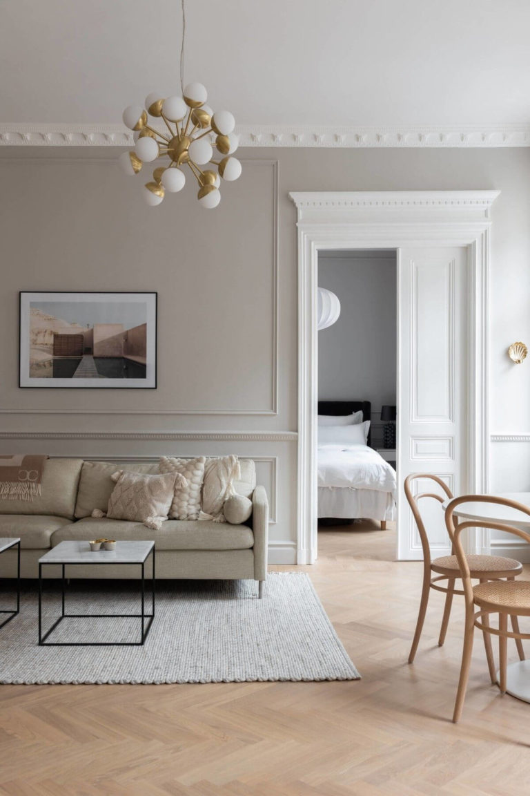
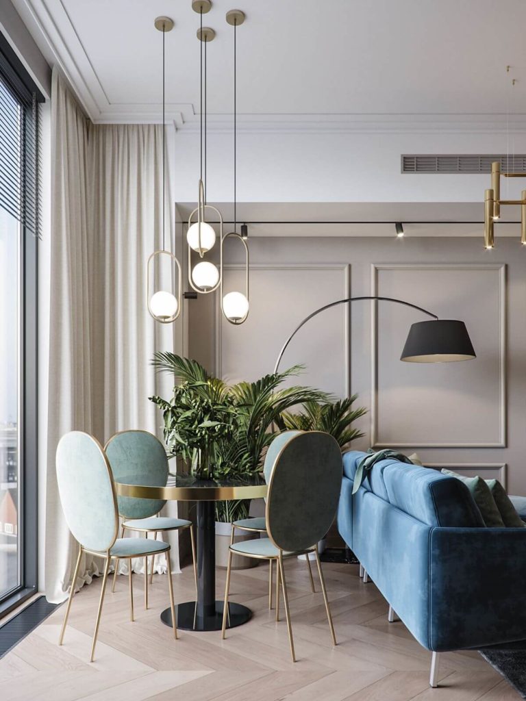
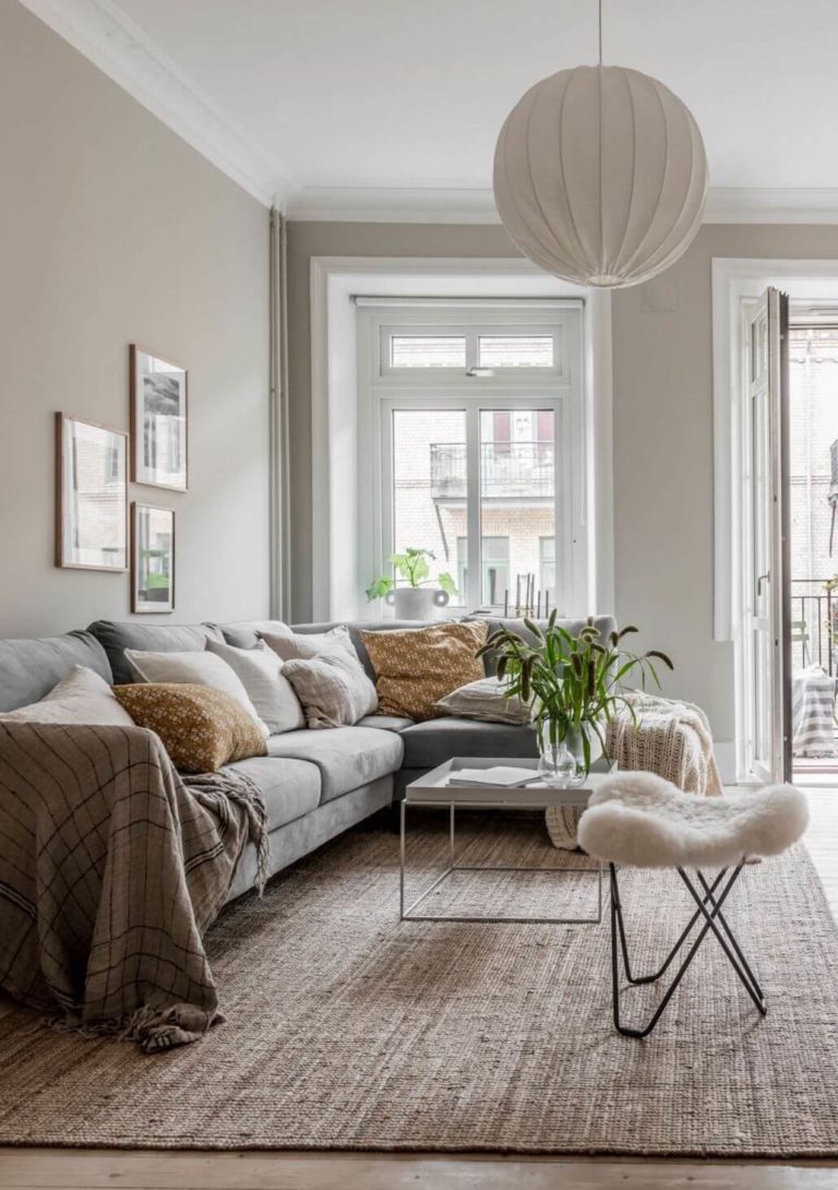
Living Room: Taupe Is the New Gray
Replace the overused gray with taupe. The latter suits as successfully as gray any room and design style, yet it feels fresher and trendier due to the subtle earthy note in taupe. Luckily, you can always paint your living room walls with Perfect Taupe, even if it is the Scandi, Parisian, Classic, or Boho style. Besides a monochromatic color palette with PT as the main color, the brown-gray shade is a great background color for bright blue, green, and pink, say, for the furniture.
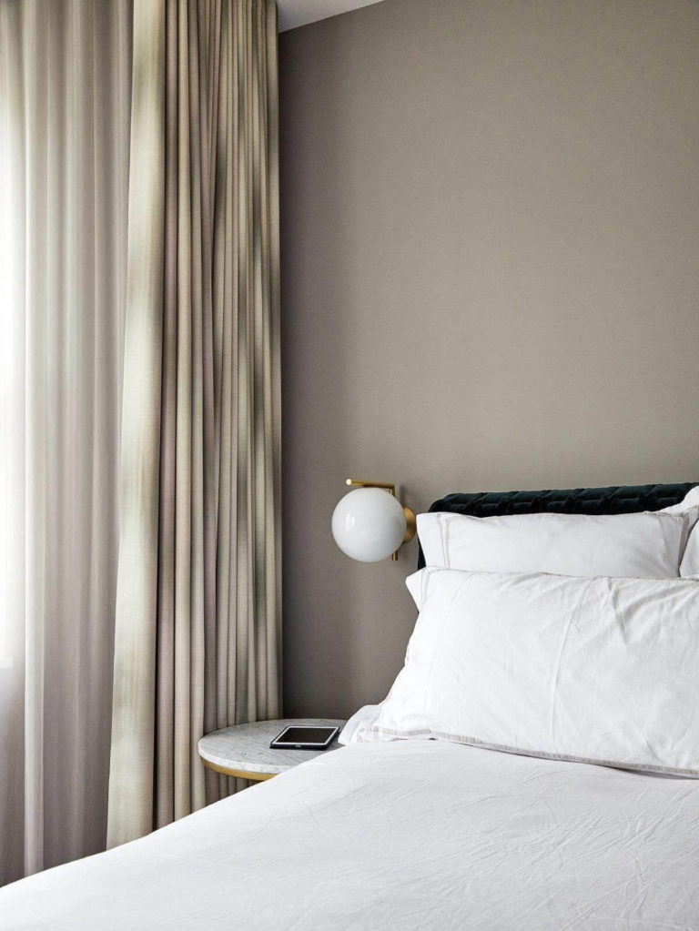
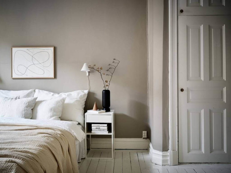
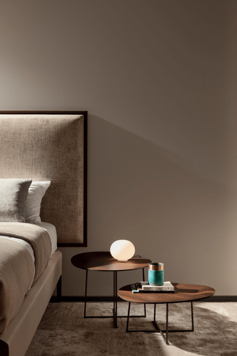
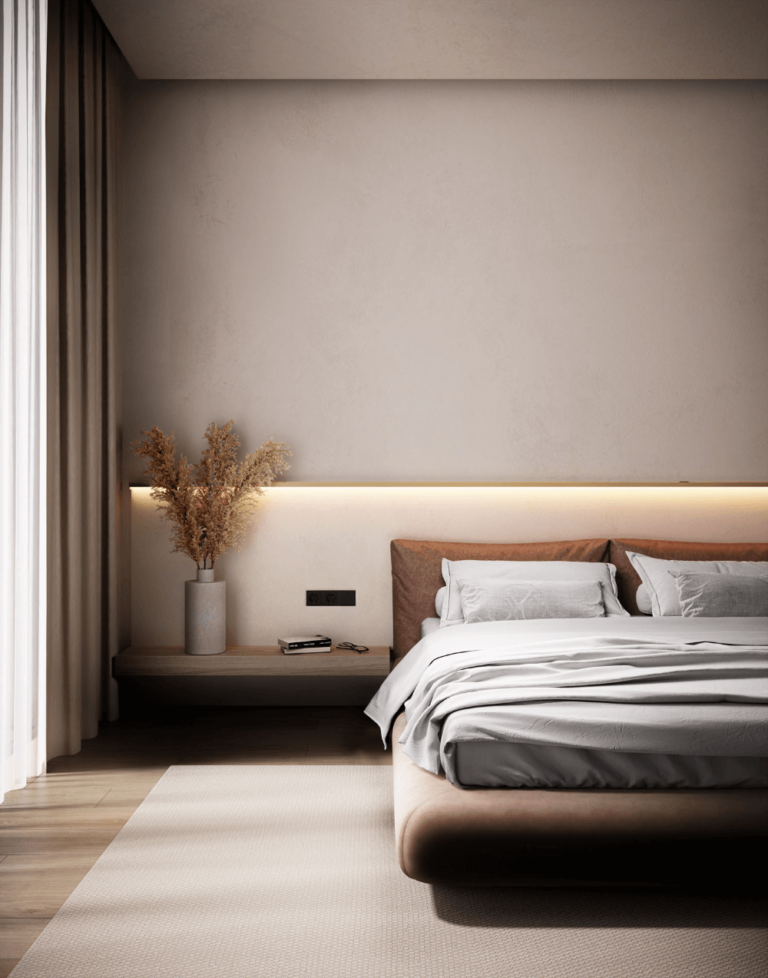
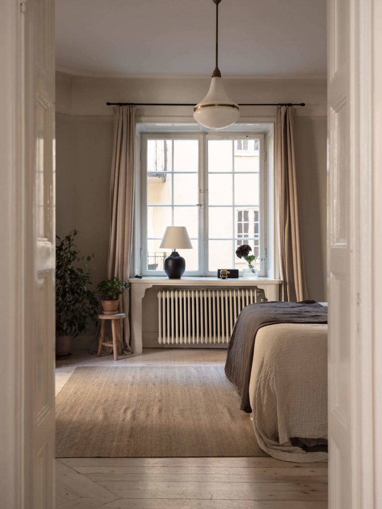
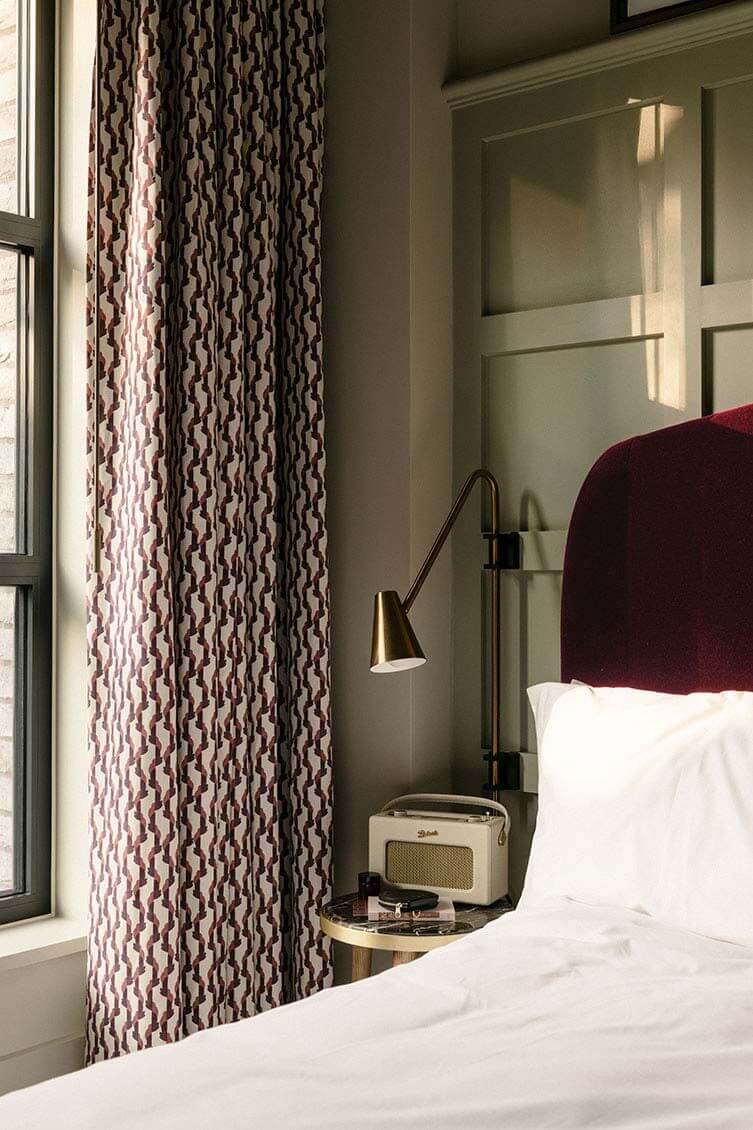
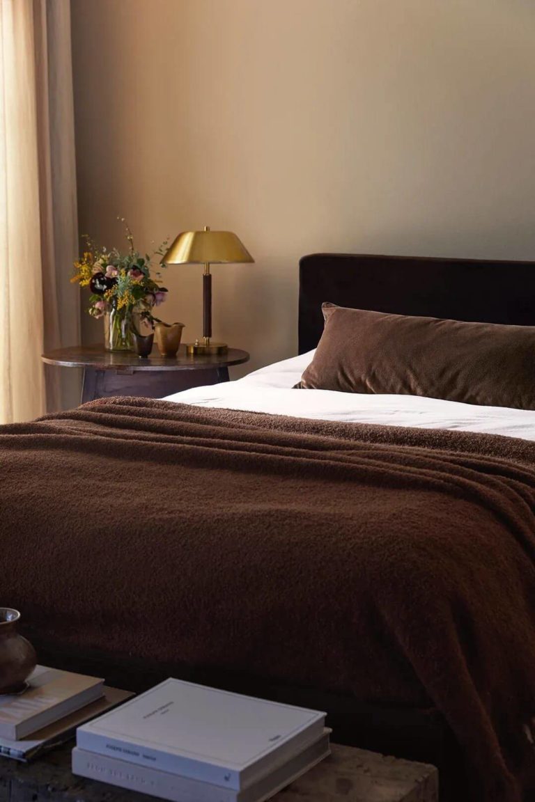
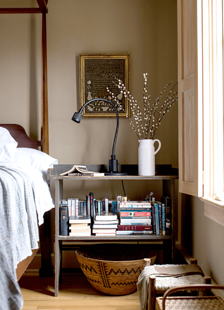
Bedroom: A Taupe Canvas for Self-Expression
Taupes are mostly used in the bedroom. The warm and comforting color creates a pleasant ambiance to fall asleep or simply relax. Perfect Taupe is the amazing balance of gray security and brown coziness to underline your taste and care for well-being. The best color choice is a taupe and white sleeping space, although colorists emphasize the elegance of bright-colored velvet on the brown-gray backdrop. Add brass with light fixtures or decor, and your dream bedroom with a luxury twist turns from a design concept to reality.
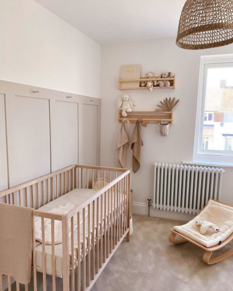
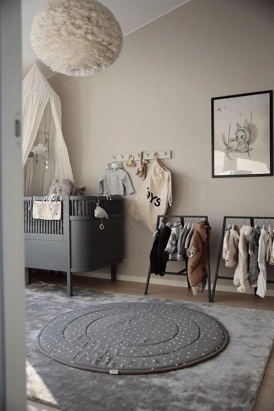
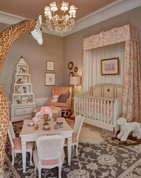
Neutral-Colored Nursery
Keep pace with the emerging gender-neutral nursery trend. Decorate your kid’s room with the unbiased Perfect Taupe that primarily emphasizes comfort. Keep the room airy and free with a light color palette and natural texture. Additionally, this color option will come in handy when your kid grows up. Taupe has never disappointed anyone with its neutral skills as a background.
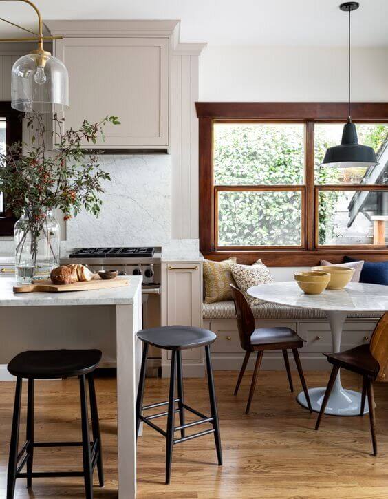
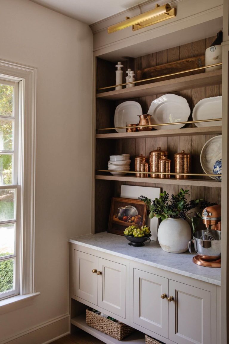
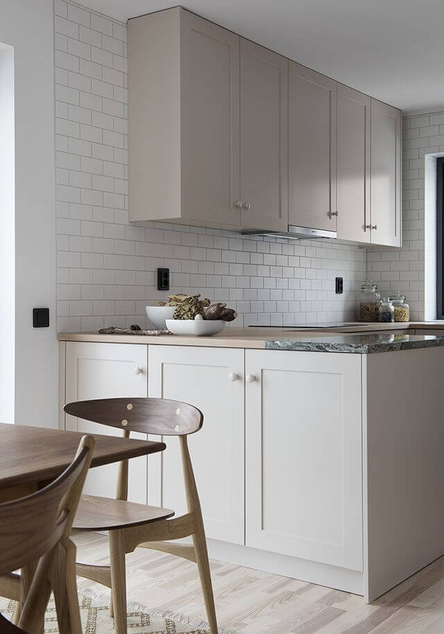
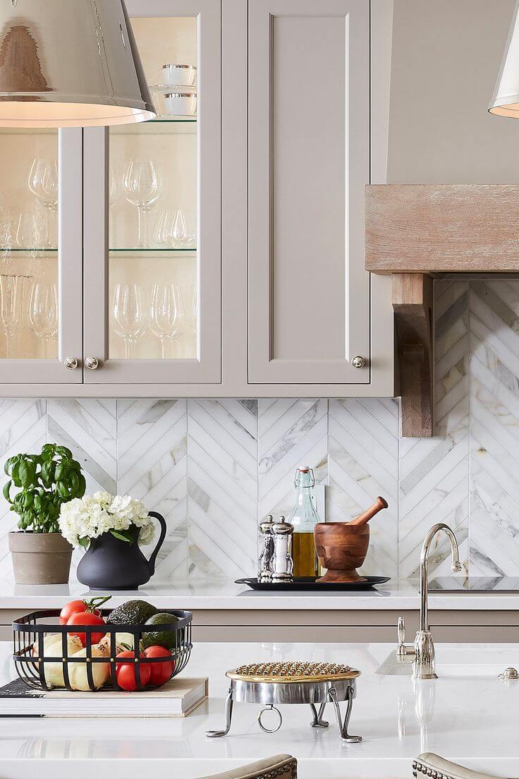
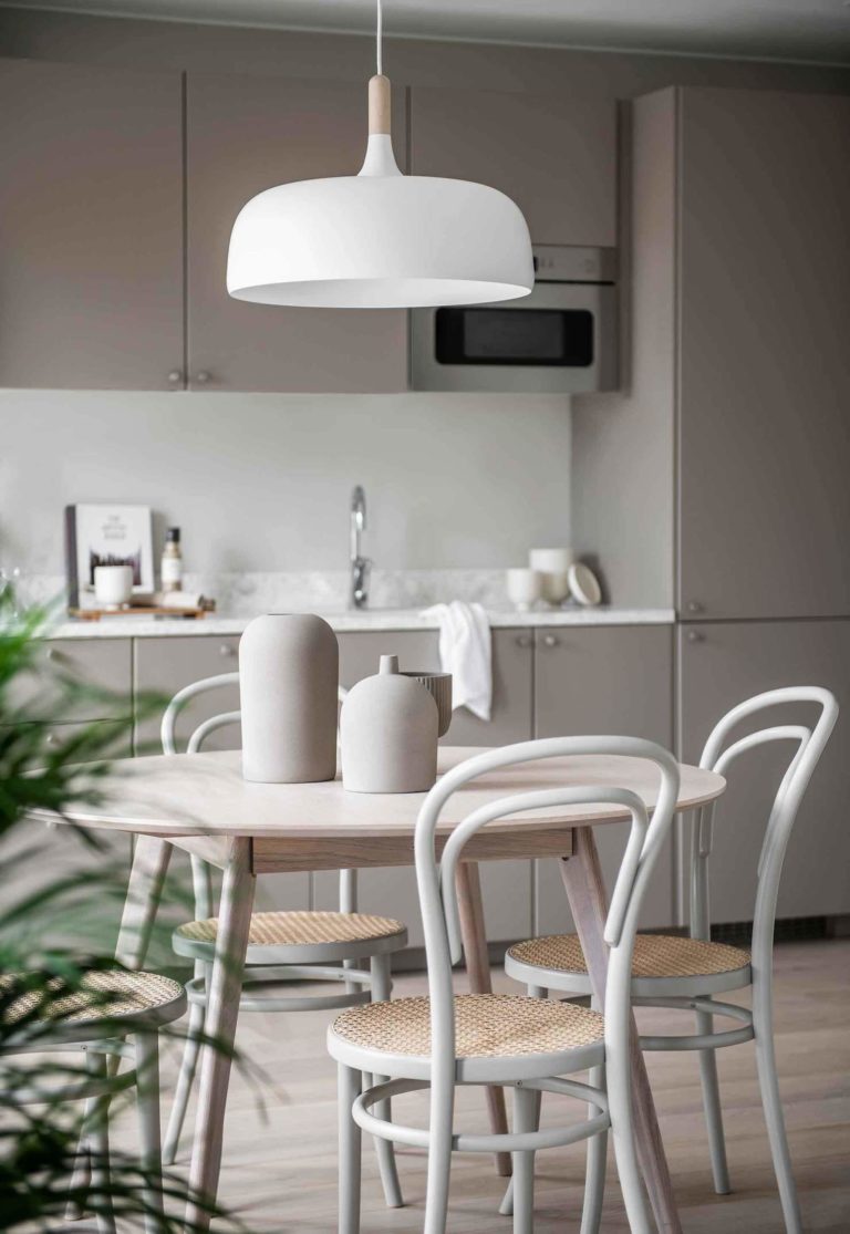
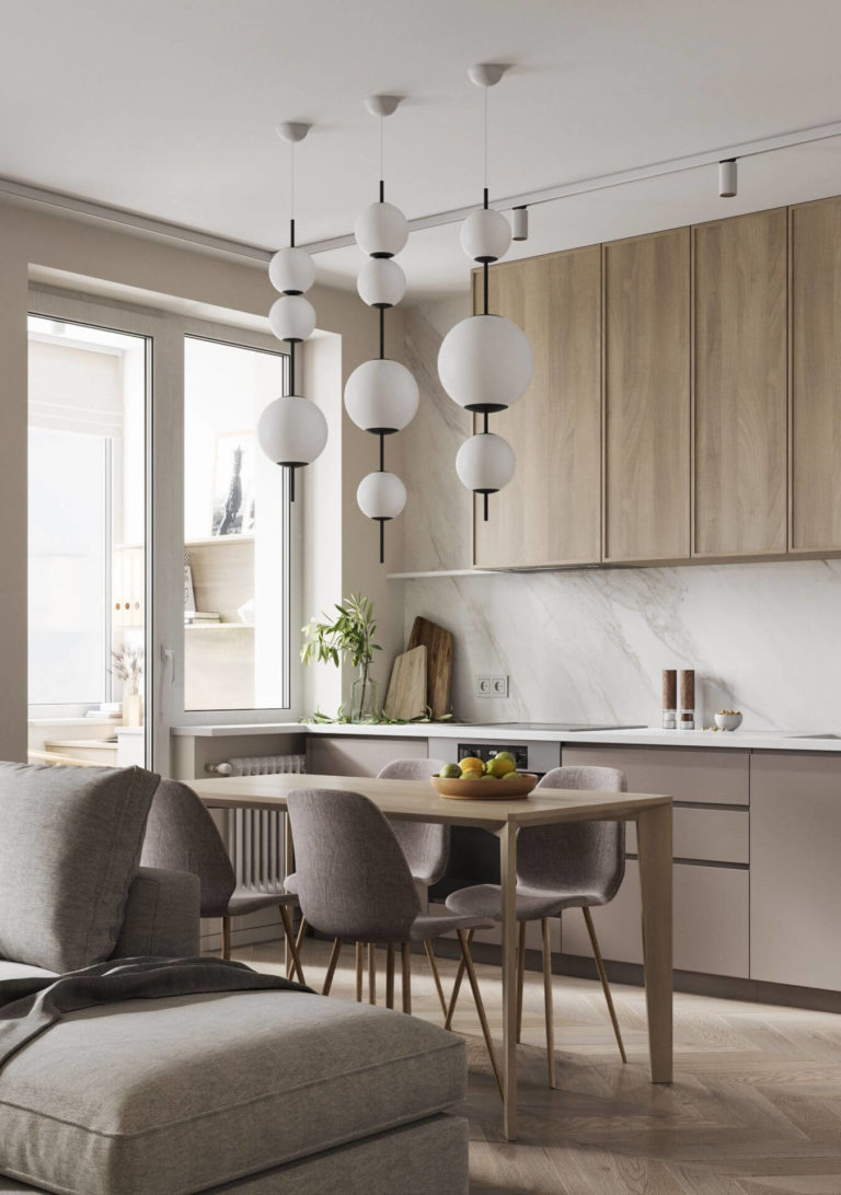
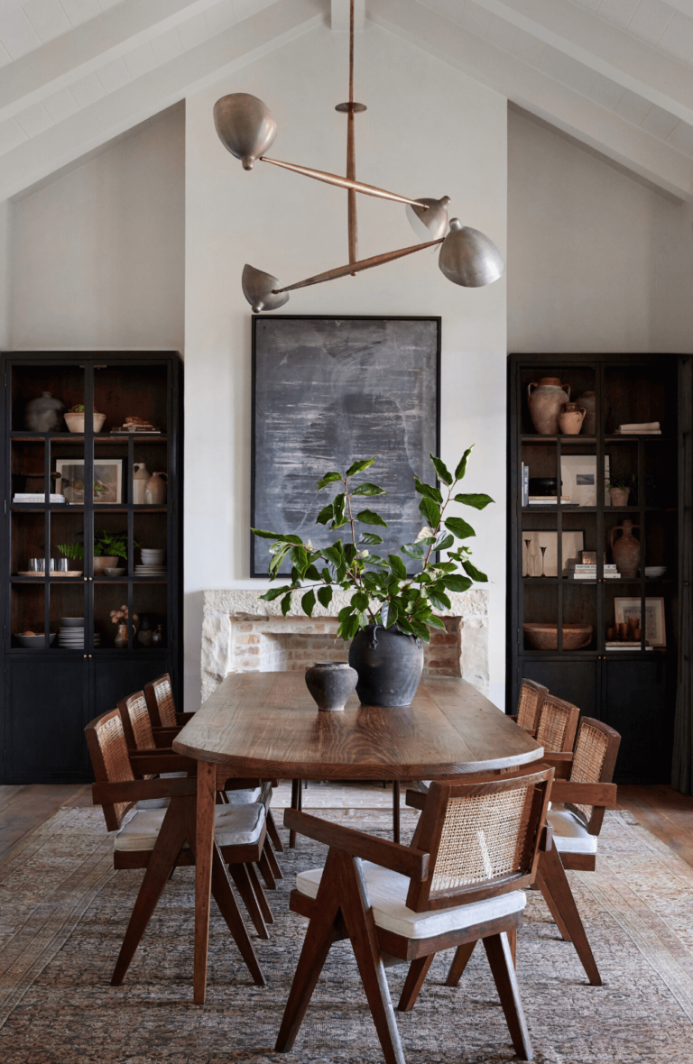
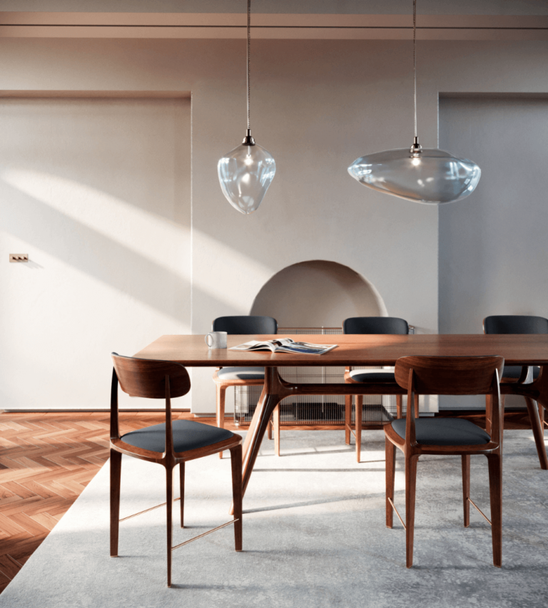
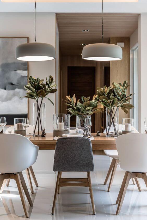
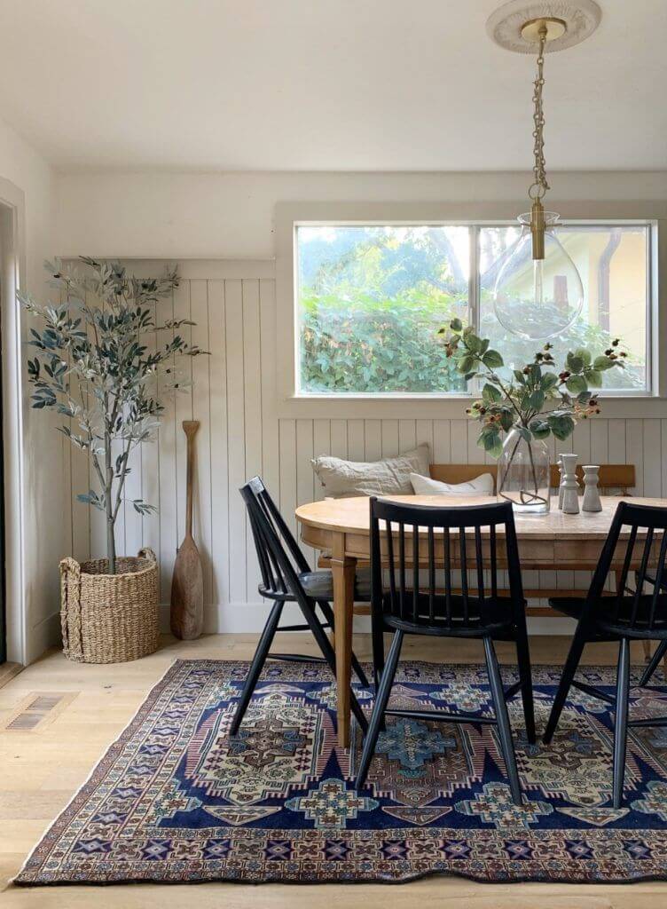
Kitchen and Dining Room
Taupe is a versatile paint color. If you are fond of traditional kitchens or already have one designed in this style, give Perfect Taupe a thought. It may become your next favorite color. Add brass, wood, or a dark accent color. It is not a stop if you like modern, handleless kitchen cabinets since Perfect Taupe can turn into a current color.
Designers claim that a dining room painted in taupe ensures an entertaining ambiance for pleasant gatherings with your dear ones at the dining table.
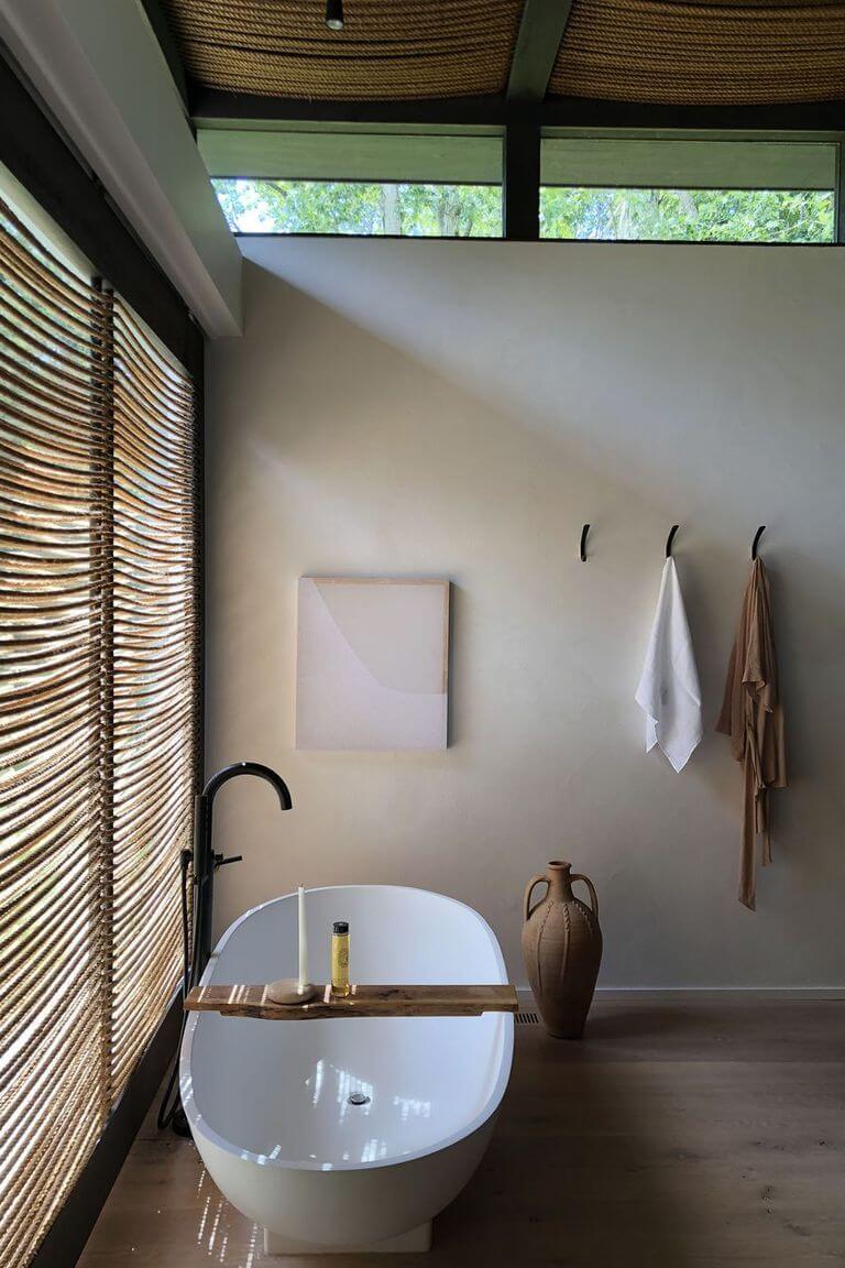
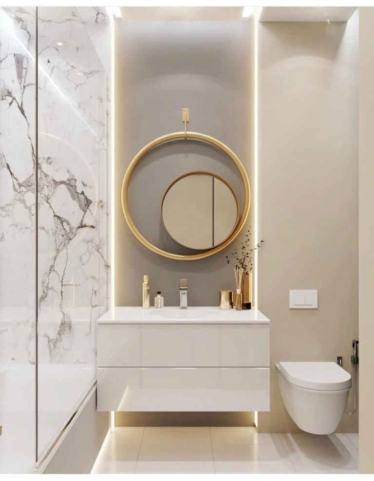
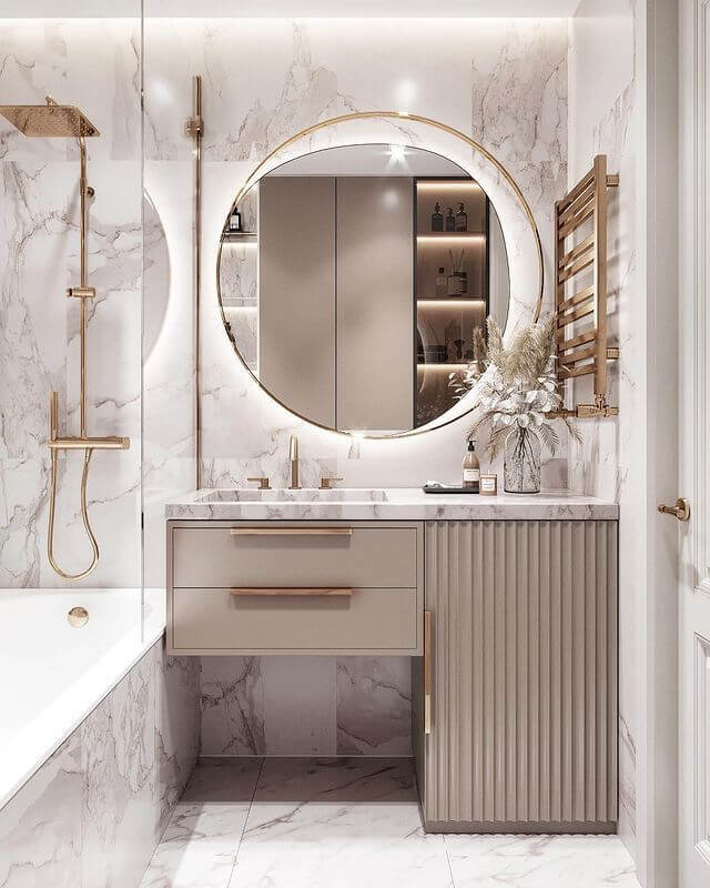
Bathroom
Experiment with the neutral mushroom color in a space thought for years to be functional only. Add a sense of style and show off your taste by using Perfect Taupe on walls or vanity cabinets. It works at its best if paired with brass hardware and marble.
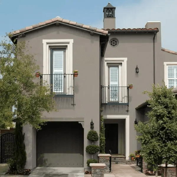
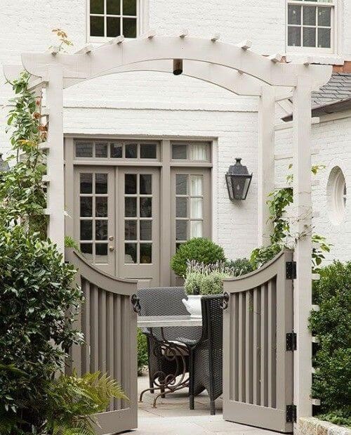
Use of Perfect Taupe for House Exterior
This is when the LRV of Perfect Taupe comes in handy. Being placed slightly lower in the mid-tone group, PT has more depth to its neutral base and won’t fade out by any means. You can safely paint your exterior house walls in this taupe shade to ensure a stately and modern appearance. Consider white for the trim. On the opposite side, an all-white house with a deep taupe front door is an excellent alternative if too much taupe is not for you.
The Perfect Taupe PPU18-13 paint color by Behr is a flexible and unmatchable brown-gray that designers worldwide happily welcomed when the paint brand introduced this shade into the trendy color palette. Don’t lose the opportunity to enjoy the worry-free, unpretentious, and easy-to-work-with, or, simply called – designer choice color – the perfect taupe shade from Behr.
