Accessible Beige SW 7036
Sherwin-WilliamsA medium beige that is moderately light and balanced but not devoid of a grayish undertone.
Try Accessible Beige paint in a room with Hackrea Visualizer
Accessible Beige (SW 7036): what color is, review, and use
The history of beige shades is fascinating and contains periods of popularity and years of decline. Their highest peak was set in the 1990s and early 2000s. It was then that marketers in construction adopted the theory of color therapists about the maximum attractiveness of beige and began to use it everywhere for interiors in the spirit of the mainstream. However, by the mid-2000s, gray and white tones came to the fore, and beige faded into the shadow for a while.
A decade later, beige shades are making a comeback on the designer’s hit lists. However, these were no longer those heavy tones with an abundance of yellow and orange, which is why they often went into viscous creamy and oily ones. Beiges of the new era – calm, light, neutral, with confident gray notes – transform the space most pleasantly for the owners. Let’s see how this works with Sherwin-Williams Accessible Beige SW 7036. This shade, which has become part of the brand’s most famous collections, including the Top 50 Colors, needs a more detailed introduction like no other.
Accessible Beige paint color features
We have already written about Sherwin-Williams beige shades, whose colorists and designers love to offer complex and multi-layered color options that, however, leave no impressions but pleasant ones. We hope you remember our article about Balanced Beige SW 7037. Accessible Beige is its neighbor in the color strip. Of course, it may suggest that they are very similar – however, there are specific differences between them.
Like Balanced Beige, Accessible Beige is a medium beige that is moderately light and balanced but not devoid of a grayish undertone. However, in SW 7037, this tone is more of a gray-brown, so it looks darker, especially when compared with samples of these colors. Experts often argue which group to attribute both shades to, while points of view are divided between the gray-beige group and the neutral group. Both these color families are quite close, so the decision in favor of one or another option is a matter of taste.
You can apply wallpapers, paints, etc. on walls and see how they look in various interiors.
Accessible Beige: is it warm or cold?
In this matter, there simply cannot be two opinions. Accessible Beige is a light and warm shade of beige. Despite the importance of the gray undertone, its natural warmth and the presence of golden notes provide a slight warming effect. Therefore, it will not seem cold even in subdued or insufficient lighting.
How does lighting affect Accessible Beige?
In full sunlight, typical of south-facing rooms, Accessible Beige appears as a very soft and neutral shade with a very discreet nod to gray undertones and, in some cases, green notes. However, it is not overly warm and imposing towards the atmosphere in the room in hot weather while remaining completely unbiased and even.
As for rooms with windows to the north, the behavior of SW 7036 is predictable. The fact is that it goes into a calm gray-beige with an obvious gray undertone. This undertone is not too cool to feel uncomfortable and, at the same time, light enough not to make the room gloomy. Some designers advise paying attention to the risk for Accessible Beige in a dimly lit room, where it can look quite dim. However, this phenomenon is quite rare, and more often, this shade of beige takes on a sophisticated and natural depth.
Accessible Beige LRV
Accessible Beige has an LRV of 58, which puts it into the light tones with great confidence, although it can also be included in the medium-light tone category in certain conditions. Designers recommend using it for almost any room, without fear that it will appear cramped or dimmer when there is a lack of light. SW 7036 reflects and holds light very well. Therefore, it favorably affects the space, making it more refined, soft, and welcoming.
Accessible Beige undertones
The Sherwin-Williams Accessible Beige undertones are a form of art at their finest. On the one hand, the presence of gray in it is very obvious, although a little warmer, even pinkish, lighting is enough to make the golden notes spread all over the surface. Some designers claim that in rooms with south-facing windows, you can also catch a greenish undertone, which, if necessary, can be enhanced or completely removed with the help of certain accompanying shades.
Similar colors
We already mentioned the proximity of the Accessible Beige shade to the neighbor Balanced Beige SW 7036 earlier. In general, both colors have almost the same list of similar colors, and we believe you don’t mind mentioning them again. Here they are:
Coordinating colors
Due to its neutrality, Sherwin-Williams Accessible Beige pairs with almost any tone, but designers say it works especially well with warm and cool grays, creams with subtle or no orange undertones, and earthy browns, including gray undertones. It dislikes colors lacking gray and brown notes and grays with a higher light reflectance. However, let’s not talk about sad things. We offer you examples of shades that are compatible with Accessible Beige:
Use of Accessible Beige in interior
We won’t talk about rooms where Accessible Beige would be out of place. The fact is that this neutral grayish-beige shade is organic absolutely everywhere, and therefore you should not have any doubts about using it where you see it appropriate. Can’t wait to see some examples? Well, let’s get started.
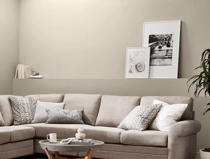
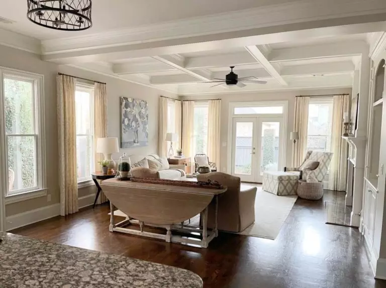
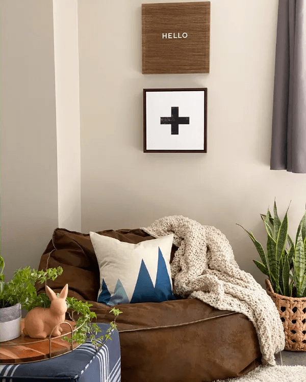
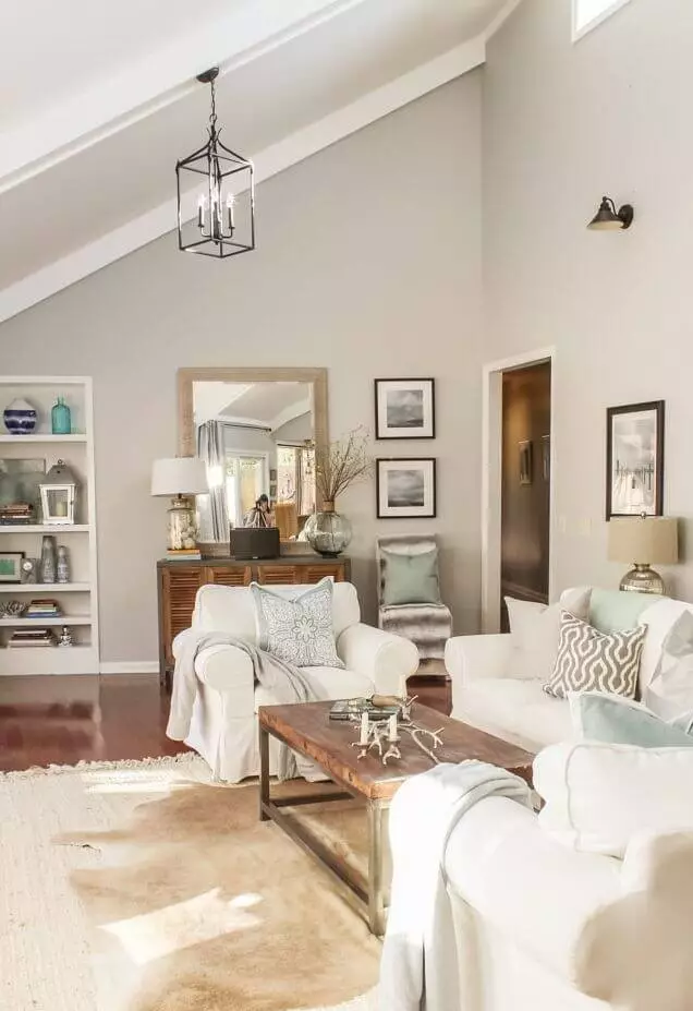
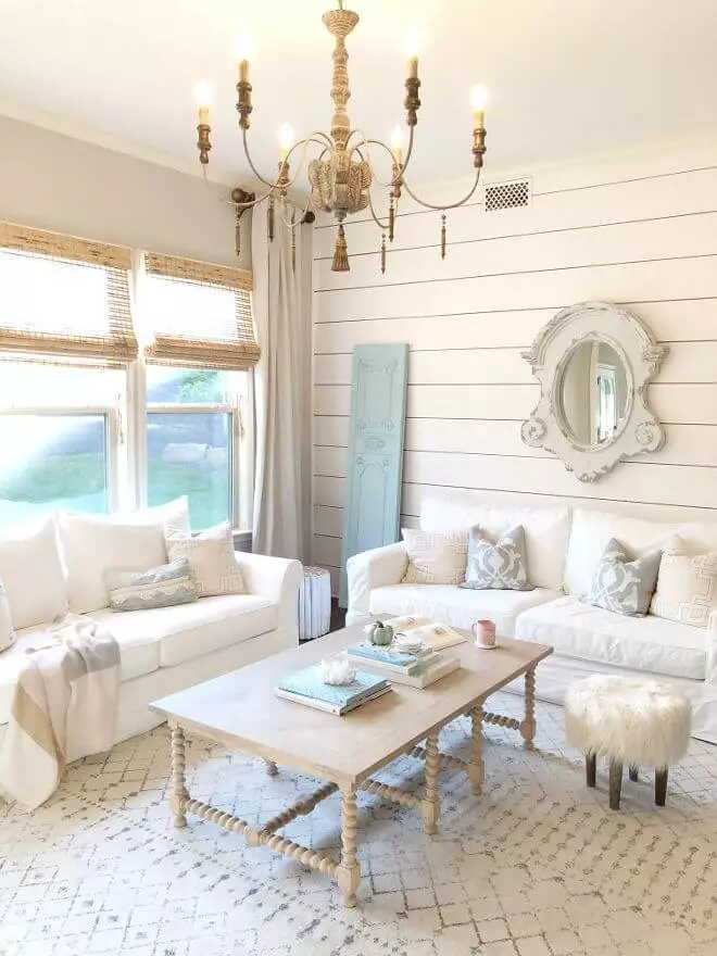
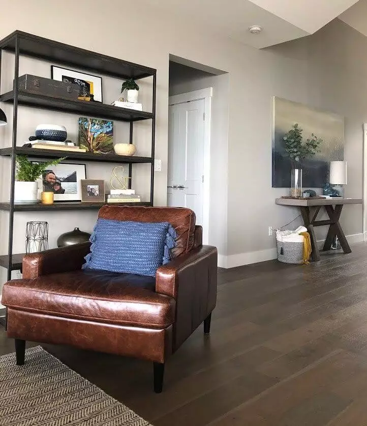
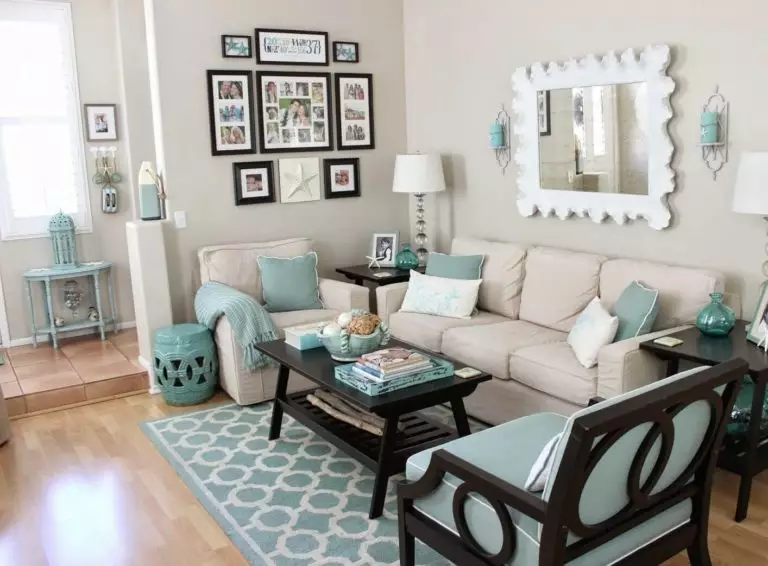
Living room
SW 7036 is ideal for open floor plans. Due to the complexity of undertones, it is able to make even an impressively large space cozy and welcoming. Therefore, it is often used for modern interiors, where the absence of extra walls and partitions is an absolute plus.
Designers suggest using Accessible Beige as a backdrop for such charming solutions as natural wood trim, including doors, skirting boards, and ceiling beams. If you’re using a white finish, then try to look towards clean, bright whites as well, although softer options can also work. A pleasant surprise for newfound fans of this grayish-beige will be its excellent combination with brick, stone, brown leather, and warm-toned metals.
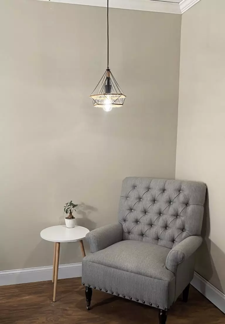
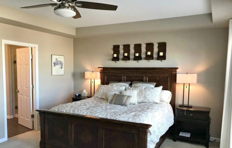
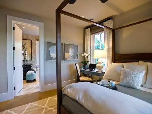
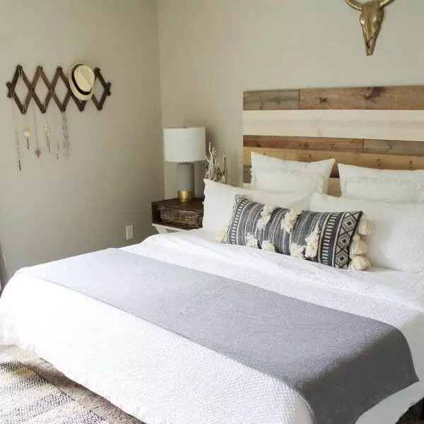
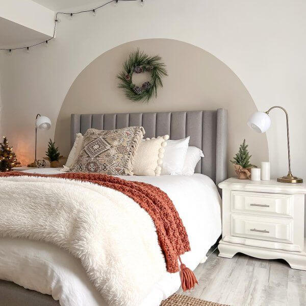
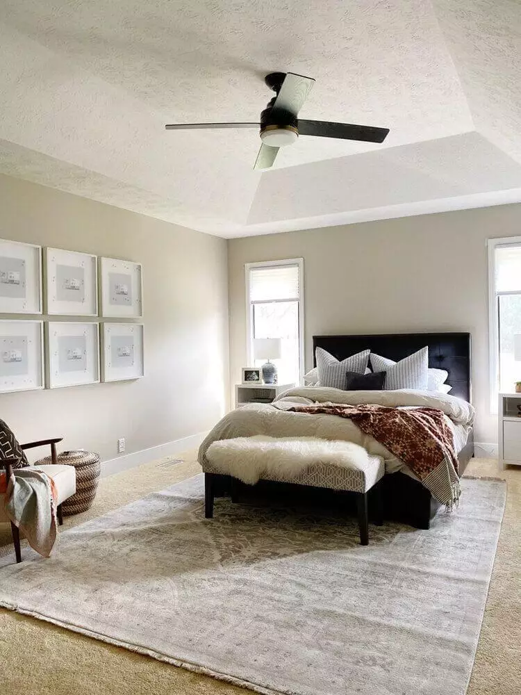
Bedroom
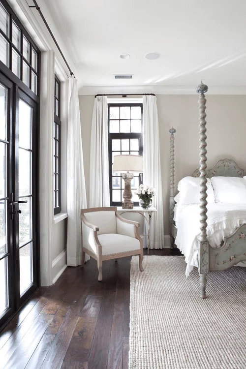
If original solutions are close to you, and you want your bedroom to look cozy and stunning at the same time, try a combination of black window frames and Accessible Beige on the walls. The interior will look outstanding even without a single luxury item if this shade is paired with a dark wooden floor and white ceiling. However, if a bedroom like from the cover of a magazine is not what you want, this grayish-beige will still come in handy. Consider the soft light of table sconces on wooden pedestals, carpets with animal skin prints, white curtains, and the most exquisite watercolors for the walls on such a background.
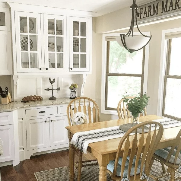
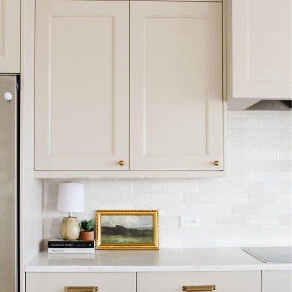
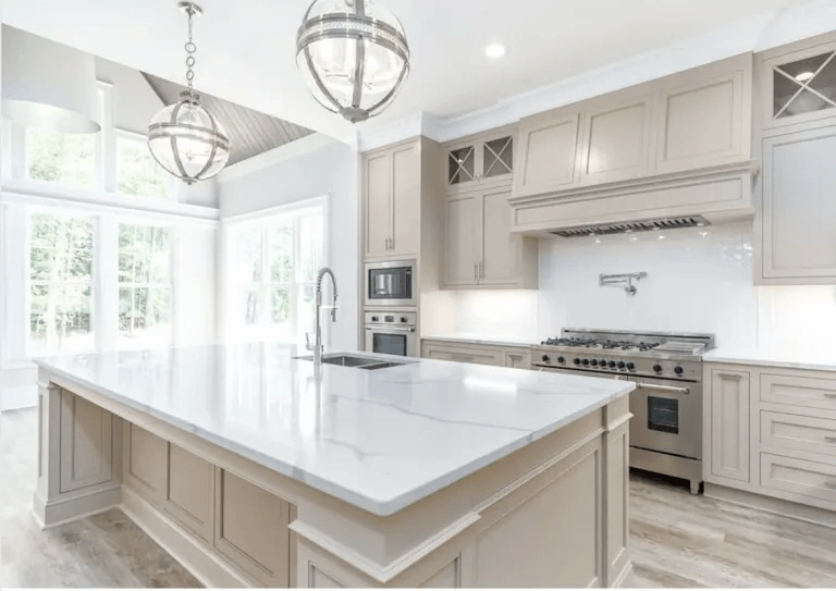
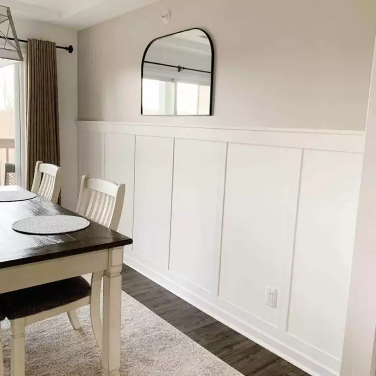
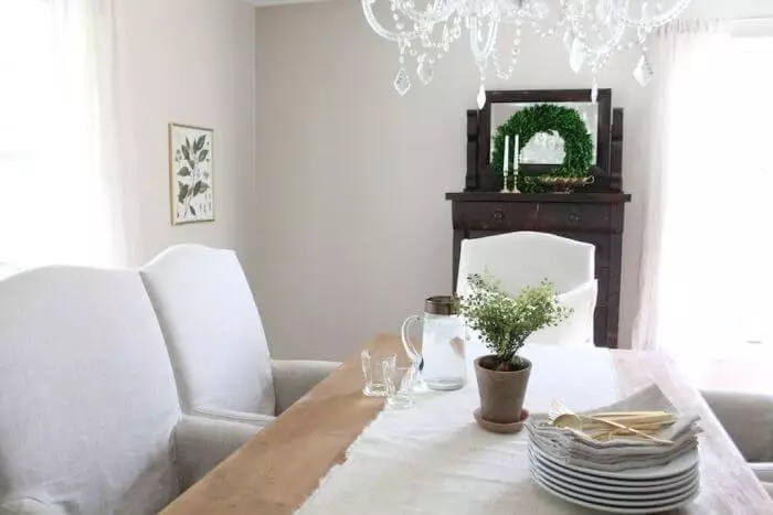
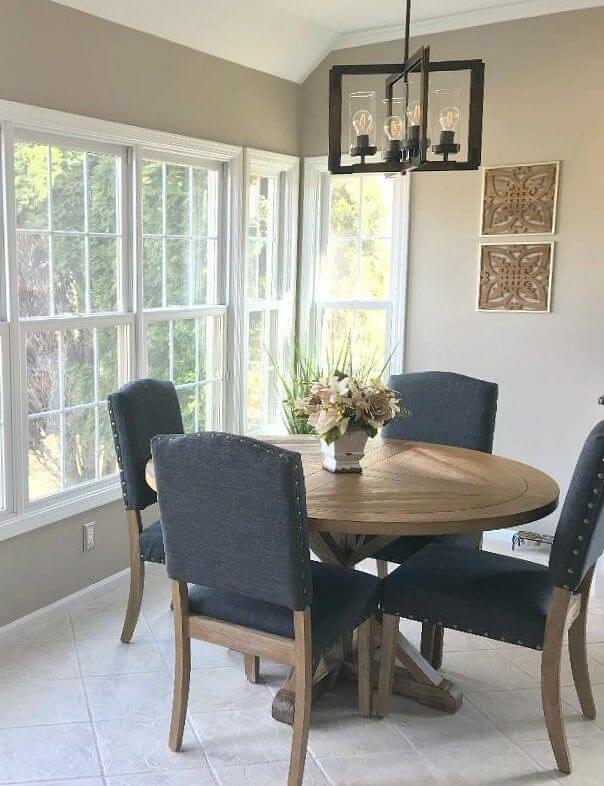
Kitchen and dining room
With SW 7036, you can accentuate any item in the dining room that seems most worthy of everyone’s attention, whether these are chairs upholstered in pure white suede, a dark wood table, or a luxurious crystal chandelier. At the same time, you can play with both the lighting temperature and the decor by choosing blue, aquamarine, or coral accents. We also recommend not forgetting about live plants and freshly cut flowers, which make surfaces in Accessible Beige even more warming and natural.
As far as it concerns the kitchen, SW 7036 is a taupe that will open up in both farmhouse and traditional interiors. Designers prefer to match it with gray stone countertops, cabinets in soft white shades, dark brushed metal, and floors in brown and honey shades. Enjoy family comfort in a delightful variety of textures and harmony of the palette.
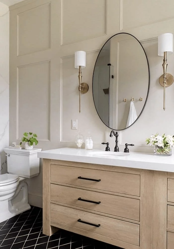
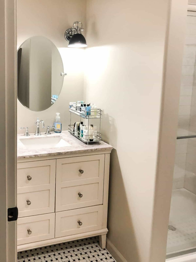
Bathroom
By choosing Accessible Beige, expect it to look noticeably grayer and slightly cooler here. If this does not bother you and even seems like a positive thing, you can start painting! Complete the picture with warm cream-colored furniture, golden lighting, wood accents, polished sandstone tiled floors, and get ready to experience true relaxation in such an atmosphere.
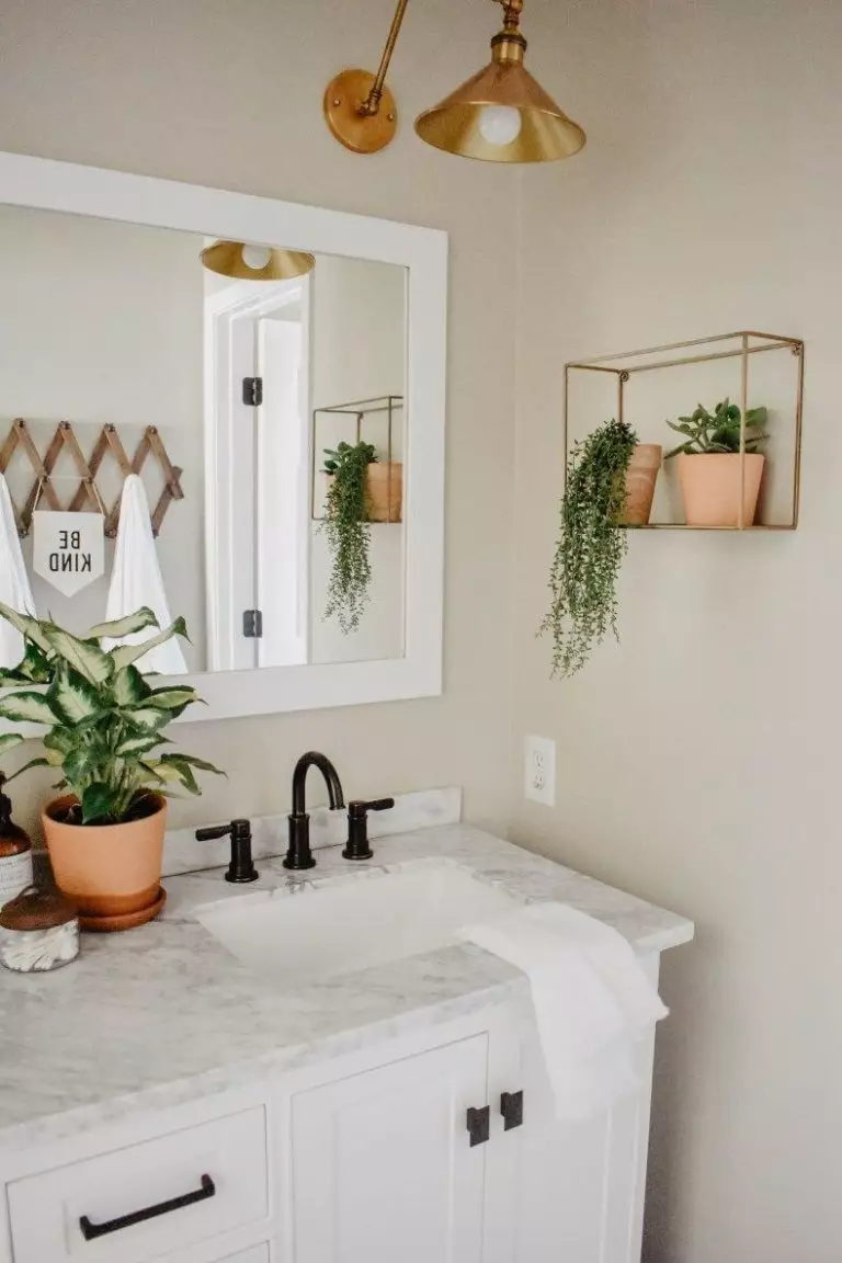
If you are looking for the right color for a classic style bathroom, then Accessible Beige proves to be a very sophisticated solution, showing a perfect match with marble walls and floors, sconces in gold and brass, and the same sanitary ware and furniture fittings. If you opt for countertops made of natural stone, green plants, and white textiles, you will get the atmosphere of an expensive and, at the same time, extremely cozy spa.
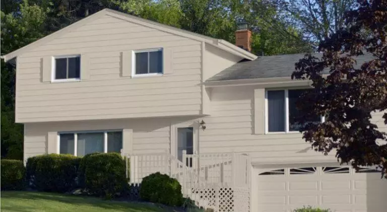
Use of Accessible Beige for house exterior
Accessible Beige is one of the most popular and sought-after paints for the house exterior, and we would not be surprised if it later appears on the pages of any design encyclopedia. The laid-back naturalness of this gray-beige shade suits any preferences. It resembles real pale cream limestone in daylight, which gives the house a cozy and respectable look, even if it is very small.
A definite plus will be the variety of colors suitable for decorating the house painted in SW 7036. Dark gray, snowy white, noble earthy brown, and even dark blue – Accessible Beige is friendly to any of these options.

Sherwin-Williams SW 7036 Accessible Beige is not something stunning or revolutionary. Calm and soft, neutral and warm, friendly and easy to compromise – it is beautiful in itself. Its accommodating character makes it a great base for modern and classic designs and places it among the best beige tones in the current era of interior design.
