Tony Taupe SW 7038
Sherwin-WilliamsThe pretty dark shade of taupe, regarded also as beige, from Sherwin-Williams is a perfect alternative to usual greiges, prevailing in softness and style.
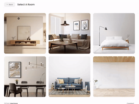
Try Tony Taupe paint in a room with Hackrea Visualizer
Tony Taupe (SW 7038): what color is, review, and use
If you got tired of greige shades that seem to have entered every field of interior and exterior design, take a look at a new upcoming variation that designers refer to more and more – taupe. Now, we speak about a mix of gray and brown. The leading shade in this sense is Tony Taupe SW 7038 from Sherwin-Williams.
At first glance, a simple combination of gray and brown. The more you look at it, the more questions arise. Is it indeed taupe or a very deep shade of beige? How does it feel? How does it behave when put into practice? And not least, why Tony? What do you say if we get straight to the answers?
Tony Taupe paint color features
As far as we are aware, there is no particular reason for calling this shade – Tony. What you should pay attention to is the second word – Taupe. While the paint color may look gray and brown, it can also be perceived as a variation of beige. Regarded as neutral, it features a rather creamy base that offers a sophisticated yet calming effect. Among other aspects, Tony Taupe falls in the medium-to-dark color category, which makes it also behave as an accent. Still, it feels soft and ensures what most homeowners and designers are looking for – comfort.
You can apply wallpapers, paints, etc. on walls and see how they look in various interiors.
Tony Taupe: is it warm or cold?
We would not call it overly warm; still, it is surely not cool. The thing that it slightly resonates with a beige shade proves it to be appealingly soft despite the almost dark base. This feature can be felt in spaces with southern exposure particularly. Nevertheless, rooms with north-facing windows do not steal the warm scents, revealing them as slightly played-down.
How does lighting affect Tony Taupe?
Regardless of how light or dark a color is, lighting always influences its appearance. Even such a striking paint color like Tony Taupe cannot stand it. Let’s see what the effects are! If your room has a northern or eastern exposure, this shade will reveal a muted taupe variation yet not devoid of softness. If your space has a southern or western exposure, the scenario changes entirely, bringing such a pleasant effect that you would hardly believe this shade is close to entering the dark color category.
Tony Taupe LRV
Let’s prove the words with facts! Do you know why SW 7038 gravitates between the medium and dark extremities? It has a Light Reflectance Value of 37. Consider 0 for a true shade of black and 100 for pure white to make it clear. Now, you know that Tony Taupe stands lower than the medium level directed towards the dark side. All clear with figures, but what do they actually mean? In terms of LRV, a value like this stands behind a paint color that absorbs the light and bounces back just tiny particles of it. In poor lighting, this shade may look overly dark, which is an effect worth avoiding with an appropriate amount of natural or artificial light.
Tony Taupe undertones
The composition is clear: gray, brown, and even a few beige notes. Still, in particular conditions, this shade reveals an unusual undertone – a slight green hint, especially when paired with elements that have red undertones. Amazing! From a dark gray-brown to a slightly green shade. Tony Taupe proves to be tricky. Therefore, you should experiment with a sample within your interior and make sure this shade reveals itself the way you expect.
Similar colors
As we stated, taupe variations are more popular than ever. Various manufacturers work on developing paint colors of this kind. It is not a surprise that there is already a wide range of shades that seem close to the deep sense of welcoming softness SW 7038 replicates. Let’s get specific by referring to a few prominent representatives!
Coordinating colors
Although appreciated as a neutral, Tony Taupe does not behave like one. There are specific shades it pairs with perfectly, and we suggest sticking to them. If you are looking for a monochromatic palette including this shade, consider beige and greige variations close to SW 7038. On the other hand, a slightly contrasting result implies brighter color variations, although soft ones as well. Start with lighter shades of gray or brown to harmonize with the essence of Tony Taupe, or bring in a new splash, such as a pastel blue, to balance the deep notes set by the gray-brown color. For better integration, consider the following shades:
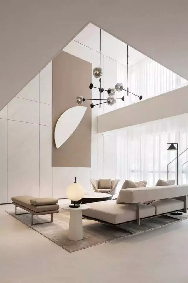
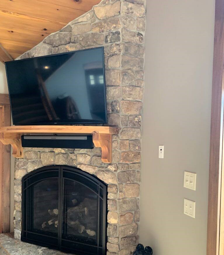
Use of Tony Taupe in interior
Starting with particular partnering colors, you can take any style direction. As regards interior design as a whole, you can safely go with the gray-brown variation in any room. Mostly used as a backdrop color despite its dark base, SW 7038 serves no less impressively as an accent. It may seem hard to integrate such a deep color into the interior, but we will prove to you that smart choices make it easier. Let’s go through the best ways to play with the renowned taupe shade in your house!
Warm Minimalism
Get ready to replace the usual light neutrals with deeper ones for a minimalist interior you have never seen before. If it seems too bold to you, consider SW 7038 for an accent. Still, we suggest opting for a full taupe interior with Tony Taupe as the leading shade accompanied by close greige variations. Additionally, consider white to balance the overly comfy environment. The rest stays the same – simple layout, functional approach to furniture, little to no decor.
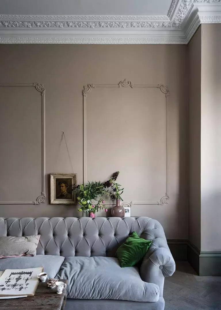
Neoclassic like never before
Gray is definitely a good choice for the walls in a Neoclassic interior. Lighter shades of blue or greige feel no less appropriate. What about a dark taupe variation, exceptionally warm and exquisitely deep? It does not seem like something the rather neutral Neoclassic would approve of, but here we are with a new perspective on the renowned style. There is something special about the molding that flows through the walls when accompanied by the gray-brown shade. Display an accent piece of furniture or decor on it, such as a Retro sofa or an Art Deco chandelier, consider a contemporary minimalist layout, and let the styles engage themselves in an eclectic dance.
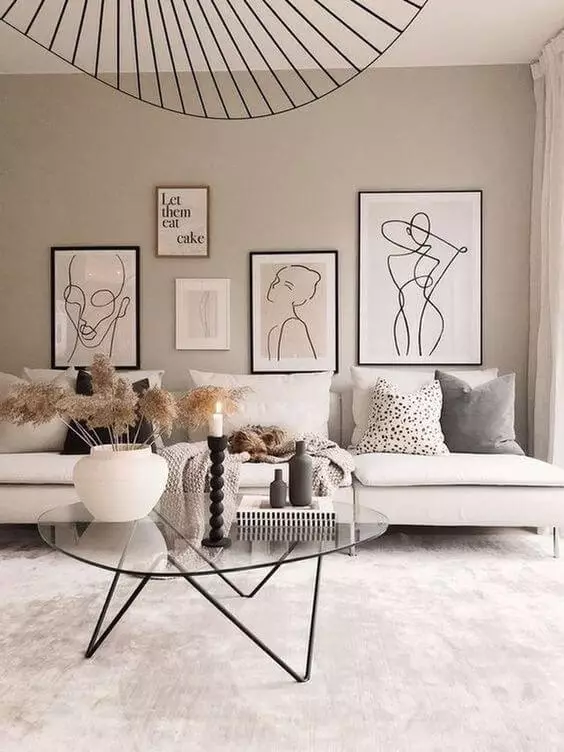
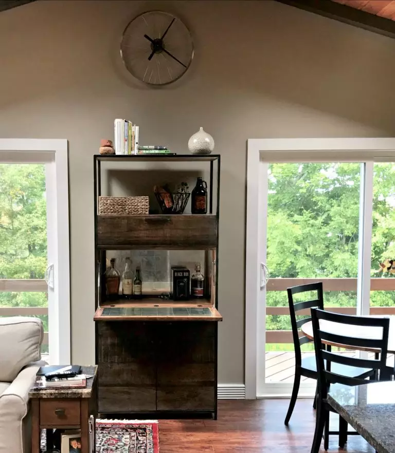
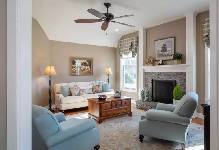
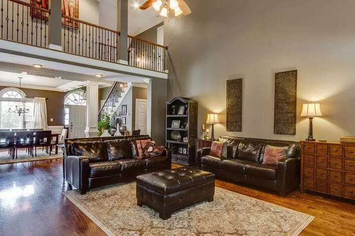
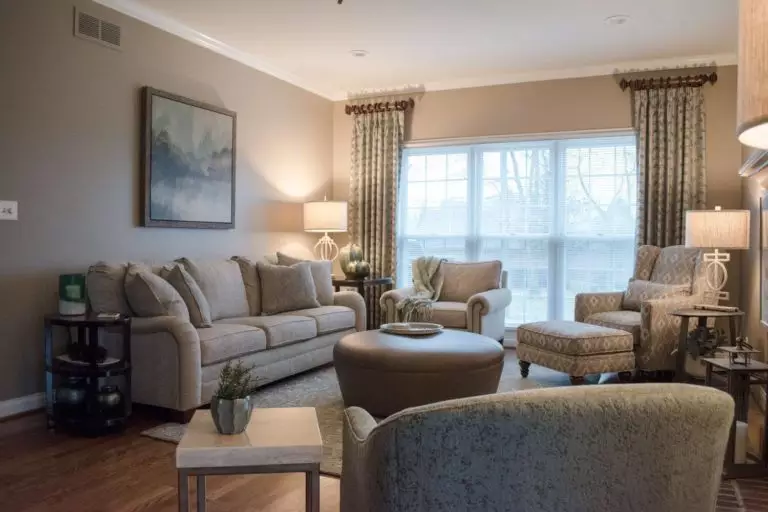
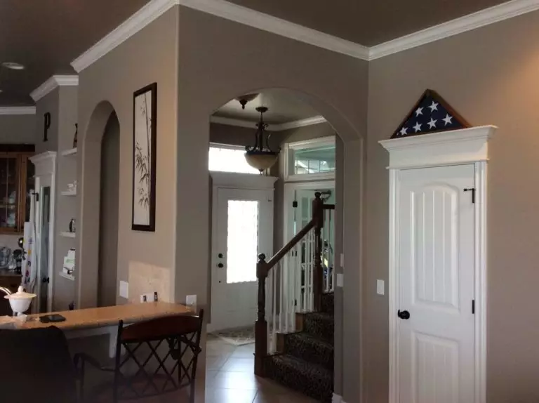
Living room
Considering the coordinating colors suggested by us, you can safely opt for any design approach. SW 7038 has been successfully integrated into traditional and modern interiors as a background for a refined sense of comfort that feels safe and stylish simultaneously. Stick to shades of white and lighter greige variations to expose on the gray-brown backdrop for a sleek contemporary result, or go with brighter brown or blue accents to enliven the space.
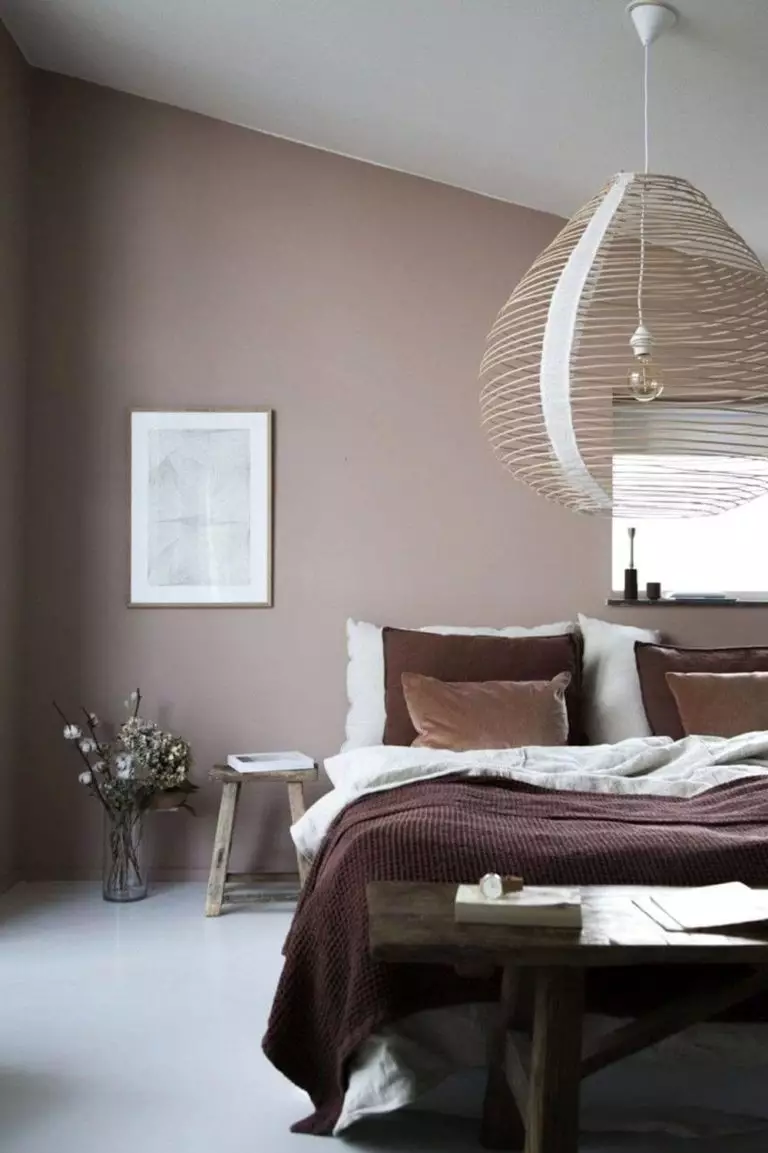
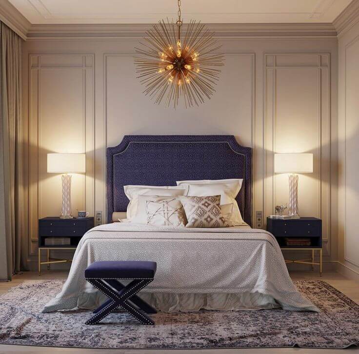
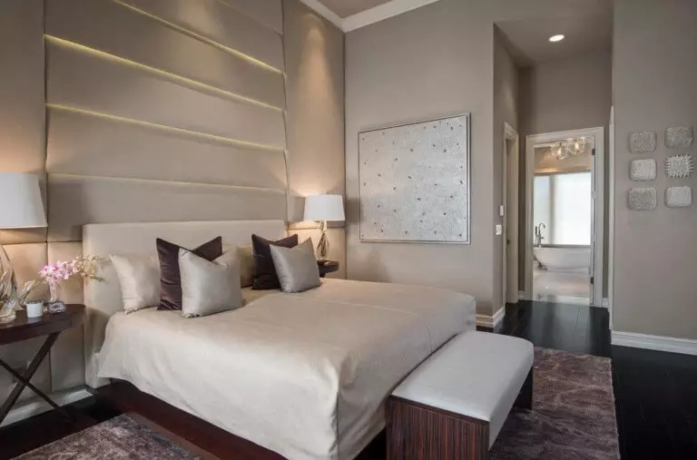
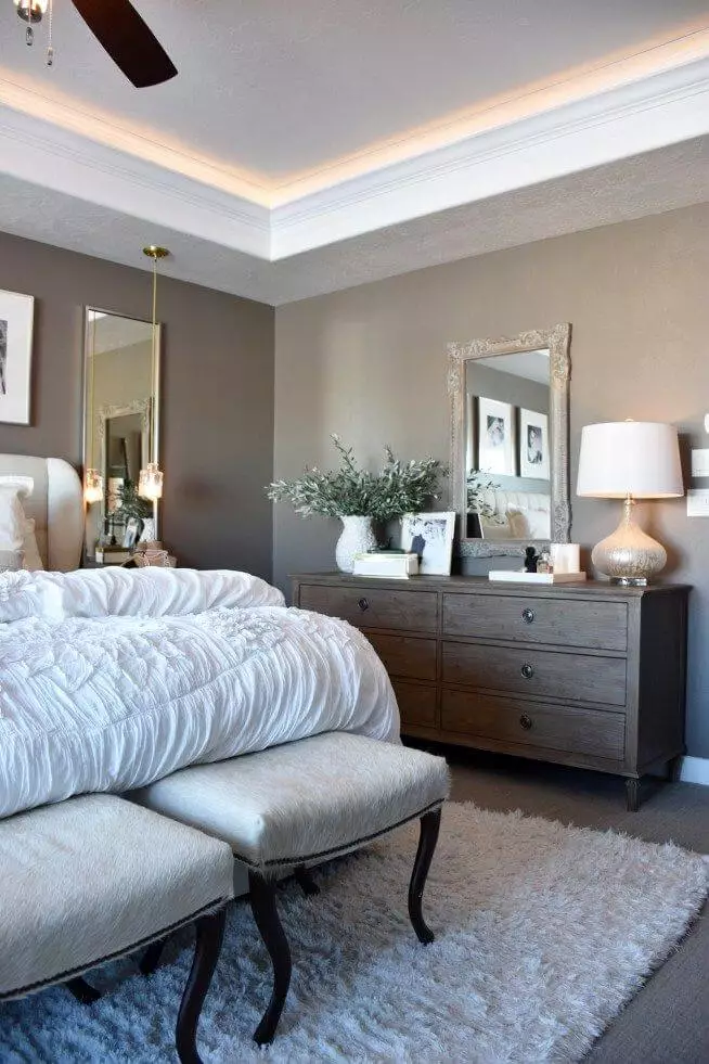
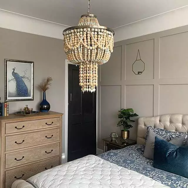
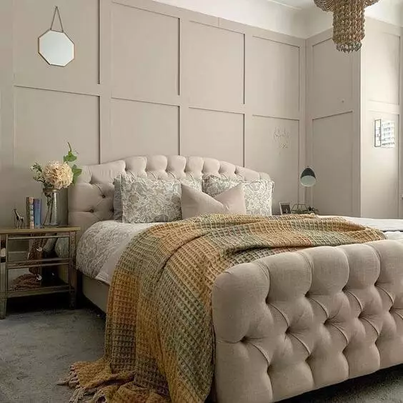
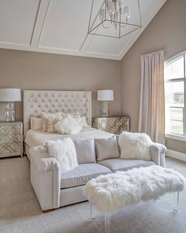
Bedroom
Fill the room with a deep feeling of comfort and keep your personal space within borders with an accent background like SW 7038. Go entirely greige or soften the space with fluffy bedding in white for an extra sense of comfort. Frankly speaking, this grayish brown is so striking that there is no need to opt for additional accents. Let the color penetrate the space to the fullest and make coziness a defining feature.
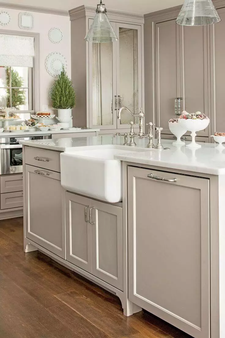
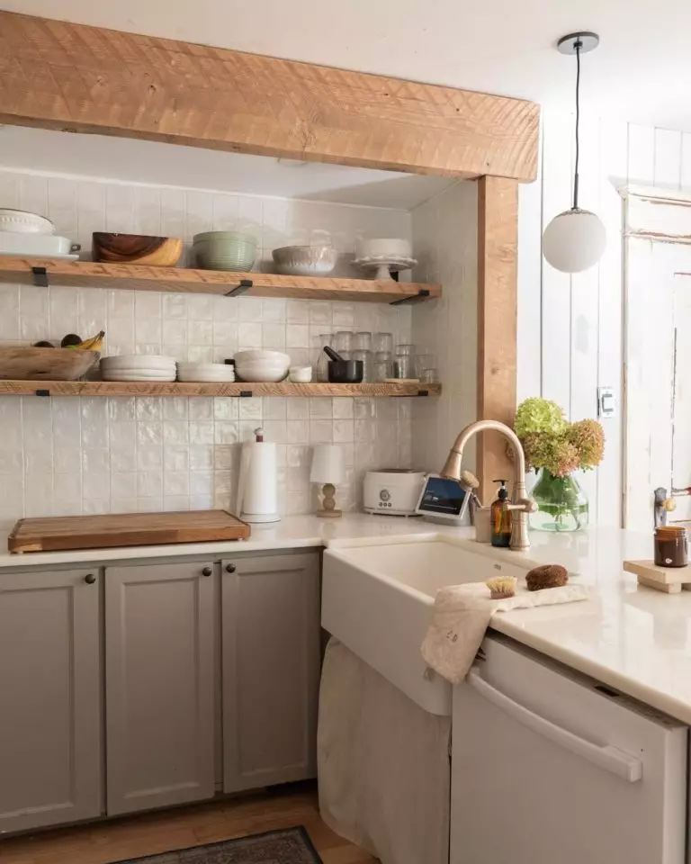
Kitchen and dining room
Particularly in these spaces, Tony Taupe shows a special admiration for traditional approaches. Paint the traditional kitchen cabinets in this shade and pair it with silverish hardware for a balanced mix of cool and soft or partner it with brass hardware to gracefully bring its warmest variation to the surface. Don’t hesitate to combine the gray-brown lower cabinets with white upper cabinets for a contemporary adaptation. Wood seems a no less appropriate partner, particularly if considered for open shelves. The wood texture goes as perfectly in the dining area for the furniture on a background filled with grayish contemporaneity and brownish comfort.
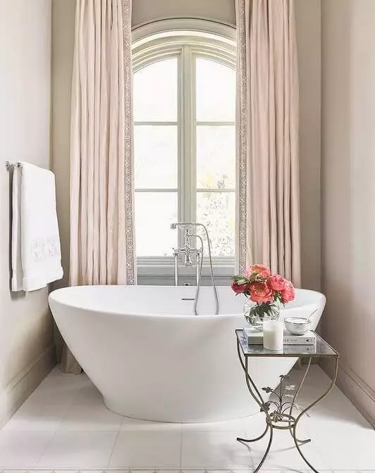
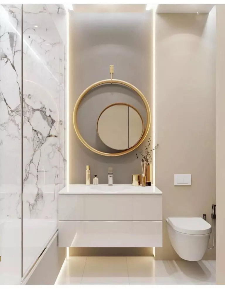
Bathroom
It would seem rather daring to integrate a pretty dark color into the bathroom. Still, the level of softness it radiates is worth considering in a space that feels rather cool. Furthermore, you can either opt for the walls or vanity to paint this way. Don’t overdo the rest of the room. Keep it rather white and sleek for a contemporary interior, while the deep taupe variation will preserve comfort and add individuality to a space usually appreciated as functional only.

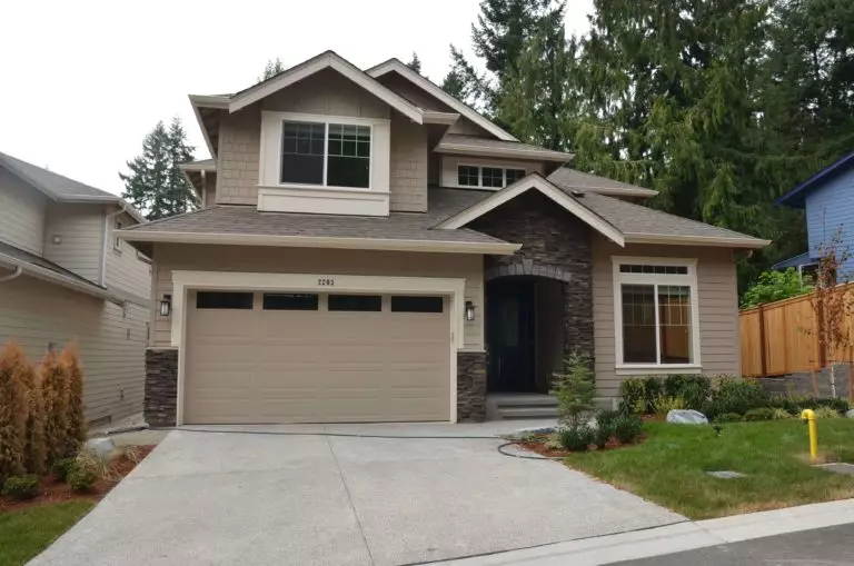
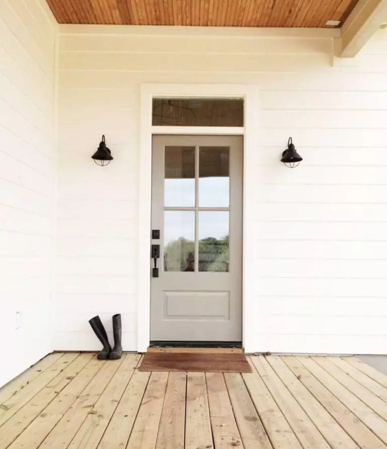
Use of Tony Taupe for house exterior
Replace the classic greige paint with the new gray-brown variation for the exterior. This shade feels more up-to-date, new, and original. By the way, it goes with any style, preserving neutrality and adding a balanced inviting feel. As for the front door, designers are simply amazed by what an accent SW 7038 can add to the exterior without feeling too eye-catching. Don’t hesitate to paint your front door this way on white walls for a no-fail result.
The Tony Taupe SW 7038 paint color from Sherwin-Williams seems to be the new favorite, seemingly neutral yet full of rich undertones. The recently discovered shade is quite promising, and we suggest you be among the first to apply it to the interior and exterior.
