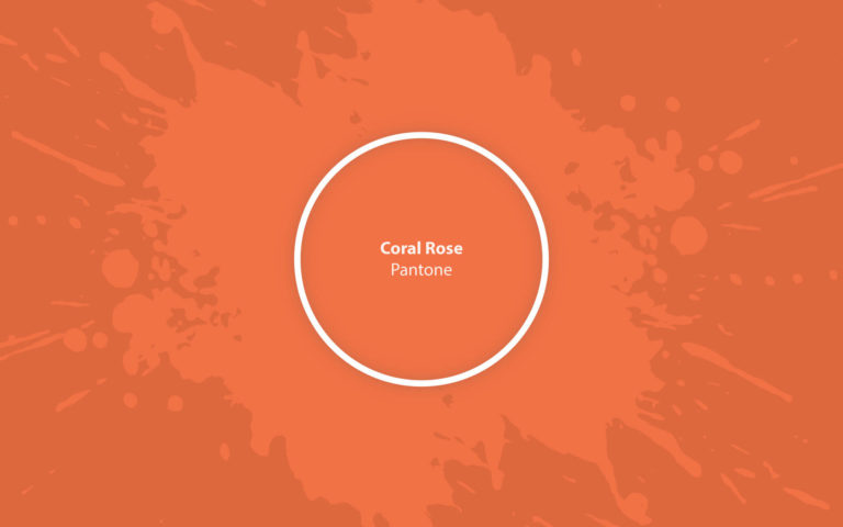
It’s November outside, and 2022 is just around the corner. As always, at this time, we are waiting for changes and carefully study the current trends – including the color trends that will be with us throughout the following year. We have already discussed the shades that famous paint manufacturers and global trendsetters have declared their favorites. We could not help but notice their craving for calm white, beige, mysterious gray-green, and refreshing blue tones. However, representatives of the Pantone Color Institute have always had and will have their own opinion – and this time, they preferred airy pastels, as well as bright and warm life-affirming shades, to the general inclination for coolness and tranquility. And among the most attractive in this palette is 16-1349, also known as Vivid Coral Rose or simply Coral Rose.
According to Leatrice Eisman, executive director of the Pantone Color Institute, their current palette for 2022 symbolizes the desire to transcend boundaries and bring play and creativity into your life, as well as ease, spontaneity, and freedom of expression. Coral Rose fits this concept perfectly: deep, rich, and at the same time, unobtrusive orange-pink can really awaken the thirst for life.
Coral Rose: color features
The creators describe Vivid Coral Rose as “a very vibrant floral tone whose invigorating presence is guaranteed to inspire uplift.” Indeed, this shade, inspired by the mesmerizing beauty of coral reefs and their natural warm colors, simply could not fail to enter the current color palette for 2022.
Many people often compare Coral Rose with Living Coral, which became Pantone’s 2019 color of the year. However, one cannot fail to notice that with sufficient similarity, they are entirely individual and distinctive. While Living Coral boasts rich pinks and golden and purple undertones, Coral Rose offers us a different coral – warmer, more orange, and significantly more earthy, soothing energy. Today, when we are all going through a difficult time and searching for a source of warmth, vigor, and mental strength, it came in handy.
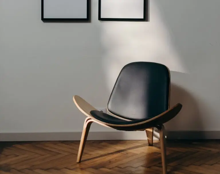
You can apply wallpapers, paints, etc. on walls and see how they look in various interiors.
Coral Rose: is it warm or cold?
A shade value of 16 degrees with a lightness of 64% clearly tells us that this color is warm. However, it is not necessary to be well versed in color gradations to see it yourself: the fantastic combination of delicate and warm pink, rich orange, and bright peach notes makes such a warming impression that you want to quickly put your hand on the surface painted with Coral Rose to feel this warmth.
How does lighting affect Coral Rose?
This amazing orange-coral shade is not very sensitive to light. Therefore one can hardly expect any shocking metamorphosis from it under the influence of bright daytime sun or diffused twilight. Due to the dominance of yellow and red, it is pretty stable, but this does not mean at all that it is entirely incapable of transformation.
So, when using this color to paint surfaces in a room with poor lighting, you will be able to notice how effectively it reveals its warming properties, almost wholly turning into a very warm brick tone with romantic pink flashes. However, having tried it in a large and bright room with a lot of sun, you will see a slightly different Coral Rose – more intense and pink, more juicy and cheerful, filled with joy, dynamics, and energy.
Vivid Coral Rose LRV
It has to be said that Coral Rose hardly boasts outstanding reflective properties. The LRV index is a little over 33, which allows us to attribute it to the mid-tones – moreover, to the golden middle of the mid-tones. All of this means that this color from Pantone is completely dusk-free and feels good even in bright light. Do not expect miracles with the visual expansion of the space or the room’s transformation into a brighter one. Coral Rose was created for something completely different – to warm and give energy, and for this, it is absolutely not necessary to reflect light in large quantities.
Coral Rose undertones
Obviously, Vivid Coral Rose is dominated by red tones, softened by many yellow undertones. At the same time, blue and green notes in this beautiful shade are practically absent, thanks to which this color seems so soft and warm that you can safely use it both in harmonious combination with neutrals and in expressive contrast with cool tones.
Similar colors
Pantone boasts an impressive base of 15,000 colors, so you can be sure that this rich palette also contains tones similar to Coral Rose. Other manufacturers are not lagging behind, offering their variations on the theme of orange-pink shades. Let’s consider them in more detail:
Coordinating colors
It makes sense that cooler and more refreshing shades are required for Coral Rose’s lively and enchanting contrast. You can find them both in the Pantone palette and from other manufacturers:
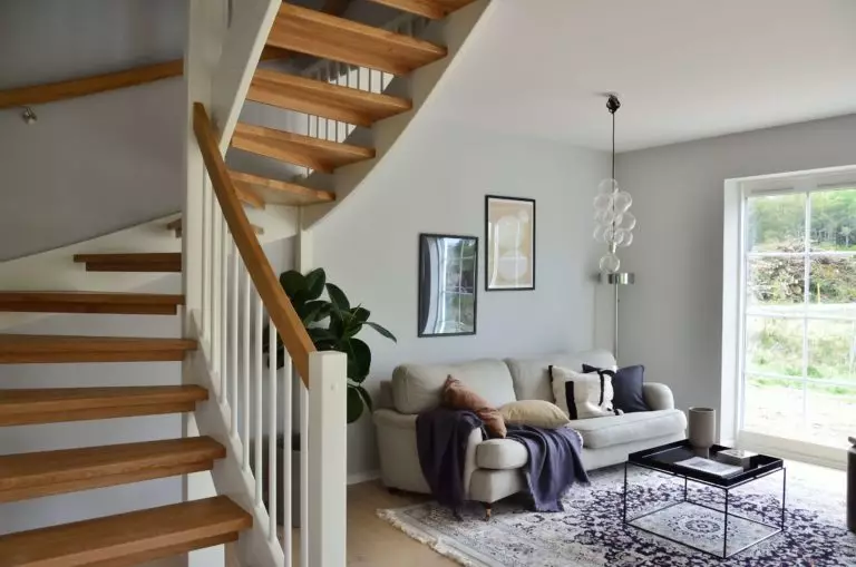
Use of Coral Rose in interior and exterior
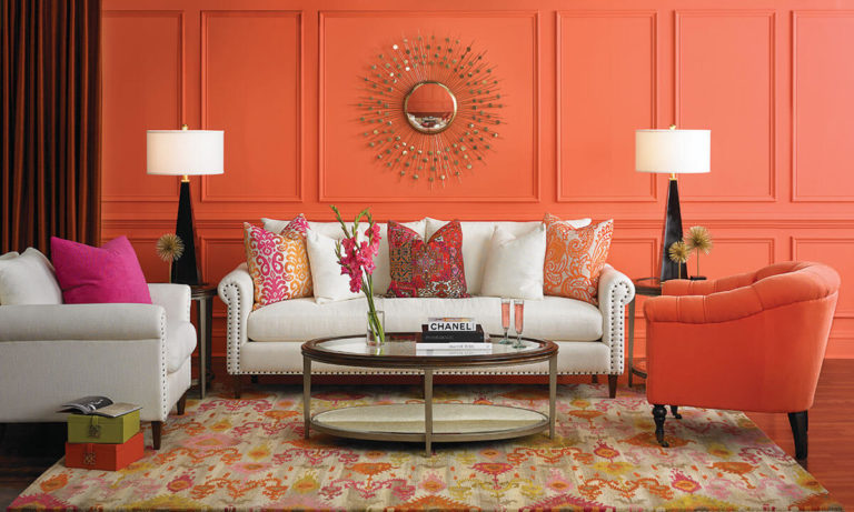
Coral Rose does not claim to dominate the interior at all, as it has unique energy sufficient to influence even when used in small quantities. However, its warmth, depth, and unconditional sophistication are so appealing that it is complicated to resist making the most of it. Well, let’s see how you can use the color included in the current Pantone 2022 palette.
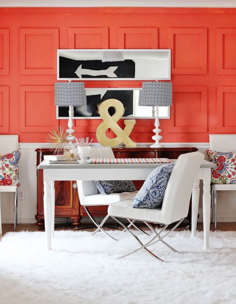
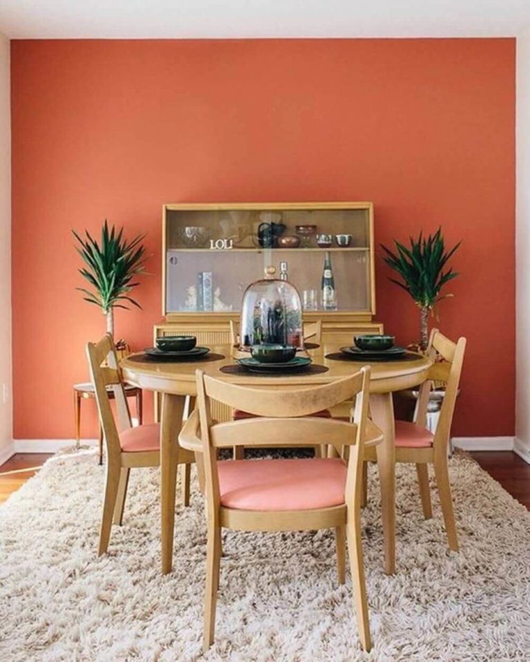
New modern
Walls painted in Coral Rose can be the perfect backdrop for the elegant and stylish solutions typical of Modern. Combine the walls in this coral shade with wallpaper in white and brown tones, do not forget about leather or velour furniture in chocolate shades, look at the mahogany coffee tables and decor in brass and light snow-white sheer on the windows. Believe it or not, this combination of sophistication, warmth, and hospitality is simply unmatched.
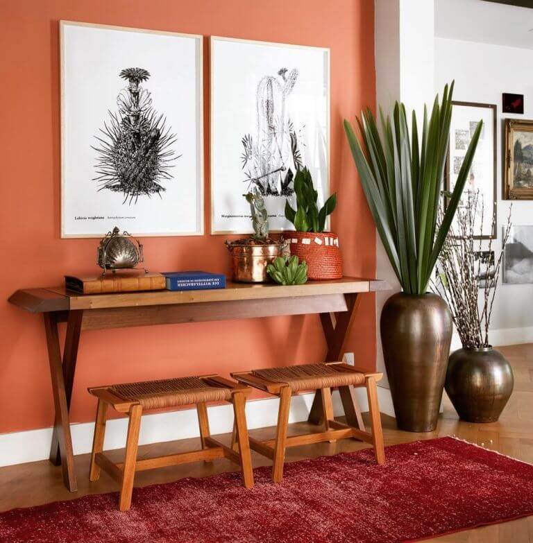
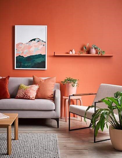
Blooming brevity
If you seriously believe that Coral Rose and similar shades cannot be combined with minimalism in any way – then you just haven’t tried it! Use this color from Pantone to paint plastered walls or wood paneling walls, match the backdrop with a wooden-legged sofa with light or neutral textile upholstery, a natural fiber wicker rug, and a pair of metal hardware. Decorative pillows in the color of the walls will become a connecting link and provide perfect harmony.
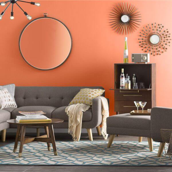
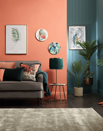
The charm of contrasts
Nobody says that you definitely need to combine Coral Rose only with light or warm tones. Coral-painted walls and a gray sofa, a dusty blue chest of drawers, and a rug in the color of pale aquamarine, placed against their background, can create a perfect interior palette for you. Add some crisp white and wood accents here and enjoy the trendy interior every day.
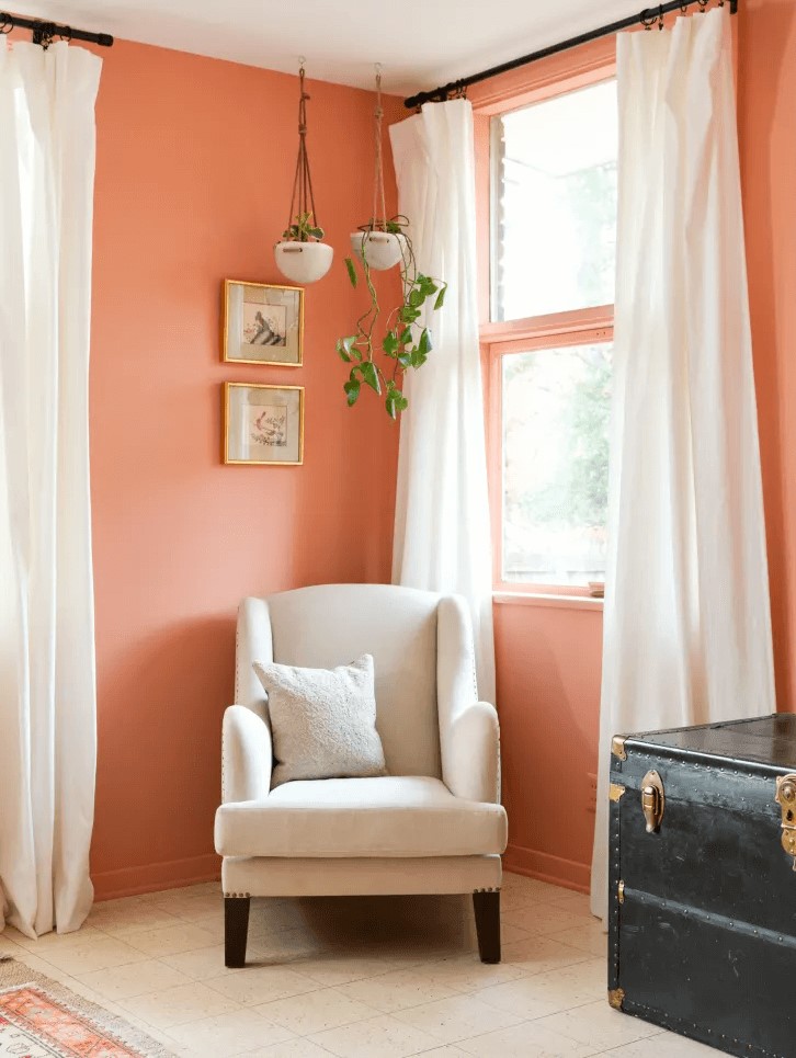
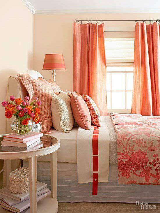
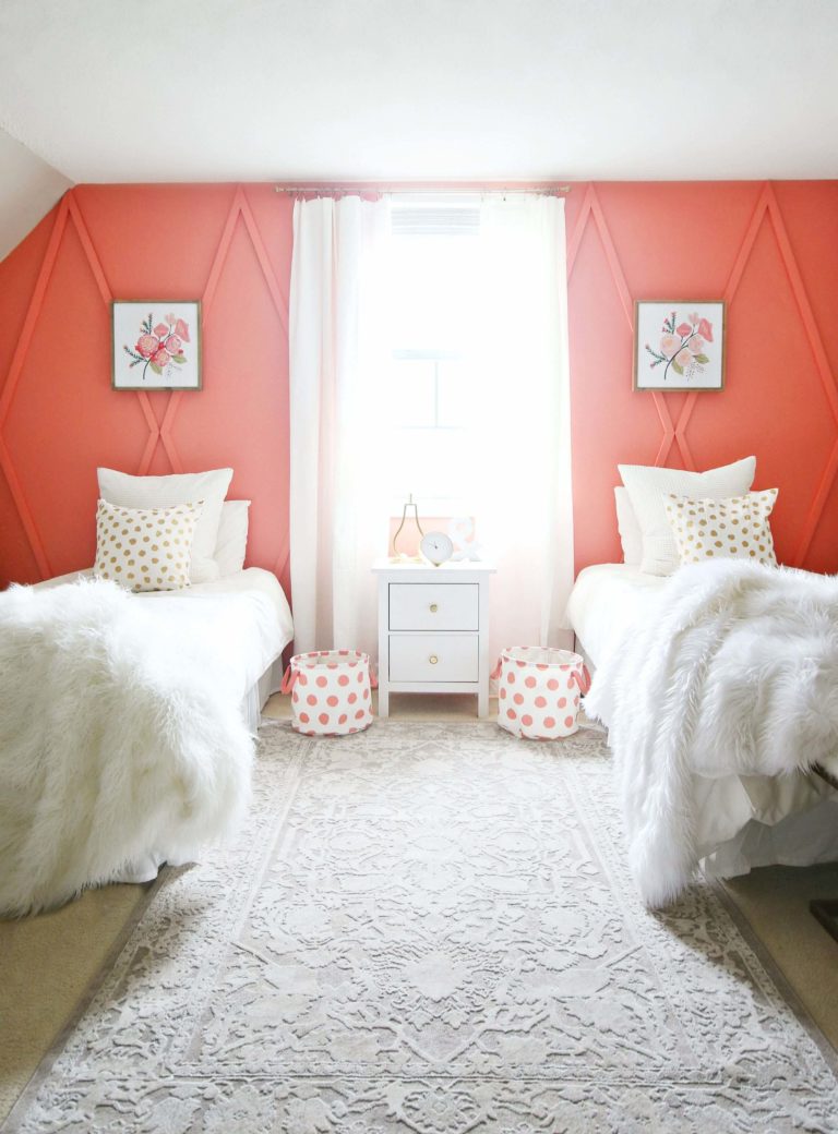
Delightful serenity
If this color is incredibly comfortable for your eyes and you want to contemplate it as often as possible, perhaps you should create an authentic total look in your bedroom. Use Coral Rose for walls, furniture, and bed textiles, while a neutral gray or beige wood floor and a couple of contrasting details in the form of lamps and decor in brushed black metal will help balance the impression.
Exterior of the house
Coral Rose is so warm and welcoming that it is even a shame to use it for painting the exterior walls of a house, and at the same time, too complex and delicate to paint a door into it. However, if the desire to use it in the exterior is still strong enough, use the soft, warm coral from Pantone for the gazebo or veranda. Coral Rose will be happy to make friends with any textures, from stone and wood to dense textiles and wrought-iron garden lamps in such an environment. Moreover, don’t be afraid to use wicker rocking chairs and as many green plants as possible for a unique feel.
Although Vivid Coral Rose by Pantone did not become the color of 2022, its role in the fashion palette of the Color Institute should not be underestimated. Warm, moderately bright, and full of life, but can color your interior with new colors – and improve the quality of life, at least visually.