A slightly warm shade of gray, not devoid of cool notes, and definitely calming. Its delightful softness is nothing else but a reason to fall in love with another shade of gray.
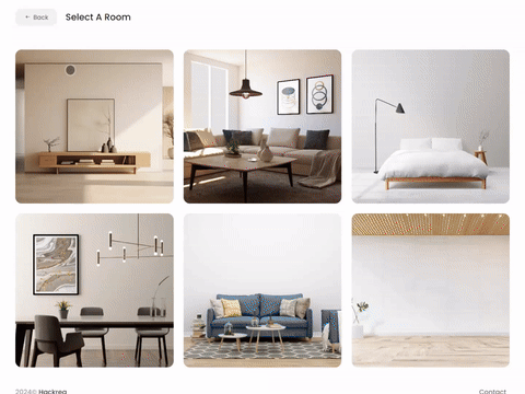
Try Dolphin Fin paint in a room with Hackrea Visualizer
Dolphin Fin (Behr 790C-3): what color is, review, and use
Although a neutral color, gray is indeed complex and choosing among its various cool, warm, and medium-toned shades is an entire process that involves a thorough analysis. This is why our list of color reviews referring to different shades of gray is quite wide. Yes, today, we are dwelling on another beautiful gray, this time from Behr. Dolphin Fin has been known as one of the most popular shades of gray at Behr, and not without a reason- its pretty sophisticated composition opens up a sea of design possibilities.
The newly discovered shade is a light gray that stands out with its combination of soft and cool notes. Let’s start with the name itself! Dolphin Fin – what an inspiring pairing of words that makes us instantly refer to a soft gray. One may even mistake this color with a greige, which is a combination of gray and beige. Nevertheless, this shade from Behr is gray, although not a true one due to its slightly perceived scents of warmth. Let’s find out what stands behind such a popular color!
Dolphin Fin paint color features
Dolphin Fin is a slightly warm shade of gray, not devoid of cool notes, and definitely calming. Its delightful softness is nothing else but a reason to fall in love with another shade of gray. A seemingly coolish shade, this enchanting gray feels like a balanced splash of color that refreshes the space and offers an appealing comfy feel. You will simply be amazed by how calming a shade of gray can be.
To give you a better understanding of its essence, we would like to refer to another popular shade of gray – Silver Drop 790C-2 from the same paint manufacturer, which is practically a shade lighter than Dolphin Fin. One should note that the latter has a more emphasized gray base. Nevertheless, a unique hint of softness can be perceived at both shades that seems rather unnoticeable on the sample but is surely visible when the colors are put into practice.
You can apply wallpapers, paints, etc. on walls and see how they look in various interiors.
Dolphin Fin: is it warm or cold?
Nobody canceled its coolish notes, although Dolphin Fin is nothing else but a warm shade of gray. Whether you like it or not, its standout softness contributes to the warm scents that this shade radiates. It is quite confusing: you see it as a coolish color but feel it as a warm one. What do we do then with this information? Nothing else but except the fact that Dolphin Fin is an unusual color that reveals particular cool or warm undertones depending on the neighboring colors and lighting.
How does lighting affect Dolphin Fin?
Do you remember what we always say? Lighting is the boss. Undoubtedly, this factor plays an essential role in the way we perceive Dolphin Fin. Let’s tackle it from a narrow perspective! First comes natural lighting. Of course, it will make this shade shine to the fullest, revealing its light and airy notes. If we speak about west, east, and south-facing rooms, the color is slightly penetrated by beige undertones. In north-facing rooms, it appears more grayish. Nevertheless, you can always use artificial lighting with particular undertones to offer this paint an appearance that fits your preferences.
Dolphin Fin LRV
A small reminder: LRV is used to determine how light or dark a color is on a scale from 0 to 100, depending on its ability to reflect the light, where the latter stands for a true white color. Back to Dolphin Fin! It reaches a value of 59, which means that it is part of the medium-toned shades, directed towards the lighter end of this category. What does it mean? Well, it is nothing else but reliable proof of its ability to reflect the light all over the space with a relatively outstanding intensity besides its no less impressive expanding effect. That’s right! The gray notes absorb a particular amount of light but not as intensely as the color itself bounces back a great part of the light that penetrates the room.
Dolphin Fin undertones
As already mentioned, Dolphin Fin is diluted with a few drops of beige responsible for its slightly soft effect. What about its coolish notes? Well, gray stands for its balanced feature, while the subtle coldish scents are radiated by a few slightly visible blue undertones. There is more to come! In a room that receives enough light, this color seems like a foggy shade of white with extremely soothing notes. This is the trick the undertones of this color are playing on us.
Similar colors
There are so many shades of gray that there is probably not a single one that would not have at least a few cousins at the same paint manufacturers, and the list gets longer once we refer to other manufacturers as well. Do you know what is more impressive? As similar as they may look, as unique they are, each coming with an original approach to the same combination of coolness and softness. Let’s start with Behr and go further while discovering alternatives to this shade!
Coordinating colors
As with most shades of gray, this color cooperates with a wide range of hues both as a background and an accent. First of all, one should consider neutrals whose undertones complement the ones contained by Dolphin Fin. In the second place come soothing shades, or let’s say – pastels followed by their bold alternatives; quite an array of possibilities we have here, and all due to the surprising versatility of this impressive gray. Let’s go through the list of coordinating colors that experts from Behr happily shared with us!
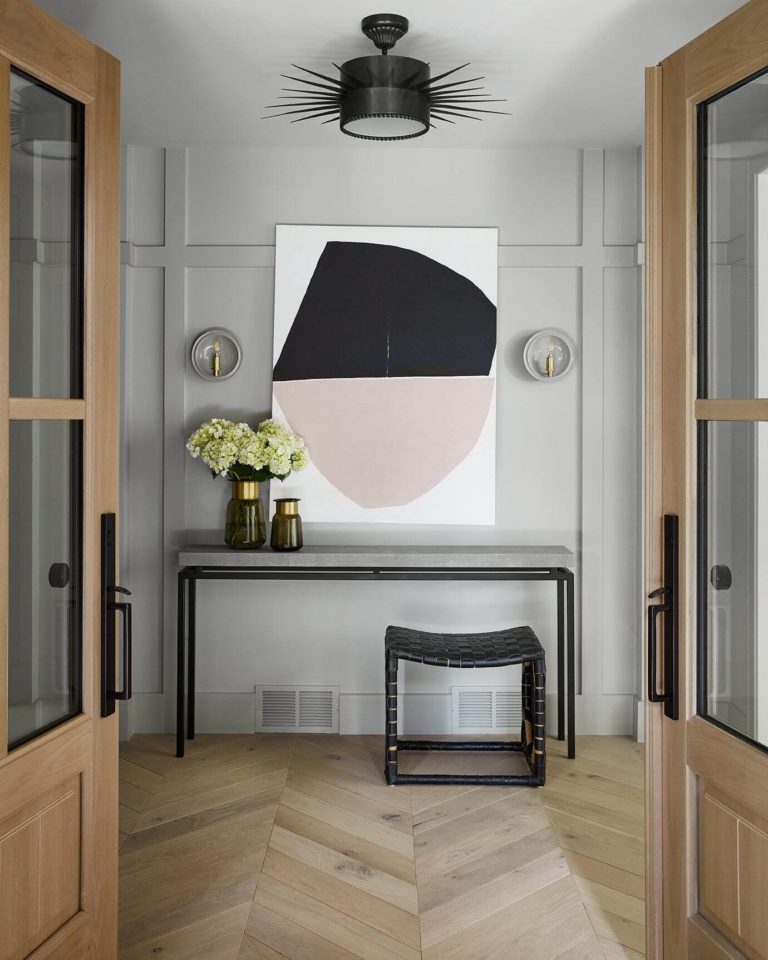
Use of Dolphin Fin in interior
When it comes to gray, it is quite appropriate for any room of your house, particularly if it is a slightly soft shade that enriches the space with warmth, which homeowners and designers strive for today. It seems that this color is one of those hues that offer a contemporary look to any space, and its versatility is responsible for its cooperation with a variety of shades within various spaces, be it as a background when painting the walls or an accent when choosing it for a piece of furniture or other elements of the room. Let’s see what the best design solutions are!
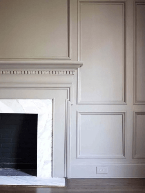
A new perspective on accents
We are used to the idea that an accent should immediately be a bold color but not according to contemporary standards. Considering that more and more neutrals are penetrating the interior, such a shade as gray with more emphasized notes is no less appropriate for an accent. Consider Dolphin Fin for the interior doors, trim, or even an accent wall if it is decorated with wood paneling, particularly on a lighter background. The result is a sleek interior decorated in an exquisite way that replicates nothing but an exceptional sense of contemporaneity.
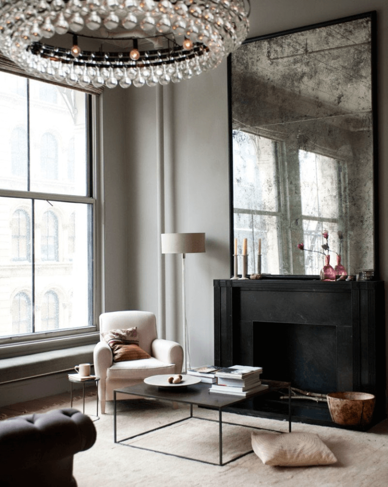
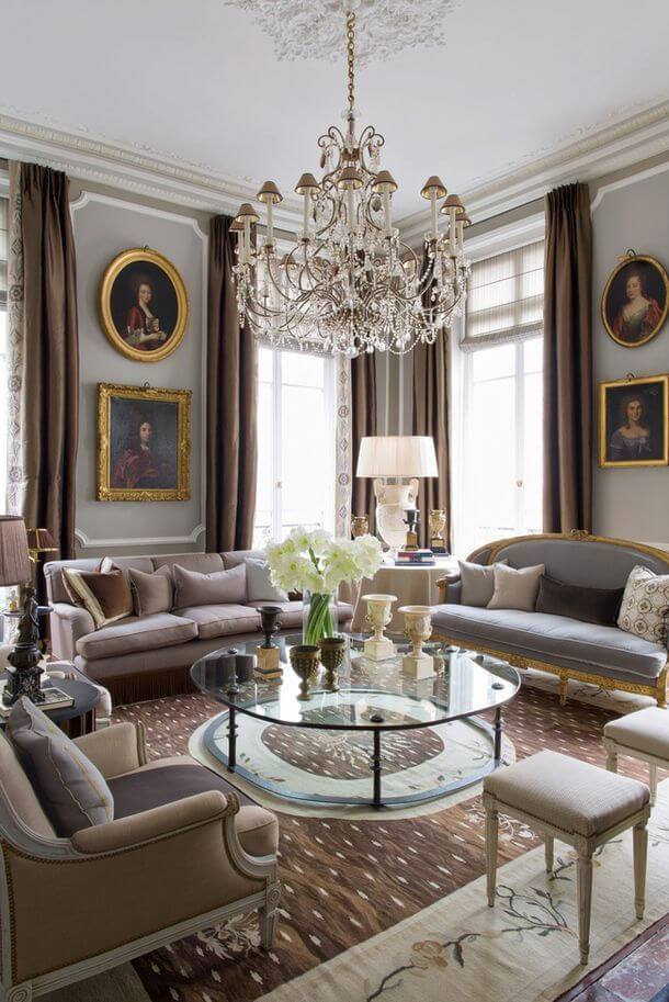
Living room
Are you looking for a perfect background to implement an original design idea? Dolphin Fin is more than welcome to help you and even add a bit of individuality with its unusual scent of softness. Functional contemporaneity, elegant Art Deco, natural Eco, comfy Scandi, flamboyant Provence; which one feels closer to you? Or, is it a completely different style that you have in mind? No problems, the versatile gray from Behr will serve as a canvass for any of your design preferences. A perfect partner for neutral shades and no less impressive companion for bolder accents, Dolphin Fin will simply enter the space and look as if it was meant to be part of your interior, regardless of what direction you go.
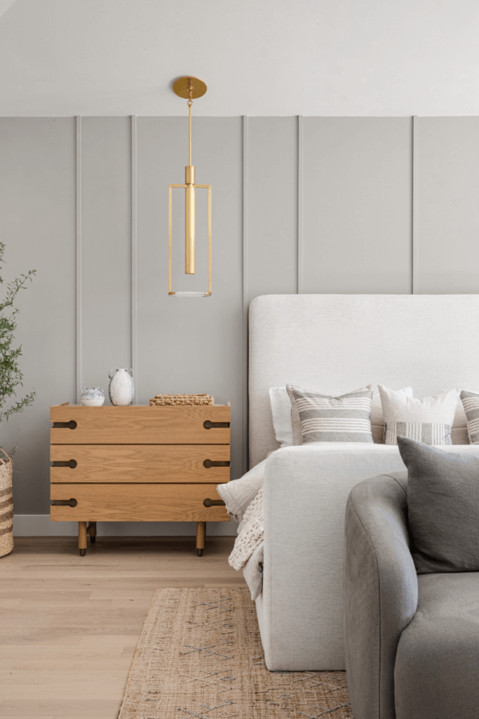
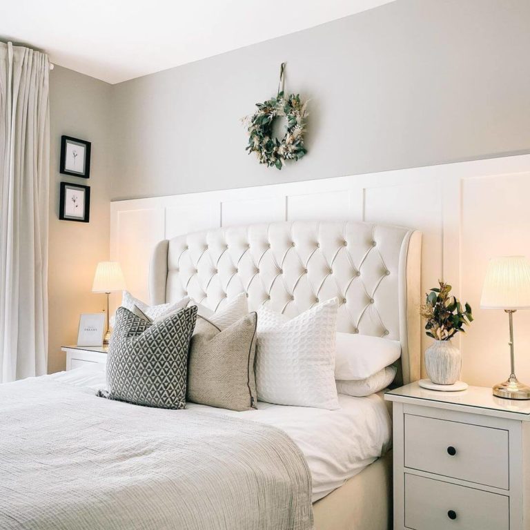
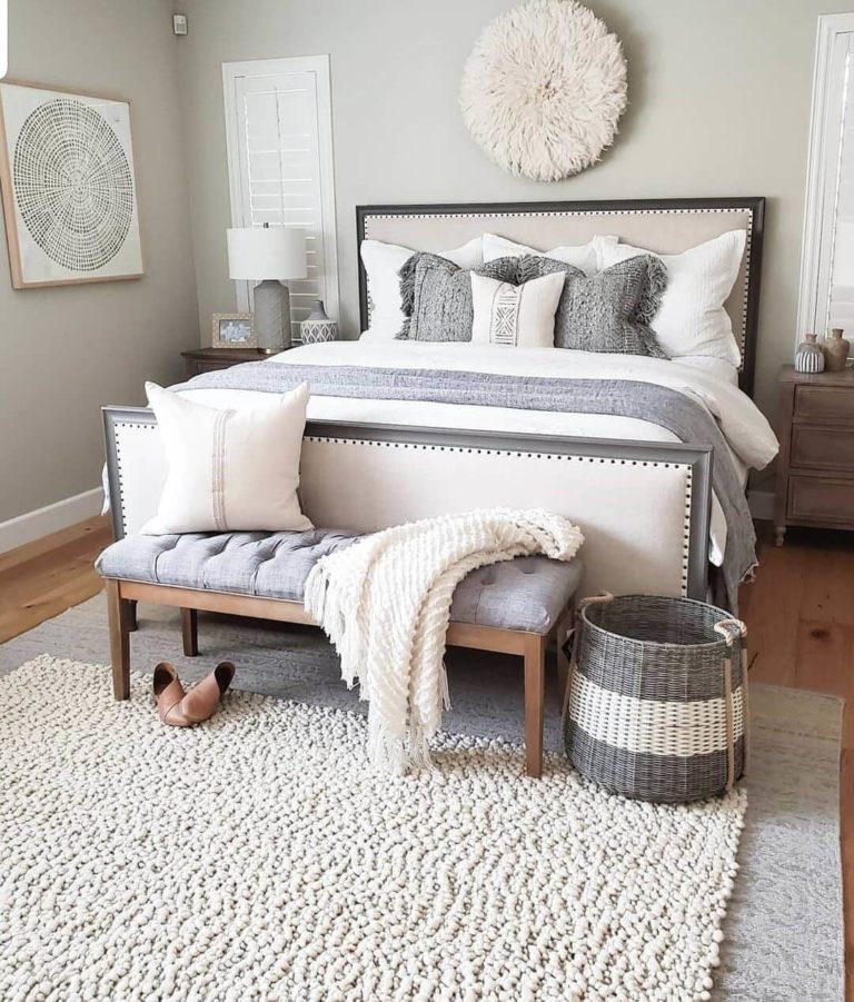
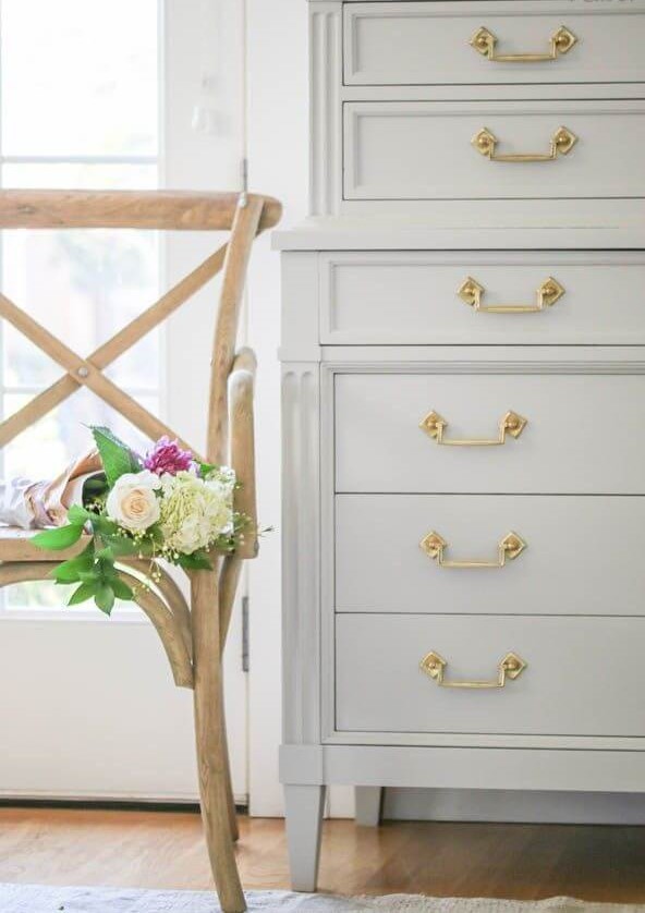
Bedroom
It seems that experts from Behr were thinking about this space in particular when they came up with Dolphin Fin. Such a soft and calming shade doesn’t suit any other space better than the bedroom. The design project is easier than you thought: Dolphin fin for the walls and lots of white shades for the rest, considering an additional splash of wooden texture. Keep it simple, and this impressive gray will reveal its soft notes to the fullest, enriching the space with a confident feel of comfort. You will simply not want to leave your bedroom filled with unusual scents of calmness accompanied by an irreplaceable sense of ease. If white feels closer to you, consider it for the walls, and opt for Dolphin Fin to paint a piece of furniture, such as the dresser. Even a tiny splash of this color is enough to spread a delightful feeling of coziness all over the space.
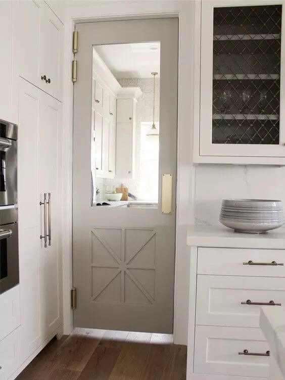
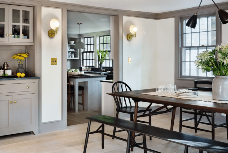
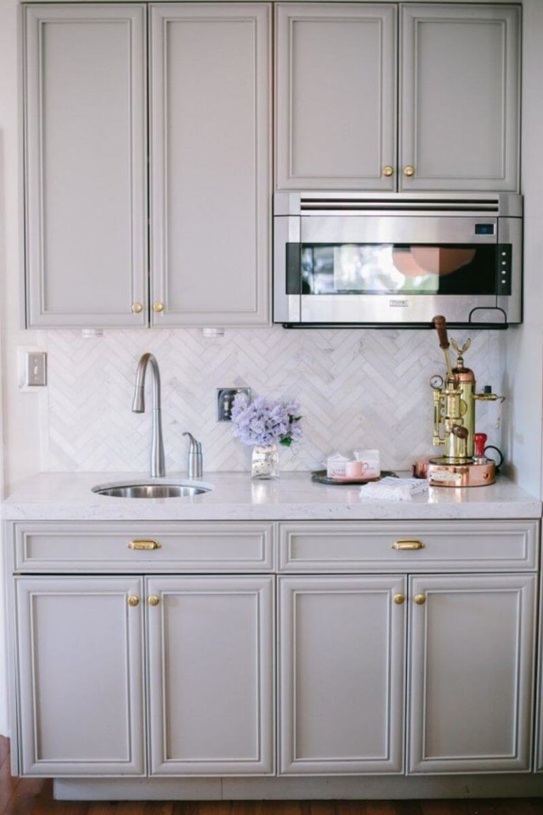
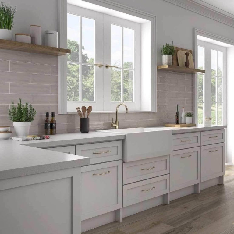
Kitchen and dining room
Have you noticed the increasing popularity of painting the kitchen cabinets in gray? It is a perfect time to give it a try yourself unless you have already done that. Nevertheless, nothing will combine so impressively freshness, softness, invigoration, and calmness the way Dolphin Fin can. It seems that the latter is quite friendly to metallic hardware. It must be the rather coolish and soft undertones that try to penetrate the surface. Well, why stand in their way? Consider steel or brass hardware for the already painted cabinets, adding a splash of wood texture to dilute an overly neutral setting.
As with the living room, feel free to use Dolphin Fin as a background and put into practice your design ideas for the dining area and remember: the more individuality it acquires, the closer the environment feels to you.
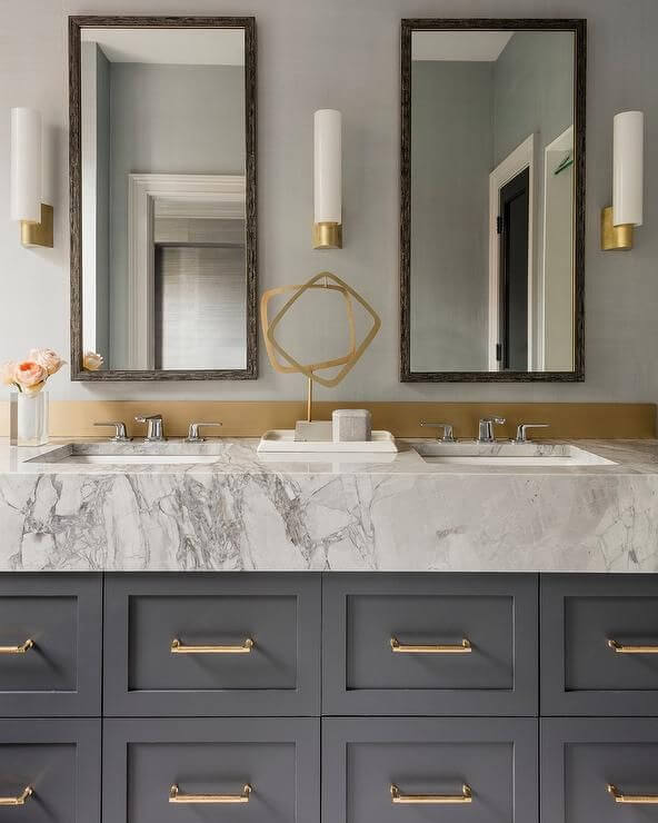
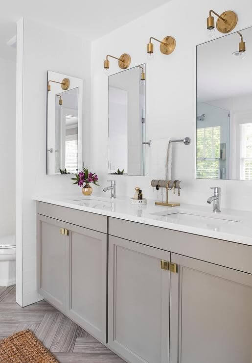
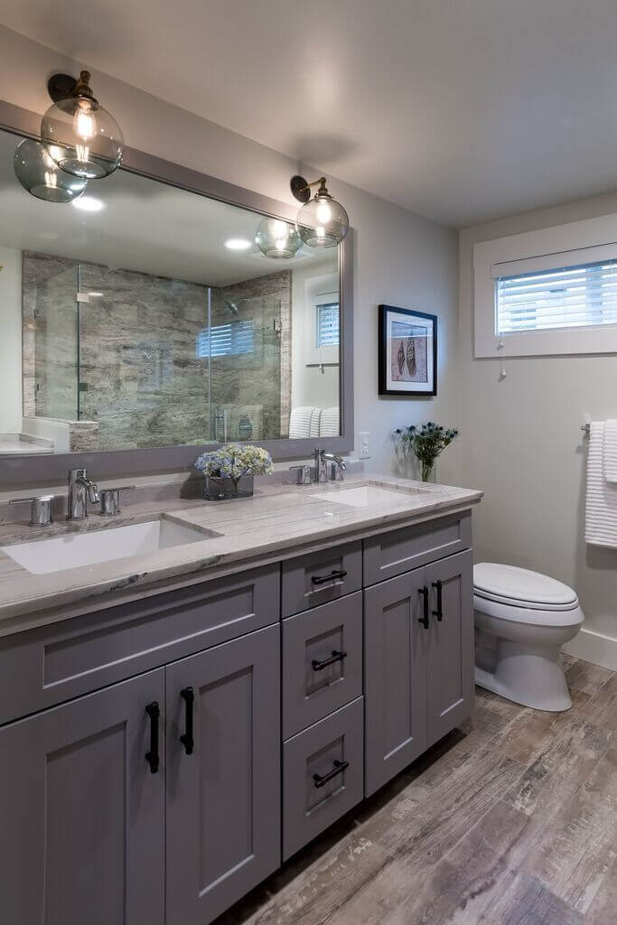
Bathroom
Bathroom walls painted in Dolphin Fin? Yes, without any doubt! Cabinets painted the same way? Why not? Either way, don’t forget about the old friends – a few bass elements or invite some new companions – a few black accents. While brass will add a feel of balanced delicacy, the latter will surely enrich the space with a surprising sense of depth. Of course, calmness will be a constant feature in any case. In such small spaces, lighting has an increasing influence. Therefore, you can surely go with particular light undertones to achieve a rather coolish or softer environment.
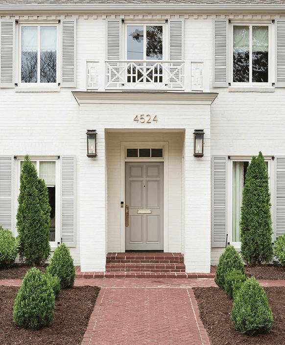
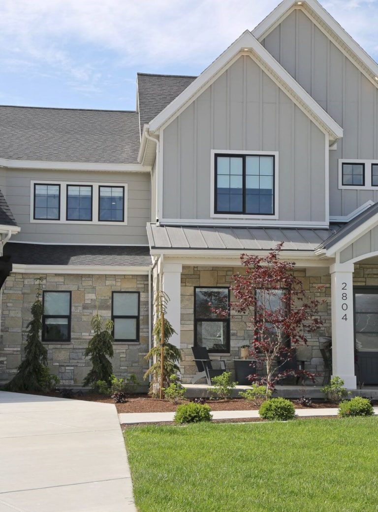
Use of Dolphin Fin for house exterior
Make an impressive statement and outstanding introduction to your interior with a no less contemporary and inviting house exterior. Of course, Dolphin Fin is a go-to option for those who appreciate the exquisite combination of formality and comfort. You could paint the walls in this shade of gray and consider a contrastive color for the trim, or opt for this color for the door and shutters on a lighter background. Do you know what is common between those two options? A unique stately yet welcoming effect.
The Dolphin Fin (790C-3) paint color from Behr is the most popular source of stimulation and calmness in terms of color effects. Do you feel that your interior or exterior would benefit from such features, additionally to the standout contemporary sense that this color bears? Don’t hesitate to make them part of your design with appropriate integration of this color.
