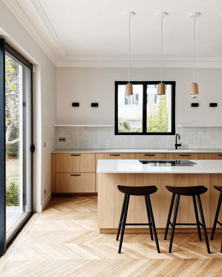
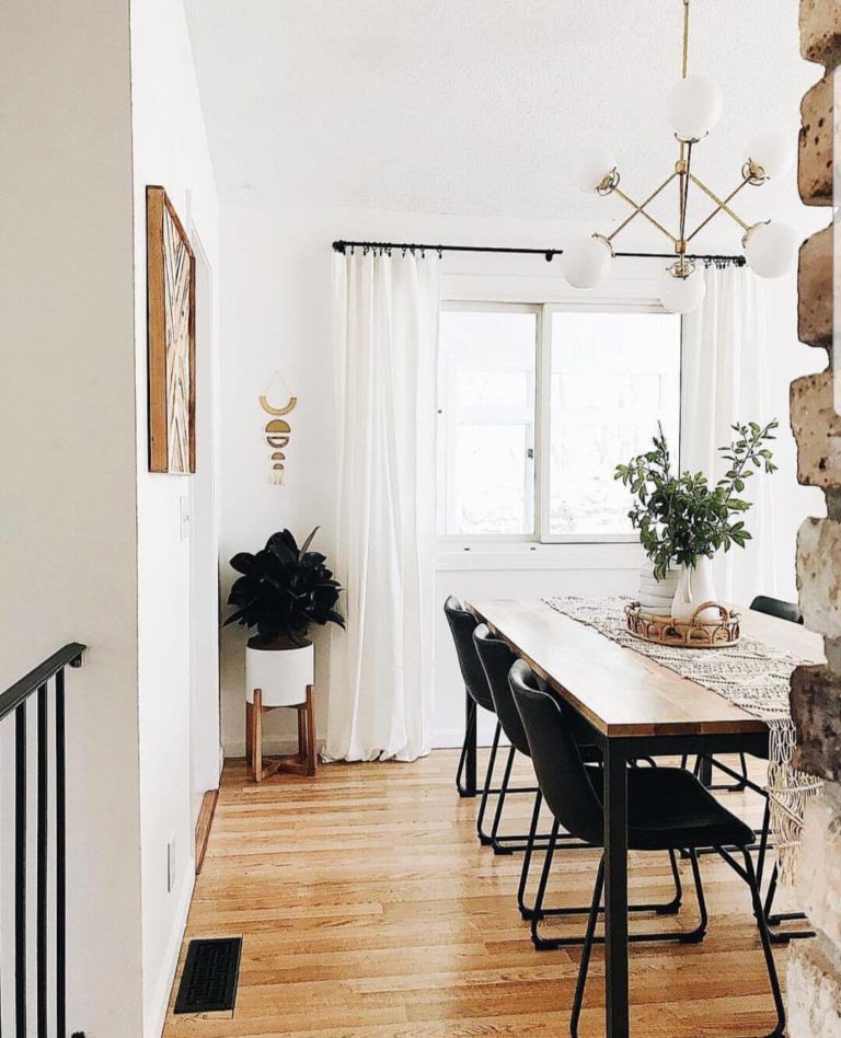
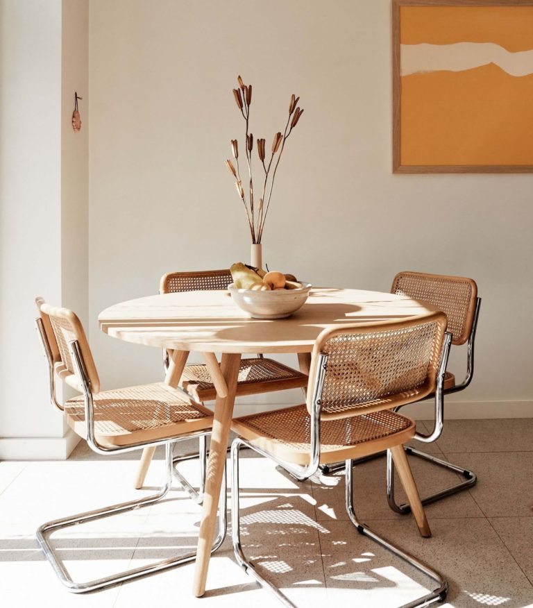
Natural wood is a classic in interior design, and, as we all know, classics never get out of trend. Now it is more popular than ever since people try to integrate the concept of bringing the outdoors indoors. A great benefit is that you just go with wood surfaces without covering them with paint, and their natural texture brings your interior to the next level. Would you like to make your design look connected to nature, set a vintage environment, keep it simple with an organic color palette, or ensure coziness in an exquisite way? Natural wood is the solution for all these options.
Nevertheless, nothing will work without a harmonious combination between all constituent elements of the room. In particular, the neighboring colors play an essential role. Whether you want to play down the warm wood undertones or emphasize their richness, this is when colors enter the play. Although natural wood is pretty versatile and works with various shades, there are paint colors that go better than others. Luckily, they are plenty enough to open up lots of possibilities. Today, we will stop at the renowned paint manufacturers Behr and Dulux and find their best hues to pair with natural wood.
Neutrals
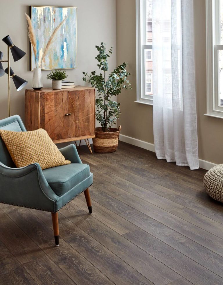
Nothing complements simplicity more than another splash of simplicity itself. The wood surfaces untouched by paint would benefit from a neutral background, offering them the possibility to reveal their texture at their finest and bloom in a way full of flair. Whether it is wood furniture, flooring, or trim, a neighboring color devoid of intensity will lead to a harmonious result. We associate calmness, reflection, and, at some level, invigoration with settings of this kind. Let’s discover what particular neutrals would work in this sense!
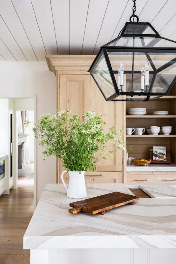
White
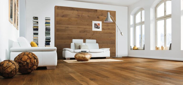
You should never doubt the combination of two classics. In this case, white and wood bring their best parts to the surface when paired. White is a perfect source of refreshment, neutrality, and stability, while wood completes these features with their exact opposite: warmth, richness, and accent. It would appear that two contradicting elements cannot cooperate, but this is when we should look at the other part of the coin: two opposites complete each other.
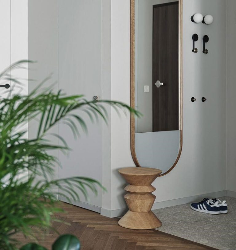
Gray
Is it possible to achieve even a more neutral result? Yes, it is, with gray. While working as a standout backdrop, gray also adds mystery and a moody vibe, enriching the space with depth. Undoubtedly, the wood texture is enough to ensure a comforting result, but why not add a tiny splash of individuality as well? Such an effect is especially easy to achieve with gray.
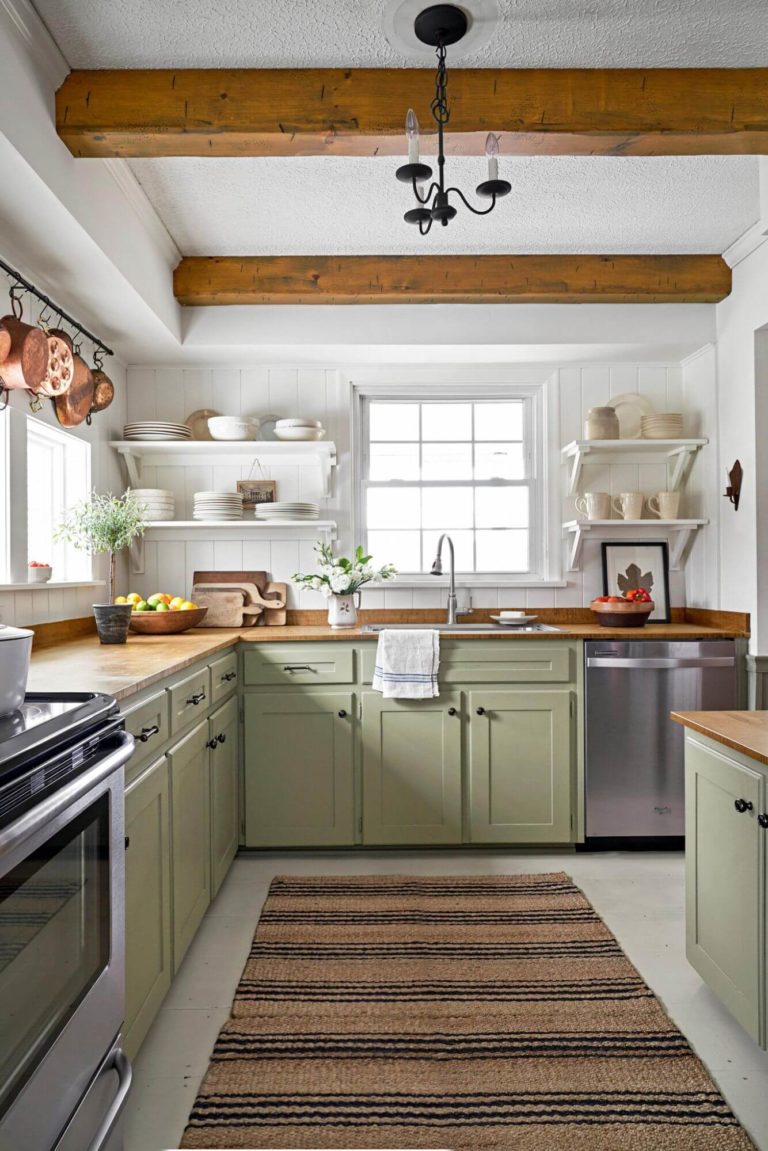
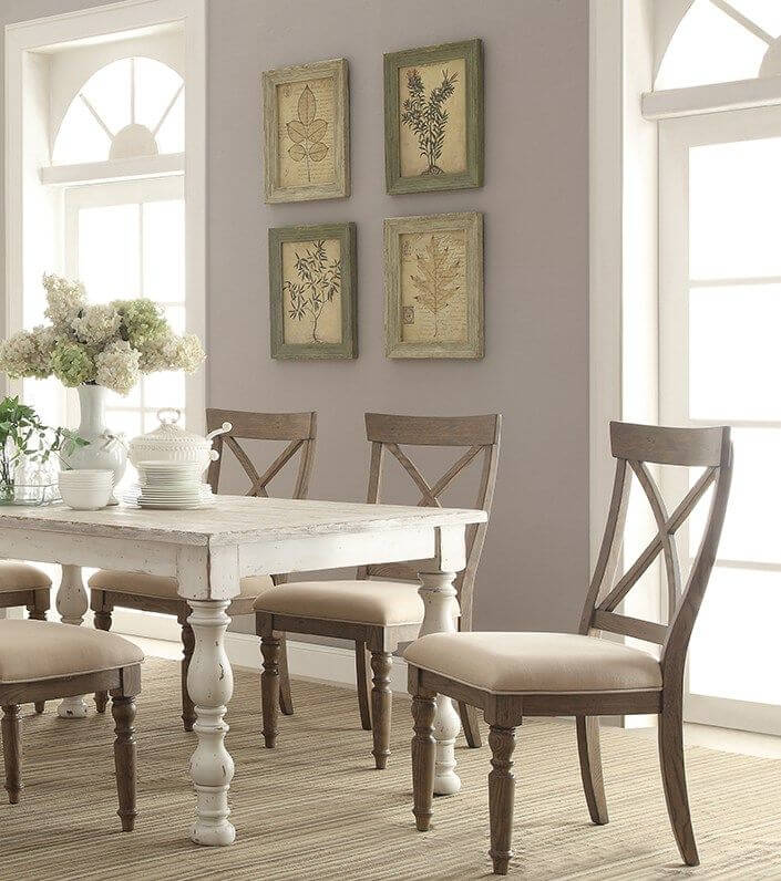
Beige
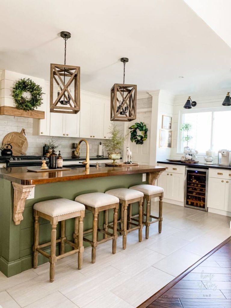
It would be a shame to speak about neutrals and skip the one that resonates with the wood undertones. Besides going in harmony with the rich wood notes, a light shade of beige can even breathe freshness into the interior, while a slightly warmer rather than darker one can deeply penetrate the wood texture.
You can apply wallpapers, paints, etc. on walls and see how they look in various interiors.
Pastels
The perfect recipe for a pastel sounds as follows: pick any shade on the color wheel, reduce its intensity, add lightness, and your pastel is ready. Considering that the latest trends tend to opt for colors that fill the space with calmness and surround it like a cocoon, pastels are more than appropriate. Whether they resonate with the wood undertones or come up with new accents to enrich such surfaces, pastels will always be a real find for those who want to combine coziness with softness.
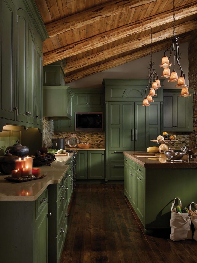
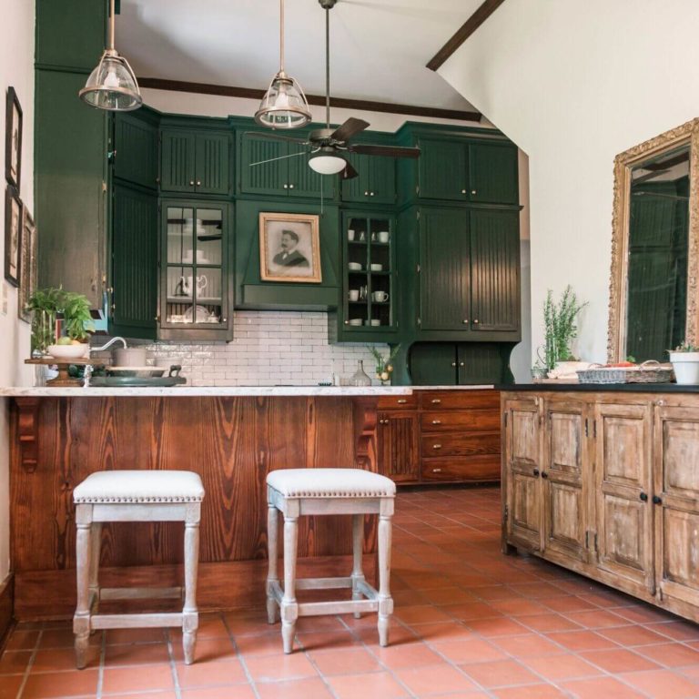
Green
Complement the natural wood surface with a nature-inspired shade. Of course, a bright shade of green would seem too extra, while a light one would fail to reveal the entire beauty of the combination between natural wood and green. The best solution is to opt for a rather emphasized shade of this kind, although with a soft cover to avoid any suppressing effect.
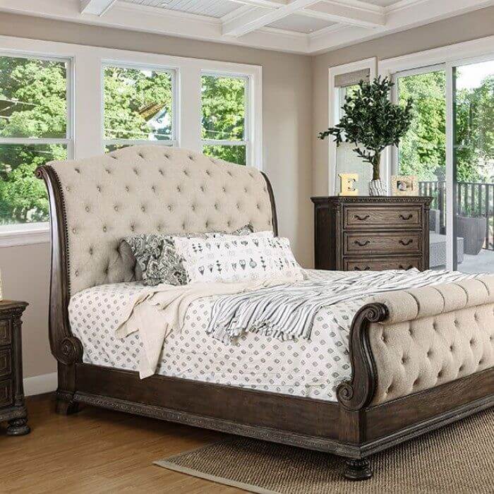
Brown
Brown is the true companion for wood surfaces if a harmonious result is a top priority. While a bright brown or a rather dark shade of this color is too bold to apply in a room already enriched with texture, a pastel brown perfectly matches the cozy undertones of wood, preserving calmness and comfort within the space.
Purple
An advantage of using pastels in combination with wood is that you can opt for bold colors as well that would normally look too extra but not when we speak about pastel variations. We can notice the increasing popularity of purple since its pastel version has become part of numerous contemporary designs.
Deep paint colors
If neither neutrals nor pastels work for you, and you are looking for more sophisticated ways to ensure a unique result, you should opt for deep colors. Besides being dark, such shades are enriched with mysterious notes that bring in intrigue and add individuality. Whether it is an ultra-modern setting or an elegant vintage space, the combination between dark and moody shades and natural wood will emphasize the particular style at its finest.
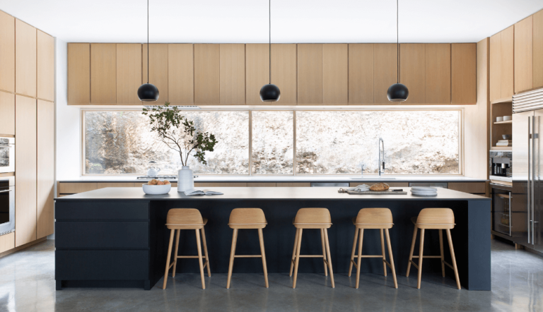
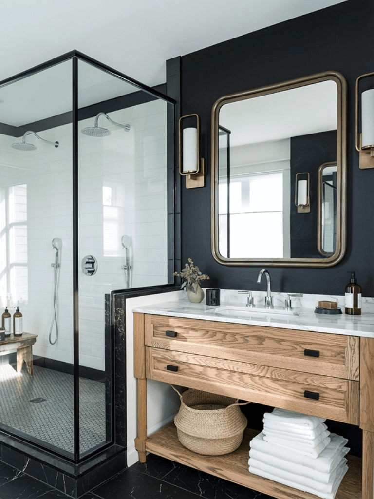
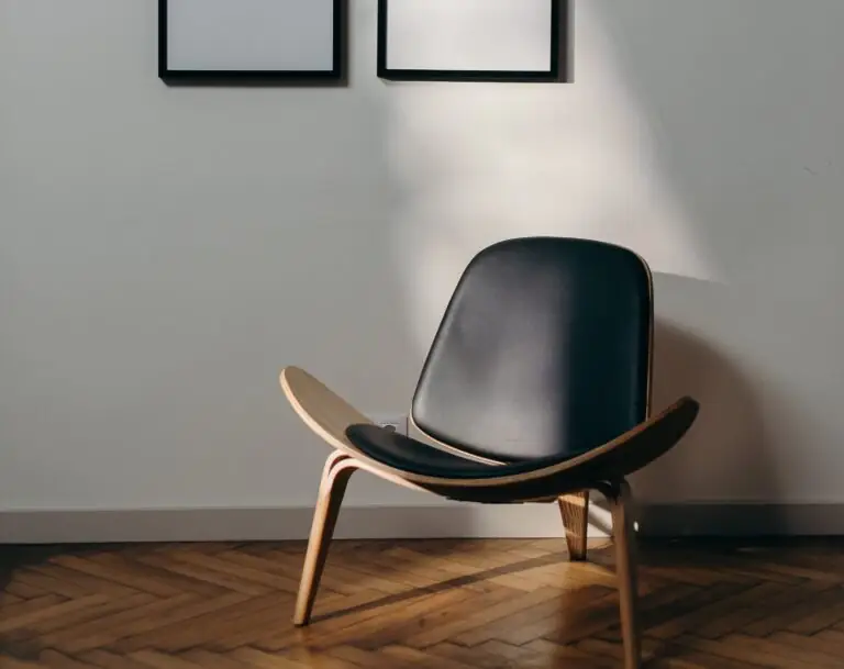
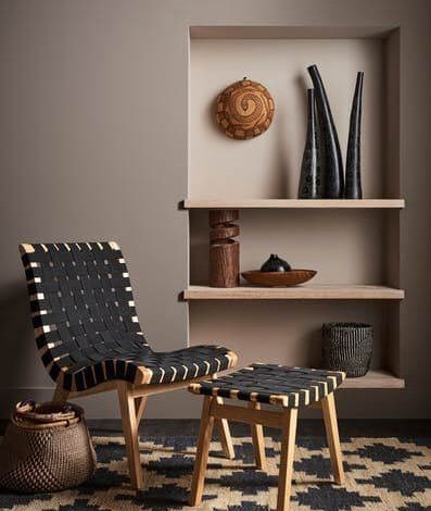
Black
Does it seem strange or unsuitable? Wait till you discover that an appropriate combination between black and wood, accompanied by a splash of white and light-colored elements, is the interpretation of uniqueness itself. Every space integrating such an approach will reach an original result since this design idea is fully unpredictable.
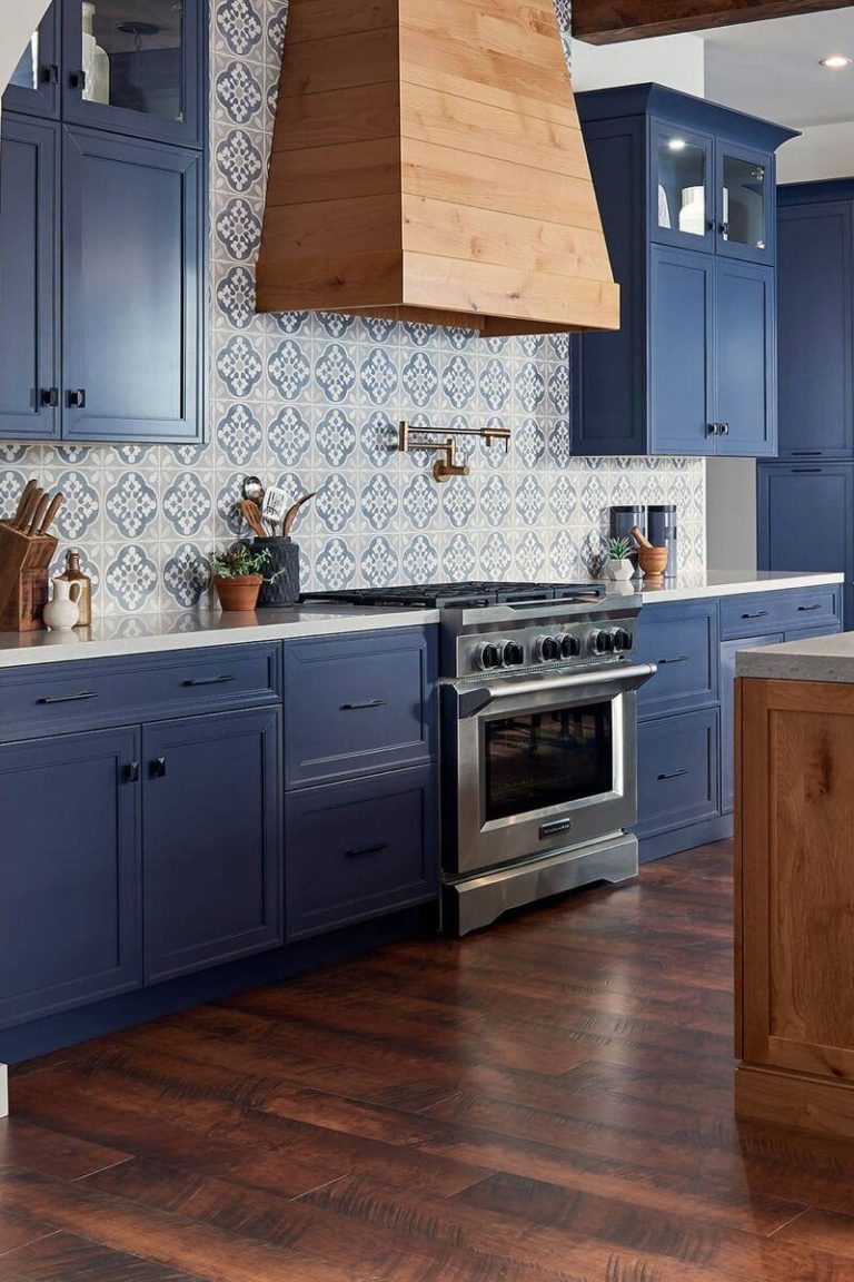
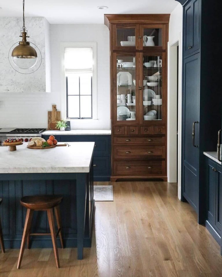
Blue
Dark blues with deep notes are extremely popular and seem like options worth considering for another popular trend – natural wood. The effect is similar to the previous option, although the slightly brighter notes also bring accents and make us perceive the wood texture from a whole new perspective, particularly if we speak about light wood. It will bloom to the fullest on such an emphasized background.
Green
This is another popular trend, and it gets more popular once we switch to dark greens. Green itself works surprisingly well with wood. A dark shade will add this sense of luxury that a contemporary setting will surely benefit from. Besides other things, such an approach will show off your exquisite taste since a combination like that cannot be underrated by any means.