Repose Gray SW 7015
Sherwin-WilliamsA really light gray color, but it also has a beige hint and a number of other, even more complex undertones. However, there is not much of beige to confidently state it as a gray-beige.
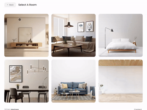
Try Repose Gray paint in a room with Hackrea Visualizer
Repose Gray (SW 7015): what color is, review, and use
The times when gray shades were treated with caution and considered flat, boring, and cold are long gone. Designers managed to find in the endless gradations of this color exactly those variations that touched our souls and hearts, and subsequently, of course, houses and apartments.
The variety of gray tones that can completely transform your house cannot but be a reason for joy, and we continue introducing to you the most popular, sought-after, appropriate in modern interiors, and, to be honest, those that we especially like. Today’s turn is the color SW 7015 from Sherwin-Williams with the intriguing and very pleasant name Repose Gray. If you are interested in colors in general and SW products in particular, you have probably seen it in such collections as Senior Living Cool Foundations, Pottery Barn, Living Well – Inspire, Dreamer, and, of course, Top 50 Colors. As you can see, the manufacturer makes a serious bet on it, which means it’s time to get to know this color better.
Repose Gray paint color features
This gray color from Sherwin-Williams has not received such a name without reason: if you look at the surface painted with such color for several minutes, you will feel that your eyes are resting, and if you stay in a room where this color predominates for a long time, you will feel relaxed, and the peace it brings will encourage you to stay in there longer.
Many are still arguing whether to classify Repose Gray as a so-called “true gray” shade or consider it a representative of the gray-beige group. The fact is that it all depends on what exactly is considered a “true gray”. This is absolutely not the case if we speak about a true gray as the mix of black and white without any subtones. SW 7015 is a really light gray color, but it also has a beige hint and a number of other, even more complex undertones. However, there is not much of this beige to confidently state that Repose Gray is a gray-beige, which is also not that warm.
So, to summarize all of the above: Repose Gray is a light and warm gray color, quite complex and at the same time moderately neutral.
You can apply wallpapers, paints, etc. on walls and see how they look in various interiors.
Repose Gray: is it warm or cool?
Some may still think that gray tones are predominantly cool, but Repose Gray once again proves such stereotypes wrong. The fact is that this color is nothing else but warm. Even when the lighting becomes subdued, it can get a little cooler, but you will still see a warm color.
If you need proof in numbers, then here they are: the SW 7015 hue value is 45 degrees, which once again confirms its relation to the warm group.
How does lighting affect Repose Gray?
It can be said with all certainty (and even from my own experience) that the degree of illumination has a very serious impact on Repose Gray. Let’s look at each case in more detail.
So, for example, in a room with weak or cool natural light (and this happens if the windows are north, east, or west-facing or the trees, shrubs, a canopy, or a wall of a neighboring house block the light from the outside), it will look a little cooler, very calm and detached. If this is enough for you, you can be absolutely happy with the choice in favor of Repose Gray. If in doubt, just think over the lighting scenario in such a way as to maintain its natural lightness and warmth.
In a medium natural light environment, Repose Gray reflects light well while showing off its natural undertones. It is no less beautiful in a bright room, where it practically does not blur under bright daylight, showing remarkable durability of gray and beige. Well, in terms of artificial lighting, any experiments are completely available to you: you can choose lamps under which this gray will seem remarkably warm, pleasantly cool, slightly purple, or barely noticeable greenish.
Repose Gray LRV
The LRV of Repose Gray places it in the light tone group, and it absolutely deserved this. It reflects and holds light well in rooms with good lighting, maintains a comfortable feeling in rooms with a sufficient level of illumination, and doesn’t seem too gloomy where there is clearly not enough light.
On the other hand, designers often recommend colors with this LRV in rooms with sufficient to moderate lighting, as they show up best there. Of course, some people also like the mysterious, slightly aloof atmosphere that Repose Gray creates in shaded rooms, and if you also find it interesting, you will have no barriers to using this gray color.
Repose Gray undertones
The range of undertones in Sherwin-Williams SW 7015 replicates such an amazing cocktail that it sometimes becomes incomprehensible how such a calm, even balanced gray comes from them. It contains beige with subtle pinkish notes and brownish, even greenish undertones, which can appear in rather cool lighting. Some see even reflections of purple in it, but this is rather a reflection of undertones from the coolish shades adjacent to it.
Similar colors
SW 7029 Agreeable Gray, SW 7016 Mindful Gray, HC-172 Revere Pewter by Benjamin Moore are the colors with which Repose Gray is often compared to and which it has a lot in common with. However, the list of similar colors is not limited to this short list. Let’s find out about other colors that obviously resemble Sherwin-Williams warm gray:
Coordinating colors
Designers suggest combining Repose Gray by Sherwin-Williams with warmer grays and gray-beiges, trying combinations with gray-blues and gray-greens, but avoiding too cold and light shades. SW colorists offer their palettes, suggesting a harmonious partnership with shade 7015:
Use of Repose Gray in interior
If you think about whether or not to choose SW 7015 for your interiors or paint your house exterior, there is no point in wasting much time: just do it. Of course, in this case, it will not do without nuances: we remind you that this is still a complex gray color. So let’s talk in more detail about how Repose Gray can appear before us in various rooms in the house. Get ready: we will try to make it really exciting.
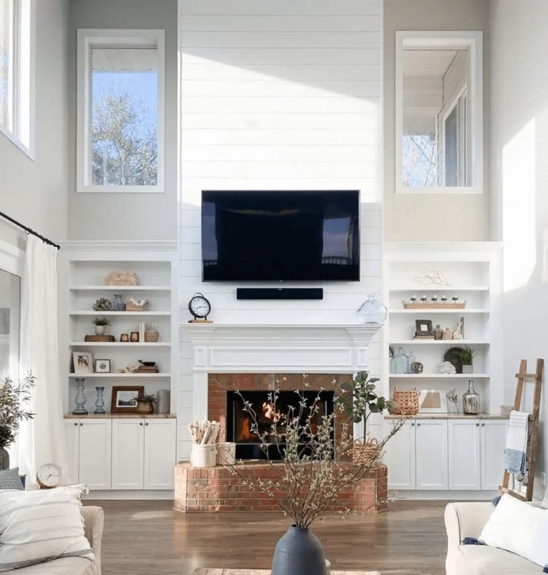
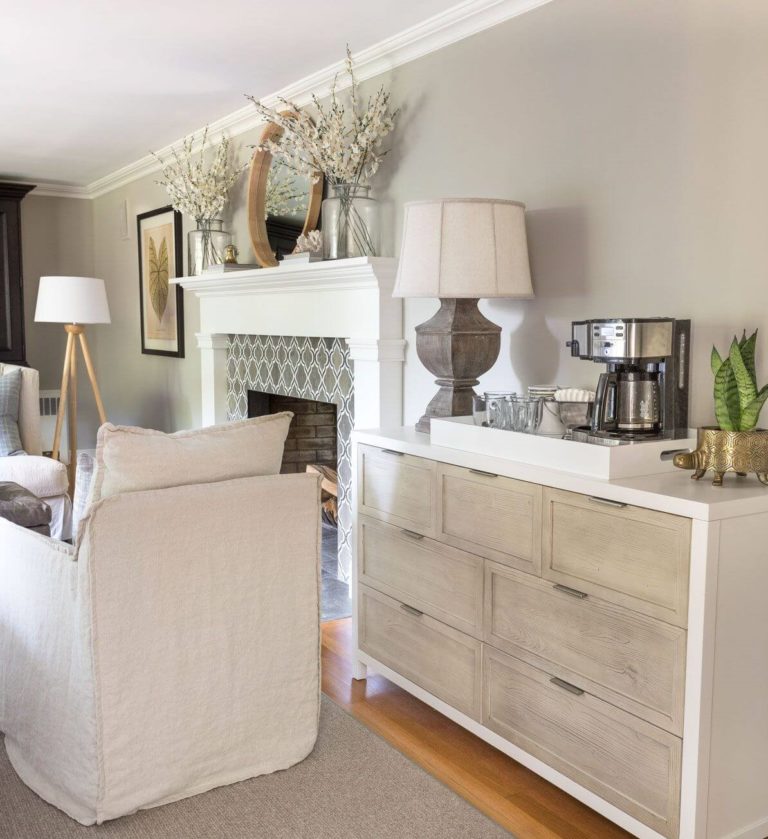
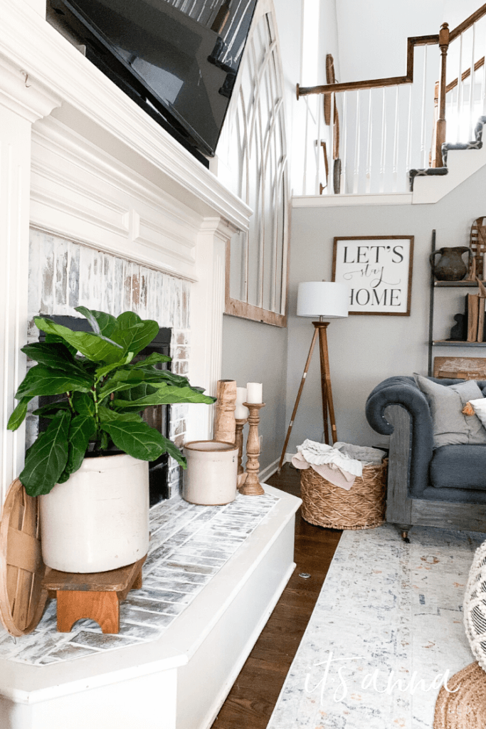
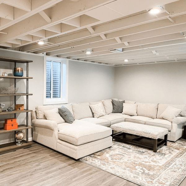
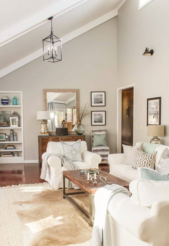
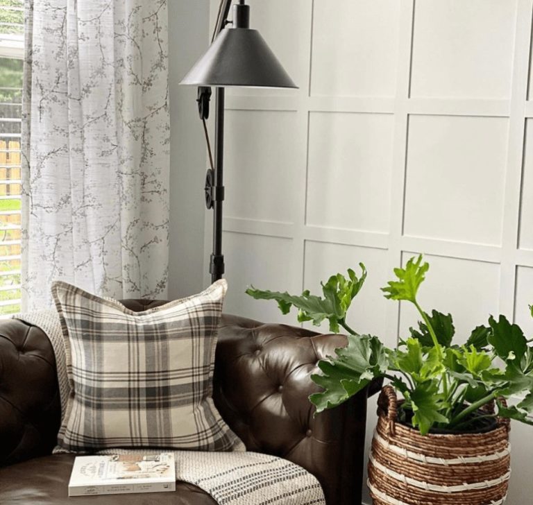
Living room
When thinking about which gray color to choose for the living room, Repose Gray should by no means be left aside. This shade can brighten up any room without looking cold or unwelcoming. Scandi, Modern, Minimalism, Mid-century, Traditional, Farmhouse – no matter what style you have in mind for the living room, SW 7015 will be very appropriate.
In terms of details, we advise you to pay attention to the choice of wood shades for rooms painted in Repose Gray – we recommend looking at honey and light brown tones, or going to the other extreme – wood of a dark and deep color. Dark blue accents and watercolors in pastel shades create a charming consonance with a warm gray background. Want more chic? Decorate a wall of this color with a collage of black and white photos – and enjoy the art deco atmosphere.
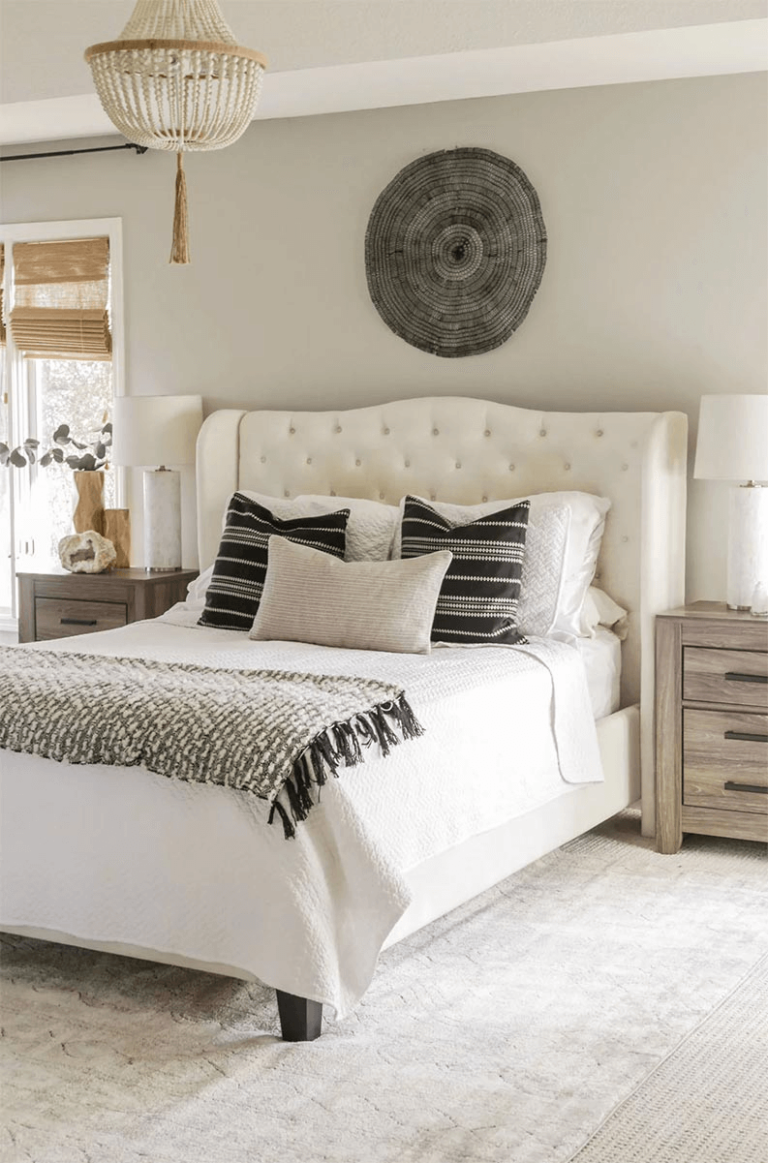
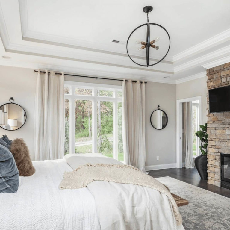
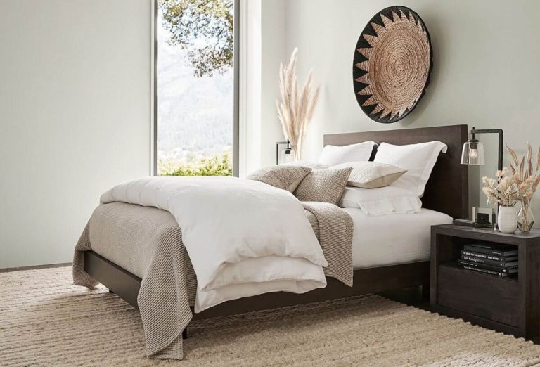
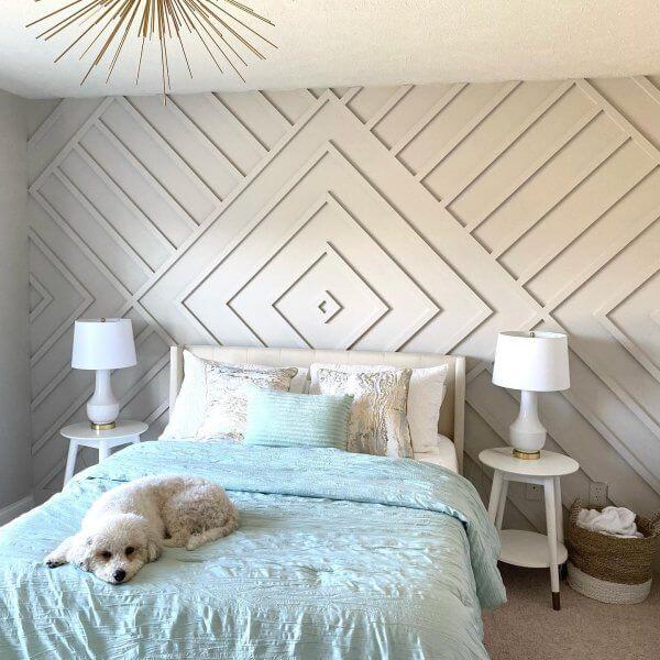
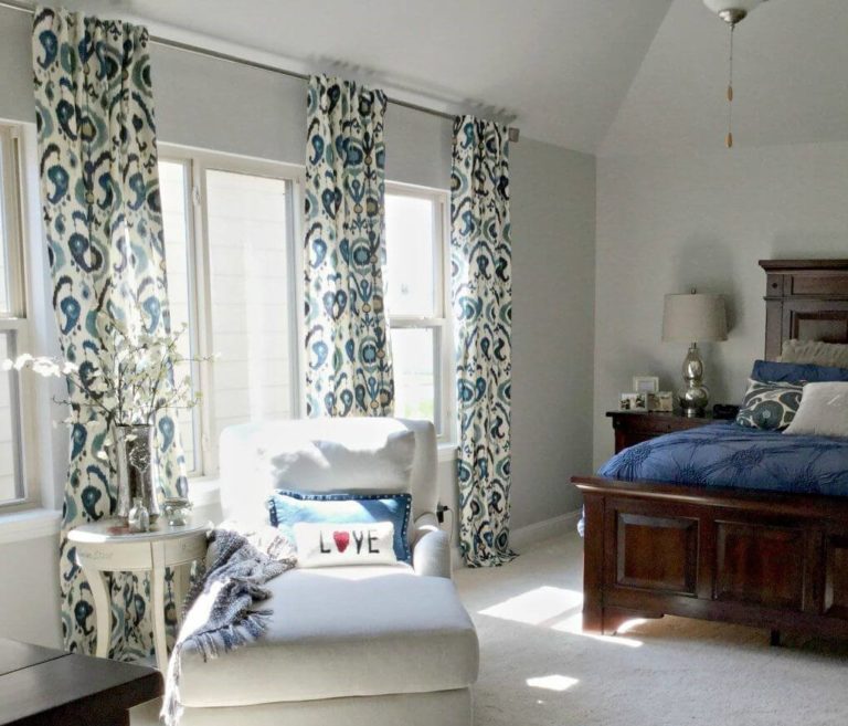
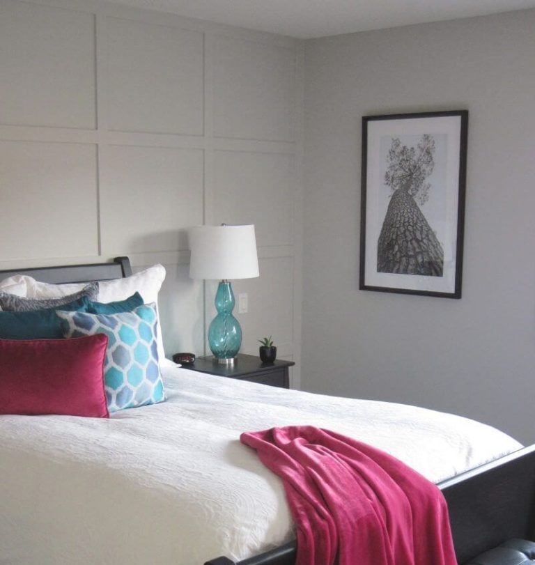
Bedroom
When choosing Repose Gray for a bedroom, you can go one of the two ways – consider it as warm or cooler as possible. The first option is relevant if your room has north or west-facing windows; use soft white trim, furniture, and accents in warming rich tones and natural wood. In a south-facing bedroom, pairing this gray with light-colored furniture and slightly light fabrics in pastel colors would be more appropriate.
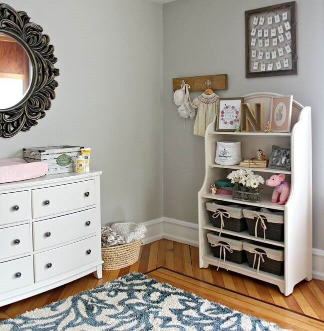
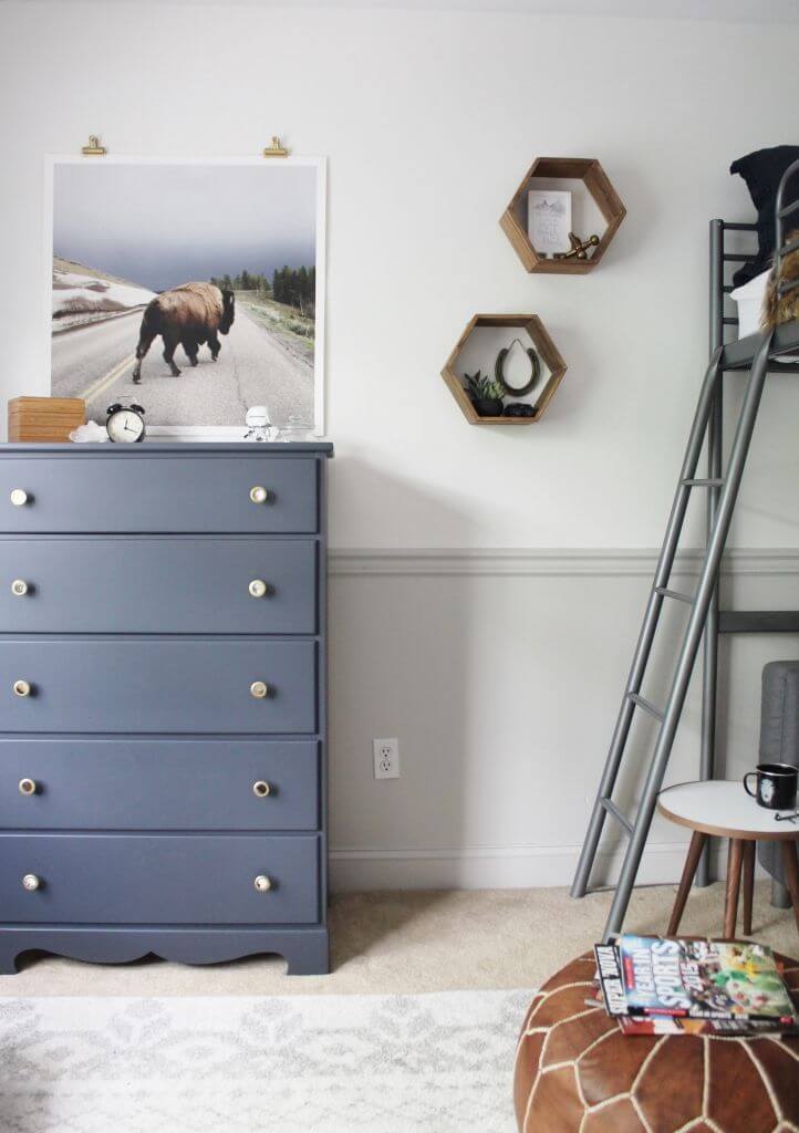
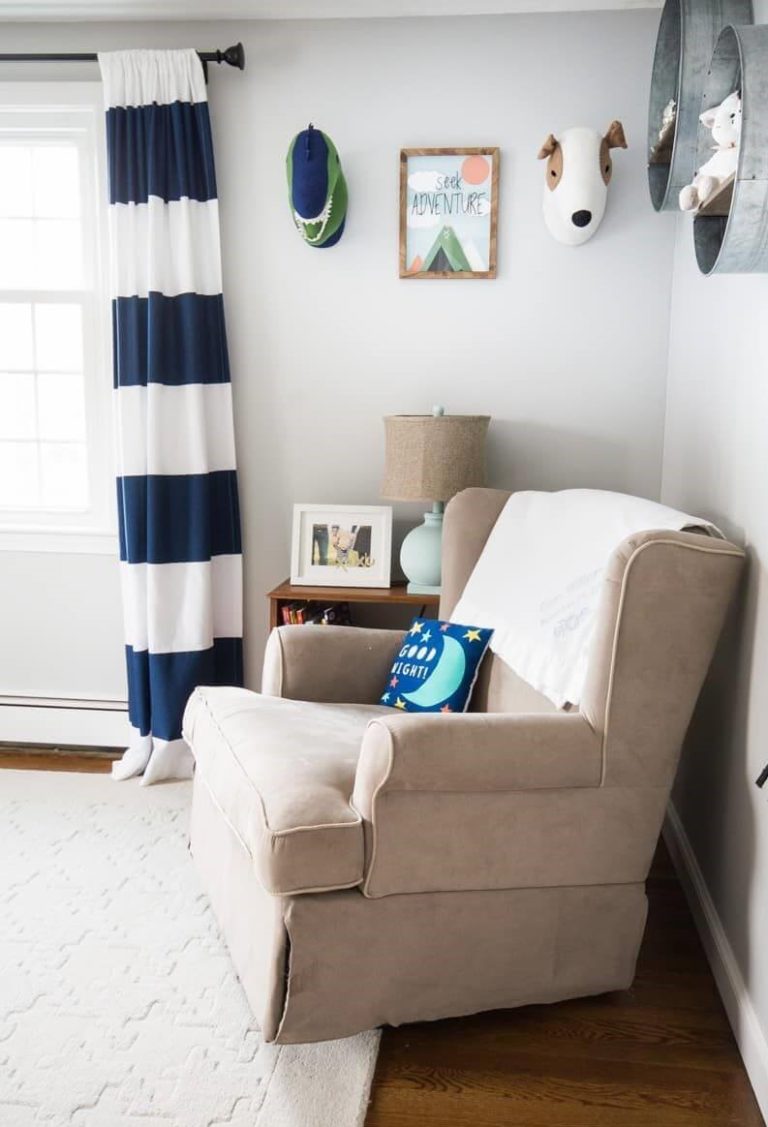
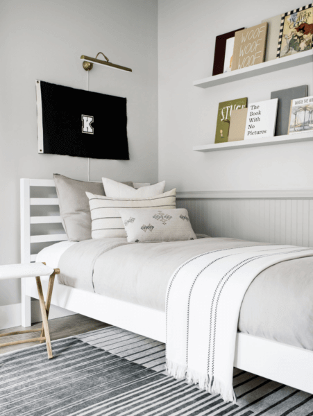
Kids’ room
If you consider yourself a practical parent, painting the walls in your child’s room in Repose Gray can once again confirm this positive trait of your character. The fact is that soothing and warm gray creates a psychologically and visually comfortable environment for the baby. In addition, as the child grows, you can change the furniture and accessories, choosing both pastel and pure saturated colors, depending on the preferences of the young owner of the room.
A nice bonus is that any stickers and posters look good on the Repose Gray surface – the child will appreciate it too!
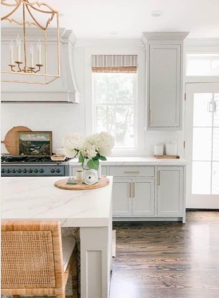
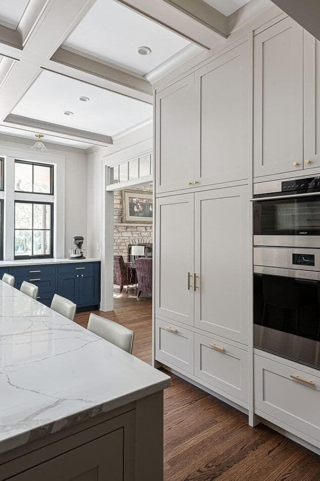
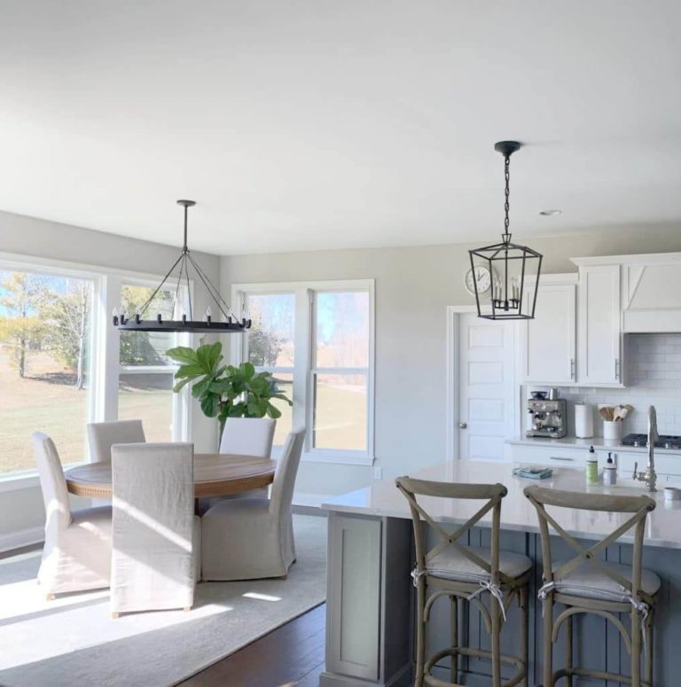
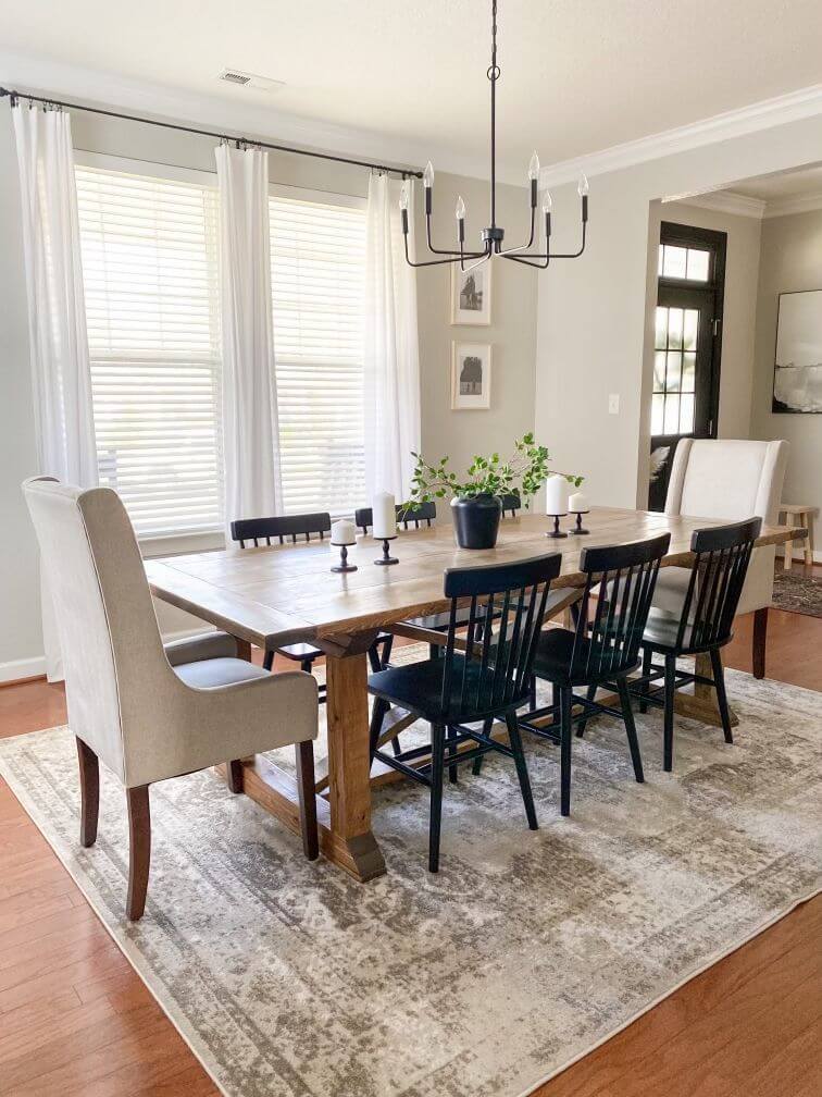
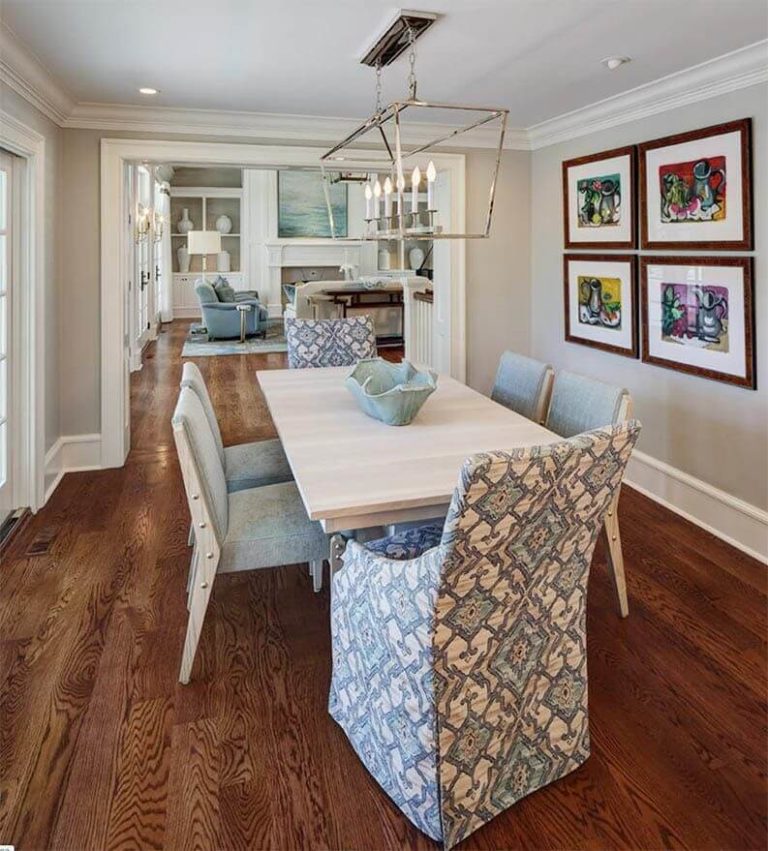
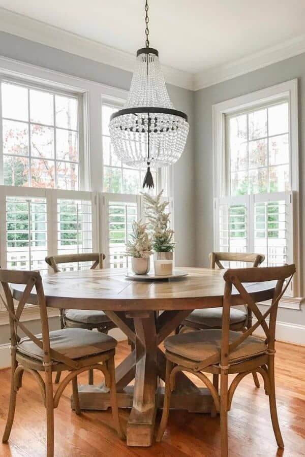
Kitchen and dining room
Why do designers love to use SW 7015 in kitchens so much? The answer is simple: not only is it amazing as a wall color, but it also shows its versatility on kitchen cabinets, pairing beautifully with bronze and brass, as well as chrome and black metal fittings.
As for dining rooms, Repose Gray is able to create a completely unobtrusive and very pleasant backdrop for both gala dinners and fun family gatherings. It works especially well in a room with uniform and fairly intense lighting, large and high windows, and very light or very dark furniture – it is better to leave the intermediate color options for later.
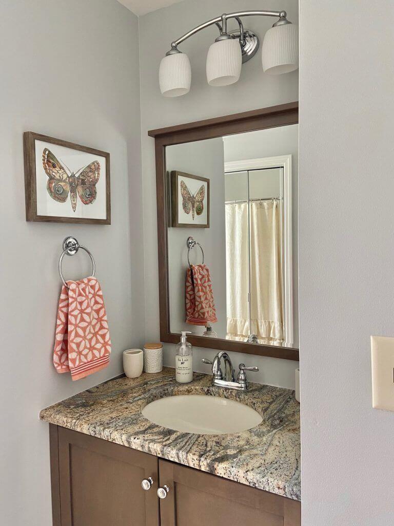
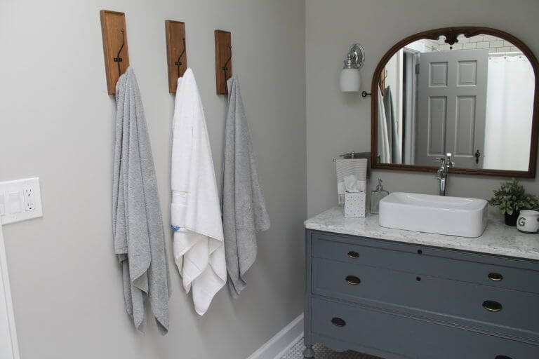
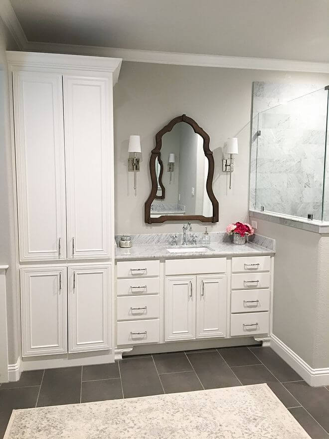
Bathroom
A bathroom in Repose Gray will never look outdated or boring (if it does, you can always repaint it, kidding!). The same accommodating character allows you to successfully combine various textures and colors with surfaces of this shade – including quite bright and accent ones. Marble, wood, granite, chrome, bronze, textiles, glass – all these materials allow you to present the gray SW7015 in a new light.
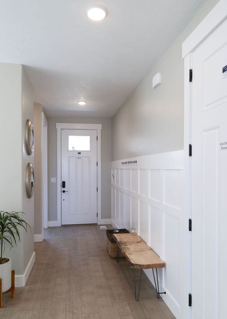
Hallway
Designers have repeatedly stated that Repose Gray is also very good for entrance spaces. Take the use of wood in there as one of the reasons. Natural brown woods are not liked by many gray tones because they can make them look dirty and dull. However, SW 7015 does not face such a problem: it always preserves the look of a confidently clear, concentrated warm gray – either next to a tree or in the neighborhood of ceramic tiles.
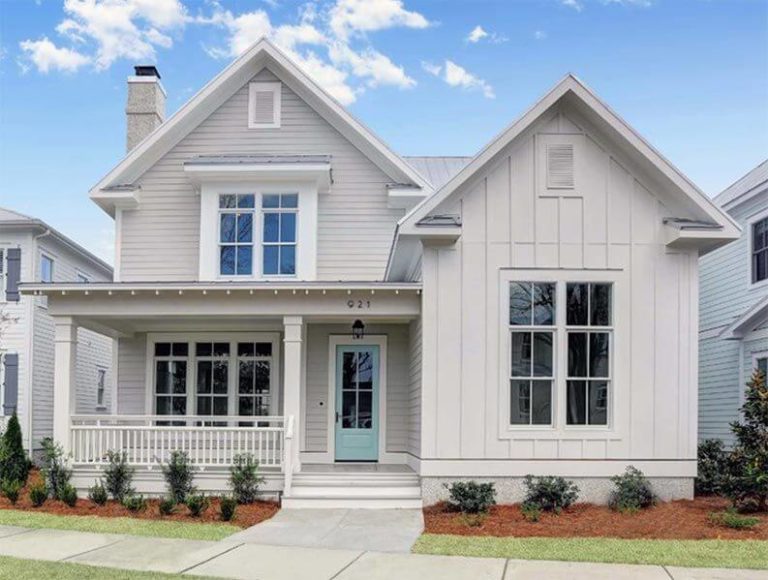
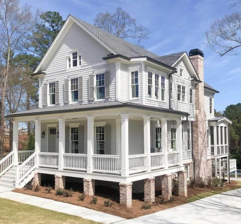
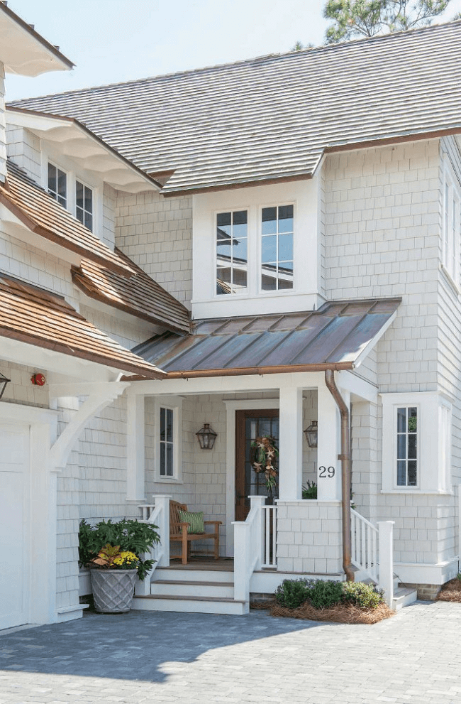
Use of Repose Gray for house exterior
We won’t tell you anything new here: like any other light and warm gray, Repose Gray will be a good choice for the house walls – especially if they are plastered or trimmed with siding. You can choose a white finish or paint the frames, cornices, columns, and roofing in dark shades. You can add a contrasting door, put stone flower pots with flowers at the entrance, or hang forged lanterns. In a word, you will certainly find room for experimentation, all thanks to the friendly nature of the SW 7015.
Maybe we’re being too picky about Repose Gray by Sherwin-Williams, but there’s nothing we can do about that: we really love it. And we have no doubt that if you include it in your collection of gray shades, you will not be disappointed.
